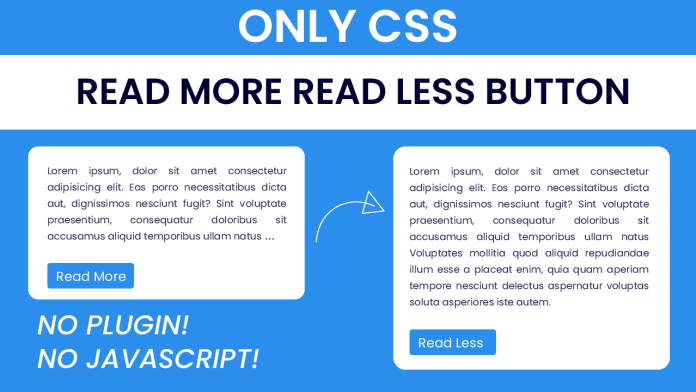
In this blog post, we will explore how to create a “Read More/Read Less” button using only CSS. This button allows users to toggle between displaying a truncated text and the full text content. We will walk through the HTML and CSS code that powers this button, and discuss the things you will learn by implementing it. Additionally, we will provide a video tutorial to guide you through the process, and explain the project folder structure. Let’s get started!
Introduction
The “Read More/Read Less” button is a common UI element used to handle long blocks of text content in a user-friendly way. By providing a truncated version of the text initially and allowing users to expand and collapse the full content, we can improve the user experience and reduce clutter on the page. In this project, we will create this button using only CSS, without any JavaScript code.
Things You Will Learn
By implementing the “Read More/Read Less” button using CSS, you will learn the following:
- Utilizing CSS selectors and pseudo-classes to target specific elements.
- Using the
:beforepseudo-element to add content before an element. - Leveraging the
appearanceproperty to customize the look of form elements. - Employing CSS sibling selectors to style elements based on their relationship in the document structure.
- Creating interactive buttons and transitions using CSS.
Video Tutorial:
To guide you through the process of creating the “Read More/Read Less” button using CSS, we have prepared a video tutorial on our YouTube channel. You can watch the tutorial here. The tutorial provides step-by-step instructions, demonstrations, and explanations of the code implementation.
Project Folder Structure:
index.html: This file contains the HTML structure for our “Read More/Read Less” button.style.css: It holds the CSS styling rules and declarations to create the button.
HTML:
In the HTML file, we have a container div that wraps the text content. Inside the container, we have two paragraphs: one with the original truncated text and another with the additional text to be revealed. We also have an input checkbox element and a label element. The label is positioned to act as the button for expanding and collapsing the text.
CSS:
The CSS file is where the magic happens. We define styles for the container, original text, truncated text, and the button. The button is created using the checkbox input and label elements. We use CSS selectors, pseudo-classes, and sibling selectors to toggle the display of the truncated and extra text when the button is clicked. Additionally, we add some visual enhancements, such as changing the label content and hiding the ellipsis when the full text is visible.
Conclusion:
In this blog post, we explored how to create a “Read More/Read Less” button using only CSS. We discussed the benefits of this button for handling long text content and improving the user experience. By following the video tutorial and examining the HTML and CSS code, you learned valuable CSS techniques and selectors. Feel free to customize and enhance the button’s styling and behavior according to your project’s requirements. Enjoy implementing this user-friendly feature in your web applications!


