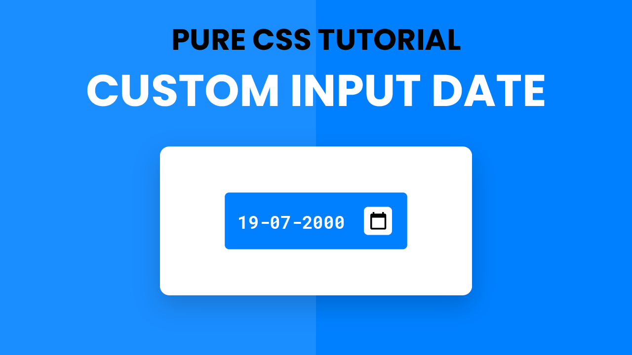
Video Tutorial:
If you are interested to learn by watching a video tutorial rather than reading this blog post check out the video down below. Also, subscribe to my youtube channel where I post new and exciting tutorials every alternate day.
Project Folder Structure:
Before we start coding let us take a look at the project folder structure. We create a project folder called – ‘Styling Input Date’. Inside this folder, we have two files. The first file is index.html which is the HTML document. And the second file is style.css which is the stylesheet.
HTML:
We begin with the HTML code. First, copy the code below and paste it into your HTML document. Our HTML document consists of just the input tag of type ‘date’.
<!DOCTYPE html>
<html lang="en">
<head>
    <title>Styling Input Date</title>
    <!--Google Font-->
    <link rel="preconnect" href="https://fonts.gstatic.com">
    <link href="https://fonts.googleapis.com/css2?family=Roboto+Mono:wght@500&display=swap" rel="stylesheet">
    <!--Stylesheet-->
    <link rel="stylesheet" href="style.css">
</head>
<body>
   <input type="date">
</body>
</html>
CSS:
We style this date input with CSS. For this copy, the code provided to you below and paste it into your stylesheet. We make use of the ‘::-webkit-calendar-picker-indicator
‘ pseudo-element to style the input field.
*,
*:before,
*:after{
    padding: 0;
    margin: 0;
    box-sizing: border-box;
}
input[type="date"]{
    background-color: #0080ff;
    padding: 15px;
    position: absolute;
    transform: translate(-50%,-50%);
    top: 50%;
    left: 50%;
    font-family: "Roboto Mono",monospace;
    color: #ffffff;
    font-size: 18px;
    border: none;
    outline: none;
    border-radius: 5px;
}
::-webkit-calendar-picker-indicator{
    background-color: #ffffff;
    padding: 5px;
    cursor: pointer;
    border-radius: 3px;
}
That’s it for this tutorial. Our input field styling is now ready. You can now go ahead and customize it the way you want by changing font size, font family, colours, border radius and much more.
If you face any issues while creating this project you can download the source code by clicking on the ‘Download Code’ button below. A zip file will download automatically. All you have to do is extract the files inside and you are good to go.
Also, I would love to hear from you guys. So if you have any queries, suggestions or feedback comment below.
Happy Coding!


Good Design
Love all your things here
I would also like to see if and how to make it so the calendar shows a specitic year/ month and only allowas a start date and end date
demo comment
DEMO Comment