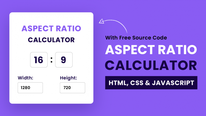
Welcome to today’s tutorial. In today’s tutorial, we will learn how to create an aspect ratio calculation. In order to create this calculator, we need HTML, CSS and Javascript.
With this calculator, the user can change the aspect ratio and then get corresponding dimensions. Or the user can change one of the dimensions to get the value of the other dimension corresponding to the aspect ratio.
This is an absolute beginner-friendly project. If you are a javascript beginner, this just might be the perfect project for you. I have a bunch of javascript project tutorials for beginners. You can check them out here.
Video Tutorial:
If you are interested in code along with me, you can take a look at the video version of this tutorial that I have posted on my youtube channel. Also, I post other interesting CSS and Javascript tutorials on my channel regularly. So do subscribe so you don’t miss any of those exciting tutorials.
Project Folder Structure:
Before we start coding, let us create the project folder structure first. The project folder is called the Aspect Ratio Calculator. Within this folder, we have three files. These files are the HTML document, the stylesheet and the script file. We name these files index.html, style.css and script.js respectively.
HTML:
The HTML code consists of a div with a class name container. Inside the container, we have an h2 tag. The h2 tag reads the name of the project. Further, we have a div with class wrapper-1. It consists of two number inputs. We set ids for these inputs as ratio-width and ratio-height.
In the next step, we create a box div. The box consists of two main divs. We set the class name of these divs as wrapper-2 and wrapper-3. Inside each of these divs, we have a label and a number input.
Add Play Button To Video Using HTML | Video Overlay Play Button
<!DOCTYPE html>
<html lang="en">
    <head>
        <meta name="viewport" content="width=device-width, initial-scale=1.0" />
        <title>Aspect Ratio Calculator</title>
        <!-- Google Fonts-->
        <link
            href="https://fonts.googleapis.com/css2?family=Poppins:wght@400;600&display=swap"
            rel="stylesheet"
        />
        <!-- Stylesheet -->
        <link rel="stylesheet" href="style.css" />
    </head>
    <body>
        <div class="container">
            <h2>
                <span>Aspect Ratio</span>
                Calculator
            </h2>
            <div class="wrapper-1">
                <input type="number" id="ratio-width" value="16" />
                <input type="number" id="ratio-height" value="9" />
            </div>
            <div class="box">
                <div class="wrapper-2">
                    <label for="width">Width:</label>
                    <input type="number" id="width" value="1280" />
                </div>
                <div class="wrapper-3">
                    <label for="height">Height:</label>
                    <input type="number" id="height" value="720" />
                </div>
            </div>
        </div>
        <!-- Script -->
        <script src="script.js"></script>
    </body>
</html>
CSS:
Let us style the calculator using CSS. We start by removing paddings and margins from all the elements. Next, we centre the container using the transforms. We also set the background colour for the document body and the container.
To make the container pop up even more we add some border-radius and box-shadow to it.
In the next step, we style the inputs inside the wrapper-1. We space and align them using the flex layout. In a similar manner, we also style wrapper-2 and wrapper-3. You can style these inputs the way you prefer.
* {
    padding: 0;
    margin: 0;
    box-sizing: border-box;
    font-family: "Poppins", sans-serif;
}
body {
    background-color: #895cf3;
}
.container {
    width: 500px;
    background-color: #ffffff;
    padding: 80px 40px;
    position: absolute;
    transform: translate(-50%, -50%);
    top: 50%;
    left: 50%;
    border-radius: 10px;
    box-shadow: 0 30px 45px rgba(18, 8, 39, 0.2);
}
h2 {
    text-align: center;
    font-size: 40px;
    line-height: 1.6;
    font-weight: 600;
    letter-spacing: 2px;
}
h2 span {
    color: #895cf3;
}
.wrapper-1 {
    display: flex;
    justify-content: center;
    align-items: center;
    margin: 50px 0 70px 0;
    gap: 10px;
}
.wrapper-1 input {
    width: 100px;
    font-size: 30px;
    font-weight: 600;
}
input {
    padding: 15px 10px;
    border: 1px solid #bbc0c5;
    border-radius: 5px;
    color: #170444;
    outline: none;
}
input:focus {
    border: 2px solid #895cf3;
}
label {
    color: #170444;
    font-weight: 600;
    letter-spacing: 0.6px;
}
.box {
    display: flex;
    justify-content: space-between;
    gap: 30px;
}
.wrapper-2,
.wrapper-3 {
    display: flex;
    flex-direction: column;
    gap: 15px;
}
.wrapper-2 input,
.wrapper-3 input {
    width: 100%;
    font-size: 18px;
}
Javascript:
Let us add functionality to this calculator using javascript. We select the 4 inputs and assign them to 4 different variables.
We create two functions – calculateWidth() and calculateHeight(). The calculateWidth() is called when an input event is triggered on height. On the other height calculateHeight() is called when input event on width, ratioWidth or ratioHeight is triggered.
When the calculateWidth() is called, it first calculates the aspectRatio by dividing ratioWidth value by ratioHeight value. Then it calculates the width value by multiplying the height with the aspectRatio. We use toFixed(2) method to round the calculated values to 2 decimals.
On the other hand, parseFloat removes the unnecessary trailing zeroes from decimals.
The calculateHeight() also calculates the aspect ratio. Further, it calculated the height by dividing the width with the aspectRatio. We get the final calculated value after using the toFixed(2) and parseFloat() methods.
let ratioWidth = document.getElementById("ratio-width");
let ratioHeight = document.getElementById("ratio-height");
let width = document.getElementById("width");
let height = document.getElementById("height");

let calculateWidth = () => {
    let aspectRatio = ratioWidth.value / ratioHeight.value;
    width.value = parseFloat((height.value * aspectRatio).toFixed(2));
};

let calculateHeight = () => {
    let aspectRatio = ratioWidth.value / ratioHeight.value;
    height.value = parseFloat((width.value / aspectRatio).toFixed(2));
};

height.addEventListener("input", calculateWidth);
width.addEventListener("input", calculateHeight);
ratioHeight.addEventListener("input", calculateHeight);
ratioWidth.addEventListener("input", calculateHeight);
Your aspect ratio calculator is now ready. If have any difficulties while coding this, you can download the source code by clicking on the download button below. Also, don’t forget to drop your suggestions and feedback in the comments section below.


