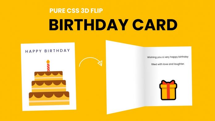
Hello and welcome to today’s tutorial. In today tutorial we will learn how to create a birthday greeting card with a 3D flip hover effect. To create this beautiful 3D card, we need just HTML and CSS.
The greeting card consists of two main parts. The first is the outside and the second is the inside. When the user hovers the card, the card rotates by a few degrees. Also, the outer page of the card flips open. This thereby reveals the inner page of the card.
The outer part consists of CSS cake art, while the inner part consists of wishes.
If you are interested in learning more 3D CSS effects, check out this playlist from my youtube channel. You can also check out my youtube channel, where I post interesting tutorials every alternate day. Don’t forget to subscribe to my channel so you don’t miss any of these tutorials.
Video Tutorial:
If would like to code along with me you can check out the video version of this tutorial here down below.
Project Folder Structure:
Before we move on to the actual coding, let us take a look at the project folder structure. The project folder is called – Birthday Card. Inside this folder, we have two files. The first is the HTML document and the second is the stylesheet. We name these files index.html and style.css.
HTML:
We start with the HTML code. Do copy the code below and paste it into your HTML document.
The HTML consists of a div with the class card. This card wraps all the other elements of the card. We have two main divs inside the card. The first is the outside div and, the next is the inside div.
Let us first take a look a the outside div. The outside div has wraps two divs inside it. They are the front and the back div. Within the front div have a p tag and some divs that create the cake shape.
The inside div just consists of p tag with wishes along with an emoji.
<!DOCTYPE html>
<html lang="en">
<head>
<meta name="viewport" content="width=device-width, initial-scale=1.0" />
<title>Birthday Card</title>
<!-- Google Font-->
<link
href="https://fonts.googleapis.com/css2?family=Poppins&display=swap"
rel="stylesheet"
/>
<!-- Stylesheet -->
<link rel="stylesheet" href="style.css" />
</head>
<body>
<div class="card">
<div class="outside">
<div class="front">
<p>Happy Birthday</p>
<div class="cake">
<div class="top-layer"></div>
<div class="middle-layer"></div>
<div class="bottom-layer"></div>
<div class="candle"></div>
</div>
</div>
<div class="back"></div>
</div>
<div class="inside">
<p>Wishing you a very happy birthday filled with love and laughter</p>
<h1>🎁</h1>
</div>
</div>
</body>
</html>
CSS:
Now to style the card and add the needed effects, we use CSS. Do copy the code provided below and paste it into your CSS document.
* {
  padding: 0;
  margin: 0;
  box-sizing: border-box;
  font-family: "Poppins", sans-serif;
}
body {
  background-color: #fdbf00;
}
.card {
  width: 640px;
  height: 400px;
  position: absolute;
  margin: auto;
  left: 0;
  right: 0;
  top: 0;
  bottom: 0;
  -webkit-perspective: 1200px;
  perspective: 1200px;
  transition: 1s;
}
.card:hover {
  transform: rotate(-5deg);
}
.card:hover .outside {
  transform: rotateY(-130deg);
}
.outside,
.inside {
  height: 100%;
  width: 50%;
  position: absolute;
  left: 50.1%;
}
.inside {
  background: linear-gradient(to right, #e7e7e7, #ffffff 30%);
  line-height: 3;
  padding: 0 20px;
  text-align: center;
  display: flex;
  flex-direction: column;
  justify-content: space-around;
  align-items: center;
  left: 50%;
}
.outside {
  -webkit-transform-style: preserve-3d;
  transform-style: preserve-3d;
  z-index: 1;
  transform-origin: left;
  transition: 2s;
  cursor: pointer;
}
.front,
.back {
  height: 100%;
  width: 100%;
  position: absolute;
  -webkit-backface-visibility: hidden;
  backface-visibility: hidden;
  transform: rotateX(0deg);
}
.front {
  background-color: #ffffff;
}
.back {
  transform: rotateY(180deg);
  background: linear-gradient(to left, #e7e7e7, #ffffff 30%);
}
.cake {
  width: 100%;
  position: absolute;
  bottom: 30px;
}
.top-layer,
.middle-layer,
.bottom-layer {
  height: 80px;
  width: 240px;
  background-repeat: repeat;
  background-size: 60px 100px;
  background-position: 28px 0;
  background-image: linear-gradient(
      transparent 50px,
      #fedbab 50px,
      #fedbab 60px,
      transparent 60px
    ),
    radial-gradient(circle at 30px 5px, #994c10 30px, #fcbf29 31px);
  border-radius: 10px 10px 0 0;
  position: relative;
  margin: auto;
}
.middle-layer {
  transform: scale(0.85);
  top: 6px;
}
.top-layer {
  transform: scale(0.7);
  top: 26px;
}
.candle {
  height: 45px;
  width: 15px;
  background: repeating-linear-gradient(
    45deg,
    #fd3018 0,
    #fd3018 5px,
    #ffa89e 5px,
    #ffa89e 10px
  );
  position: absolute;
  margin: auto;
  left: 0;
  right: 0;
  bottom: 202px;
}
.candle:before {
  content: "";
  position: absolute;
  height: 16px;
  width: 16px;
  background-color: #ffa500;
  border-radius: 0 50% 50% 50%;
  bottom: 48px;
  transform: rotate(45deg);
  left: -1px;
}
.outside p {
  font-size: 23px;
  text-transform: uppercase;
  margin-top: 30px;
  text-align: center;
  letter-spacing: 6px;
  color: #000046;
}
.inside h1 {
  font-size: 120px;
  line-height: 120px;
}
Our birthday card is now ready. You can go ahead and change the colours to suit your likes and need. If you have any issues while creating this code, download the source by clicking the download button. Also, if you have any suggestions or feedback leave them in the comments below.


lmao
imao
tf
??
bruh
z
Nice. Thanks for this