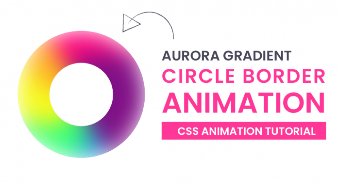
Hey everyone. Welcome to today’s tutorial. In this tutorial, we will learn how to create an aurora gradient border around a circle. To build the aurora gradient spinner, we need HTML and CSS.
The word ‘aurora’ comes from the ‘aurora UI’ trend of 2021. You can check out the tutorial for aurora gradient here.
If you are looking for more animation tutorials to improve your CSS skills, you should check out this playlist here. This playlist consists of a bunch of CSS animation tutorials.
Video Tutorial:
If you are interested to learn by coding along with me rather than reading this blog post, you should check out this video tutorial below. Also, subscribe to my youtube channel, where I post new tips, tricks and tutorials related to web development every alternate day.
Project Folder Structure:
Before we start coding, let us create the project folder structure. We create a project folder called – ‘Aurora Gradient Spinner’. Inside this folder, we have two files. These files are – index.html and style.css. The first file is the HTML document and the second file is the stylesheet.
HTML:
We begin with the HTML code. First, copy the code below and paste it into your HTML document. The HTML code consists of a div with class name – ‘container’. Inside this folder we have six <div> elements.
<!DOCTYPE html>
<html lang="en">
  <head>
    <meta name="viewport" content="width=device-width, initial-scale=1.0" />
    <title>Aurora Gradient Spinner</title>
    <!-- Stylesheet -->
    <link rel="stylesheet" href="style.css" />
  </head>
  <body>
    <div class="container">
      <div></div>
      <div></div>
      <div></div>
      <div></div>
      <div></div>
      <div></div>
    </div>
  </body>
</html>
CSS:
We now style these elements to create the aurora gradient. We also need to add animations to these elements. For this, we need CSS. Now copy the code provided to you below and paste it into your stylesheet.
We create a container of equal height and width and set its border radius to 50%. Here the most important thing to do is set the overflow to hidden.
We then give random height, widths, and background colours to the six div elements inside the container to fill it.
We then add a ‘container: after’ element over the container which is a white coloured circle.
Finally, we add the ‘container: before’ pseudo element which adds a blur filter to the container thereby creating a gradient.
Lastly, we add animations to the container and div elements inside the container.
*,
*:before,
*:after {
  padding: 0;
  margin: 0;
  box-sizing: border-box;
}
.container {
  height: 25em;
  width: 25em;
  position: absolute;
  margin: auto;
  left: 0;
  right: 0;
  top: 0;
  bottom: 0;
  border-radius: 50%;
  overflow: hidden;
  animation: spin 8s infinite linear;
}
@keyframes spin {
  100% {
    transform: rotate(360deg);
  }
}
.container:before {
  position: absolute;
  content: "";
  height: 100%;
  width: 100%;
  border-radius: 50%;
  backdrop-filter: blur(2.1em);
}
.container:after {
  position: absolute;
  content: "";
  height: 50%;
  width: 50%;
  background-color: #ffffff;
  top: 25%;
  left: 25%;
  border-radius: 50%;
}
.container div {
  position: absolute;
  border-radius: 50%;
  z-index: -1;
  animation: scale-up infinite;
}
@keyframes scale-up {
  50% {
    transform: scale(1.8);
  }
}
.container div:nth-child(1) {
  height: 90%;
  width: 100%;
  background-color: #ff057c;
  left: -5%;
  top: -5%;
  animation-duration: 2s;
  animation-delay: 3s;
}
.container div:nth-child(2) {
  height: 80%;
  width: 70%;
  background-color: #800f86;
  top: 15%;
  right: -15%;
  animation-duration: 10s;
  animation-delay: 7s;
}
.container div:nth-child(3) {
  height: 65%;
  width: 80%;
  background-color: #1ba8e9;
  bottom: -30%;
  right: -20%;
  animation-duration: 4s;
  animation-delay: 2.2s;
}
.container div:nth-child(4) {
  height: 50%;
  width: 75%;
  background-color: #34ff78;
  bottom: -5%;
  left: 8%;
  animation-duration: 7s;
  animation-delay: 6s;
}
.container div:nth-child(5) {
  height: 45%;
  width: 55%;
  background-color: #f7fb1f;
  top: 50%;
  left: 0;
  animation-duration: 2.5s;
  animation-delay: 4s;
}
.container div:nth-child(6) {
  height: 25%;
  width: 55%;
  background-color: #ffb326;
  top: 45%;
  left: -15%;
  animation-duration: 9s;
}
That’s it for this tutorial. Our aurora gradient border around a circle is now ready. If you face any issues while creating this code you can download the source code by clicking on the ‘Download Code’ button below. Also, I would love to hear from you guys, so if you have any queries, suggestions, or feedback, you can comment below.
Happy Coding!


