Introduction:
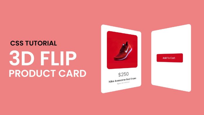
In the dynamic world of web design, interactive elements play a pivotal role in engaging users and creating memorable experiences. One such captivating element is the 3D flip card animation. In this tutorial, we will explore how to create a stunning 3D flip card animation using HTML and CSS. This tutorial will not only equip you with the technical skills to implement this effect but also offer a deeper understanding of how animations work in the realm of web development.
Things You Will Learn:
By following this tutorial, you will learn:
- How to structure HTML and CSS for a 3D flip card animation.
- Implementing a 3D perspective to create a realistic flip effect.
- Using CSS transitions to smoothly animate the flip card.
- Applying hover effects to trigger the animation.
- Styling the front and back faces of the flip card.
Video Tutorial:
For a visual walkthrough of the entire process, you can watch the video tutorial on my YouTube channel. The video complements this written guide and provides a step-by-step demonstration of each code snippet and concept.
Project Folder Structure:
Before we dive into the code, let’s take a look at the project folder structure:
- index.html
- style.css
- product-image
HTML:
In the index.html file, we start by creating a simple container structure to hold our flip card:
<!DOCTYPE html>
<html lang="en">
  <head>
    <meta name="viewport" content="width=device-width, initial-scale=1.0" />
    <!-- Google Fonts -->
    <link
      href="https://fonts.googleapis.com/css2?family=Poppins:wght@400;500&display=swap"
      rel="stylesheet"
    />
    <!-- Stylesheet -->
    <link rel="stylesheet" href="style.css" />
  </head>
  <body>
    <div class="container">
      <div class="card">
        <div class="front">
          <img src="nike-shoes.png" />
          <h2>$250</h2>
          <h3>Nike Awesome Red Shoes</h3>
          <h6>Special Edition</h6>
        </div>
        <div class="back">
          <button>Add To Cart</button>
        </div>
      </div>
    </div>
  </body>
</html>
CSS:
The style.css file is where the magic happens. We define the styling and animation properties for the flip card:
* {
  padding: 0;
  margin: 0;
  box-sizing: border-box;
  font-family: "Poppins", sans-serif;
}
body {
  background-color: #ee8182;
}
.container {
  height: 25em;
  width: 18.75em;
  position: absolute;
  transform: translate(-50%, -50%);
  top: 50%;
  left: 50%;
  perspective: 37.5em;
}
.card {
  height: inherit;
  width: inherit;
  transform-style: preserve-3d;
  transition: 1s;
}
.card:hover {
  transform: rotateY(180deg);
}
.front,
.back {
  background-color: #ffffff;
  height: inherit;
  width: inherit;
  position: absolute;
  border-radius: 1em;
  backface-visibility: hidden;
}
.front img {
  display: block;
  margin: auto;
  width: 14.37em;
  border-radius: 1em;
  margin: 2em auto 1em auto;
}
.front h2,
.front h3,
.front h6 {
  text-align: center;
}
.front h2 {
  font-size: 2em;
  font-weight: 300;
  color: #5b5b5b;
}
.front h3 {
  font-size: 1em;
  font-weight: 500;
}
.front h6 {
  color: #a0a0a0;
  font-weight: 500;
  letter-spacing: 0.1em;
}
.back {
  transform: rotateY(180deg);
}
.back button {
  position: absolute;
  transform: translate(-50%, -50%);
  left: 50%;
  top: 50%;
  width: 12.5em;
  font-size: 1em;
  background-color: #cc091f;
  color: #ffffff;
  border-radius: 0.5em;
  padding: 1em;
  cursor: pointer;
  border: none;
  outline: none;
}
Conclusion:
Creating a 3D flip card animation adds an element of interactivity and dynamism to your web projects. By following this tutorial, you’ve gained insights into the mechanics of HTML and CSS animations while crafting an engaging user experience. Remember, mastering animations opens the door to limitless possibilities in web design, allowing you to craft visually appealing and immersive websites.


