Introduction:
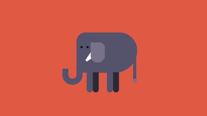
Creating whimsical and engaging web elements with pure HTML and CSS offers a fun way to enhance your web design skills. Today, we will walk through a tutorial on building an elephant using basic HTML and CSS. This project will help you understand key CSS properties like positioning, transformations, and pseudo-elements.
Things You Will Learn:
By the end of this tutorial, you will have learned how to:
- Structure an HTML document.
- Use CSS to style elements with properties like
position,transform, andborder-radius. - Implement CSS pseudo-elements for additional styling effects.
- Apply box shadows and other effects to create depth and interest.
Video Tutorial:
I would suggest you watch the video down below for a better understanding of how we have implemented the functionality of this project. If you find the video helpful give it a like and subscribe to my YouTube channel where I post new tips, tricks, and tutorials related to HTML, CSS, and Javascript.
Project Folder Structure:
Before we start coding we take a look at the project folder structure. We start by creating a folder called – ”Elephant CSS Art”. Inside this folder, we have 2 files. These files are :
- index.html
- style.css
HTML:
We begin with the HTML code. Copy the code below and paste it into your HTML document.
<!DOCTYPE html>
<html lang="en">
  <head>
    <meta name="viewport" content="width=device-width, initial-scale=1.0" />
    <title>Elephant Art</title>
    <link rel="stylesheet" href="elephant.css" />
  </head>
  <body>
    <div class="container">
      <div class="elephant">
        <div class="trunk"></div>
        <div class="leg"></div>
        <div class="ear"></div>
      </div>
    </div>
  </body>
</html>
CSS:
Next, we style our elephant using CSS. For this copy, copy the code provided to you below and paste it into your stylesheet.
* {
  padding: 0;
  margin: 0;
  box-sizing: border-box;
}
body {
  background-color: #df5943;
}
.container {
  height: 500px;
  width: 500px;
  position: absolute;
  transform: translate(-50%, -50%);
  top: 50%;
  left: 50%;
}
.elephant {
  background-color: #53536e;
  height: 200px;
  width: 300px;
  border-radius: 100px 200px 250px 100px;
  position: absolute;
  transform: translate(-50%, -50%);
  top: 50%;
  left: 60%;
}
.elephant:before {
  position: absolute;
  content: "";
  height: 80px;
  width: 100px;
  background-color: #53536e;
  right: 270px;
  top: 180px;
  border-radius: 0 0 200px 200px;
}
.elephant:after {
  position: absolute;
  content: "";
  height: 50px;
  width: 40px;
  background-color: #df5943;
  left: -40px;
  top: 179px;
  border-radius: 0 0 100px 100px;
}
.trunk {
  background-color: #53536e;
  height: 50px;
  width: 30px;
  position: absolute;
  top: 160px;
  left: 0;
}
.trunk:before {
  position: absolute;
  content: "";
  height: 180px;
  width: 15px;
  background-color: #53536e;
  top: -100px;
  left: 280px;
}
.trunk:after {
  position: absolute;
  content: "";
  height: 20px;
  width: 20px;
  background-color: #78718a;
  left: 278px;
  top: 70px;
  border-radius: 50px;
}
.leg {
  height: 100px;
  width: 30px;
  background-color: #53536e;
  position: absolute;
  top: 198px;
  left: 50px;
  border-radius: 0 0 20px 20px;
  box-shadow: 30px 0 #282a37, 100px 0 #53536e, 130px 0 #282a37;
}
.leg:before {
  position: absolute;
  content: "";
  height: 10px;
  width: 10px;
  background-color: #000000;
  bottom: 220px;
  left: -30px;
  border-radius: 50%;
  box-shadow: 30px 0 #000000;
}
.leg:after {
  position: absolute;
  content: "";
  width: 10px;
  border-top: 50px solid #ffffff;
  border-left: 10px solid transparent;
  border-right: 10px solid transparent;
  bottom: 150px;
  transform: rotate(45deg);
}
.ear {
  position: absolute;
  height: 100px;
  width: 70px;
  background-color: #78718a;
  top: 50px;
  left: 70px;
  border-radius: 0 50px 70px 70px;
}
Conclusion:
Congratulations! You have created a simple yet charming elephant using only HTML and CSS. This project demonstrates the power of CSS in creating intricate designs without any images or external resources. Keep experimenting with different shapes and properties to enhance your web design skills further.


