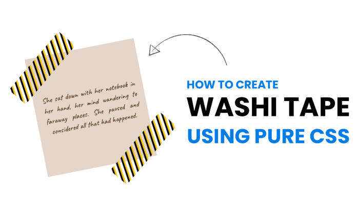
Welcome to today’s tutorial. In today’s tutorial, we will learn how to create washi tape notes using pure CSS. This is a fun and creative way to include and decorate quotes or even images on your webpage.
Before we start the tutorial, let me tell you I was inspired by Code It Pretty’s this blog post. Now let us get started with the tutorial.
Video Tutorial:
If you would prefer to learn while watching the video tutorial, please check out the video version of the video tutorial that I have posted on my youtube channel. I post exciting tutorials, challenges and quizzes on my youtube channel. Be sure to subscribe to my channel so you don’t miss them.
Project Folder Structure:
Before we move on to the actual coding. Let us first take a look at how our project folder structure looks like. Our project folder is called – Washi Tape Notes. Inside this folder, we have an HTML document, stylesheet and javascript file. We name them index.html, style.css and script.js respectively.
HTML:
Let us begin with the HTML code. Copy the code below and paste it into your HTML file.
The HTML consists of a div with a class name note. Within the note, we have a p element, and two div elements with class tape.
<!DOCTYPE html>
<html lang="en">
  <head>
    <meta name="viewport" content="width=device-width, initial-scale=1.0" />
    <title>Washi Tape Notes</title>
    <!-- Google Fonts -->
    <link
      href="https://fonts.googleapis.com/css2?family=Caveat&display=swap"
      rel="stylesheet"
    />
    <!-- Stylesheet -->
    <link rel="stylesheet" href="style.css" />
  </head>
  <body>
    <div class="note">
      <p>
        Lorem ipsum dolor sit amet consectetur adipisicing elit. Nulla qui quod
        natus animi delectus ratione, temporibus, esse facilis odit eaque ad
        quaerat accusantium consectetur ut.
      </p>
      <div class="tape tape-1"></div>
      <div class="tape tape-2"></div>
    </div>
  </body>
</html>
CSS:
To style these divs and make them look like washi tapes let us code the CSS. Copy the code below and paste it into your CSS file.
We start by removing all the unwanted paddings and margins from all the HTML elements.
Next, we set dimensions for the note as 400 x 400 px and centre it using the CSS transforms. Now to centre the content inside note we set its display to the grid and use the place items property.
For the p element, we use Caveat font that looks much similar to handwriting. This gives it the look of a handwritten note. We further style the font as per our choice.
Coming to the tape, we set its position to the corners of the note and rotate it by 45deg. Now we set a repeating pattern of gradients as a background for each tape so they look like colourful washi tape.
Next just position them as per your need and you are done. Your washi tape notes using CSS are now ready. Next just position them as per your need and you are done. Your washi tape notes using CSS are now ready.
* {
  padding: 0;
  margin: 0;
  box-sizing: border-box;
}
.note {
  height: 400px;
  width: 400px;
  background-color: #e4d6c9;
  position: absolute;
  transform: translate(-50%, -50%);
  top: 50%;
  left: 50%;
  padding: 30px;
  display: grid;
  place-items: center;
}
.note p {
  font-family: "Caveat", cursive;
  font-size: 22px;
  line-height: 1.5;
  text-align: center;
  color: #361e07;
}
.tape {
  position: absolute;
  height: 220px;
  width: 60px;
  transform: rotate(45deg);
  background: repeating-linear-gradient(
    45deg,
    #f7c61a 0,
    #f7c61a 5px,
    transparent 5px,
    transparent 10px,
    #101010 10px,
    #101010 15px
  );
}
.tape-1 {
  bottom: 250px;
  right: 335px;
}
.tape-2 {
  top: 250px;
  left: 335px;
}
If you find any issues while creating this project, you can download the source code by clicking on the download button below. Also, don’t forget to drop your comments and suggestions below.


