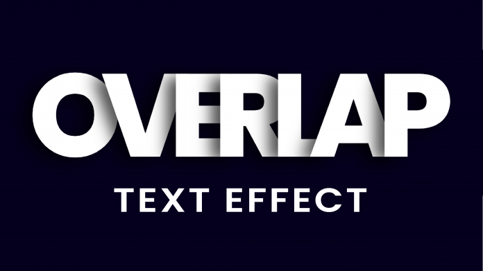
Welcome to today’s tutorial. In today’s tutorial, we will learn how to create a beautiful text effect. To create this text effect we, need HTML and pure CSS. This text effect would bring an amazing look to your landing pages. Also, you can use this text effect to create captivating headings for your website sections.
If you would like to check out other text effects created using HTML and CSS, check out this collection here. This collection is a youtube playlist of video tutorials on how you create amazing text effects.
Video Tutorial:
If you would like to learn by coding along with me then check out the video version of the tutorial here down below.
Project Folder Structure:
Let us take a look at the project folder structure before we start to code. The project folder is named – Overlap Text Effect. Within this folder, we have two files. First is the HTML document – index.html, and second is the stylesheet – style.css.
HTML:
We now begin to code the HTML. Do copy the code provided below and paste it into your HTML document.
The HTML code consists of a div tag. This div tag wraps seven span tags. Each of these span tags consists of a letter of the word – ‘OVERLAP’.
<!DOCTYPE html>
<html lang="en">
  <head>
    <meta name="viewport" content="width=device-width, initial-scale=1.0" />
    <title>Overlap Text Effect</title>
    <!-- Google Font -->
    <link
      href="https://fonts.googleapis.com/css2?family=Poppins:wght@800&display=swap"
      rel="stylesheet"
    />
    <!-- Stylesheet -->
    <link rel="stylesheet" href="style.css" />
  </head>
  <body>
    <div>
      <span>O</span>
      <span>V</span>
      <span>E</span>
      <span>R</span>
      <span>L</span>
      <span>A</span>
      <span>P</span>
    </div>
  </body>
</html>
CSS:
Let us style this text using CSS to create the needed effect. Firstly copy the code provided below and paste it into your stylesheet file.
In the first step, we remove the unnecessary paddings and margins from all the elements. We set the box-sizing of all the elements to border-box.
We set the background color of the body to #05001d. In the second step, we style the div element. We start by setting the width of div to 100% and then position it at the centre of the document using the transforms.
In the next step, we style the text by aligning it to the centre and setting the font-weight to 800.
Now we style the span inside the div by setting its font-size to 22vw. we also add a text shadow to the text. Lastly, we set the margin for all the spans except the first span. This margin shifts the spans to the left of -0.18em. These margins combined with text-shadow creates the overlap text effect.
* {
  padding: 0;
  margin: 0;
  box-sizing: border-box;
  font-family: "Poppins", sans-serif;
}
body {
  background-color: #05001d;
}
div {
  width: 100%;
  text-align: center;
  color: #ffffff;
  position: absolute;
  transform: translate(-50%, -50%);
  top: 50%;
  left: 50%;
  font-weight: 800;
}
div span {
  font-size: 22vw;
  text-shadow: -0.08em 0.03em 0.12em rgba(0, 0, 0, 0.7);
}
div span:not(:first-child) {
  margin-left: -0.18em;
}
Our text effect is now ready. If you have any issues while creating this project, you can download the source code by clicking on the download code button below. Don’t forget to leave your suggestions and feedback in the comments below.


