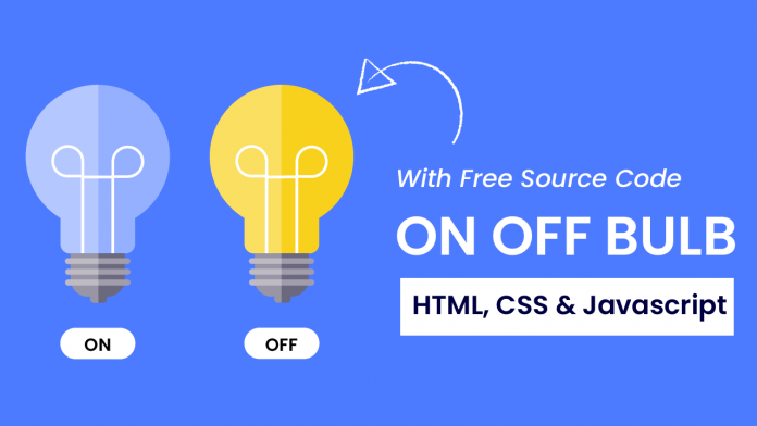
Hey everyone. Welcome to today’s tutorial. In today’s tutorial, we will learn how to create an ON-OFF Bulb. To build this project, we need HTML, CSS and Javascript. We will not use any images, icons or external libraries for this project.
We would first create the bulb illustration from scratch using HTML and CSS. Next, we would add functionality to the toggle button to turn the bulb on and off.
This is a beginner-friendly javascript project. If you are looking for more such projects to improve your javascript skills you can check out this playlist here. This playlist consists of 100+ javascript projects.
The difficulty level of these projects varies project simply to quite complex ones. Hence this playlist is suitable for all kinds of javascript learners including javascript beginners to javascript experts.
Video Tutorial:
If you are interested to learn by watching a video tutorial rather than reading this blog post you can check out the video down below. Also, subscribe to my youtube channel where I post new tips, tricks and tutorials every alternate day.
Project Folder Structure:
Before we start coding, let us take a look at the project folder structure. We create a project folder called – ‘On Off Bubl’. Inside this project, we have three files. These files are – index.html, style.css and script.js. The first file is the HTML document, the next one is the stylesheet and lastly, we have the script file.
HTML:
We begin with the HTML code. The HTML code consists of elements that will build the structure of our bulb. First, copy the code below and paste it into your HTML document.
<!DOCTYPE html>
<html lang="en">
  <head>
    <meta name="viewport" content="width=device-width, initial-scale=1.0" />
    <title>On Off Bulb</title>
    <!-- Google Fonts -->
    <link
      href="https://fonts.googleapis.com/css2?family=Poppins:wght@500&display=swap"
      rel="stylesheet"
    />
    <!-- Stylesheet -->
    <link rel="stylesheet" href="style.css" />
  </head>
  <body>
    <div class="container">
      <div class="bulb center">
        <div class="inside center"></div>
        <div class="lower center"></div>
      </div>
      <button id="btn" class="center">ON</button>
    </div>
    <!-- Script -->
    <script src="script.js"></script>
  </body>
</html>
CSS:
Next, we style and shape these elements so they look like a bulb using CSS. For this copy, the code provided to you below and paste it into your stylesheet.
* {
  padding: 0;
  margin: 0;
  box-sizing: border-box;
}
:root {
  --light-color: #94b0ff;
}
body {
  background-color: #4d7bff;
}
.container {
  height: 31.25em;
  width: 31.25em;
  position: absolute;
  transform: translate(-50%, -50%);
  top: 50%;
  left: 50%;
}
.center {
  transform: translateX(-50%);
  left: 50%;
}
.bulb {
  position: absolute;
  background-color: var(--light-color);
  height: 15.62em;
  width: 15.62em;
  border-radius: 50%;
  top: 1.25em;
}
.bulb:before {
  position: absolute;
  content: "";
  background-color: var(--light-color);
  height: 2.6em;
  width: 6.25em;
  top: 14.9em;
  left: 4.68em;
  border-radius: 0 0 0.3em 0.3em;
}
.inside {
  position: absolute;
  height: 7.5em;
  width: 2.91em;
  border: 0.5em solid #ffffff;
  border-bottom: none;
  bottom: -1.87em;
}
.inside:before,
.inside:after {
  position: absolute;
  content: "";
  height: 2.81em;
  width: 2.81em;
  border: 0.5em solid #ffffff;
  top: -3.87em;
}
.inside:before {
  border-radius: 2.81em 2.81em 0 2.81em;
  left: -3.75em;
}
.inside:after {
  border-radius: 2.81em 2.81em 2.81em 0;
  right: -3.75em;
}
.lower {
  position: absolute;
  background-color: #6b697e;
  width: 5.62em;
  height: 4.37em;
  top: 17.5em;
  border-radius: 0 0 1.87em 1.87em;
}
.lower:before {
  position: absolute;
  content: "";
  background-color: #a29dac;
  width: 6.56em;
  height: 0.62em;
  left: -0.46em;
  border-radius: 0.31em;
  top: 0.45em;
  box-shadow: 0 1em 0 #a29dac, 0 2em 0 #a29dac;
}
.lower:after {
  position: absolute;
  content: "";
  background-color: #6b697e;
  height: 0.62em;
  width: 1.87em;
  top: 4.3em;
  left: 1.87em;
}
#btn {
  display: block;
  position: absolute;
  width: 6.25em;
  bottom: 1.87em;
  font-size: 1.2em;
  font-family: "Poppins", sans-serif;
  padding: 0.6em 0;
  border: none;
  outline: none;
  border-radius: 3.12em;
  background-color: #ffffff;
  color: #000000;
  cursor: pointer;
}
@media screen and (min-width: 700px) {
  .container {
    font-size: 18px;
  }
}
Javascript:
We finally add functionality to this code using Javascript. Copy the code below and paste it into your script file.
let btn = document.getElementById("btn");
btn.addEventListener("click", () => {
  if (btn.innerText == "ON") {
    document.documentElement.style.cssText = "--light-color: #f8d11d";
    btn.innerText = "OFF";
  } else {
    document.documentElement.style.cssText = "--light-color: #94b0ff";
    btn.innerText = "ON";
  }
});
That’s all for this tutorial. If you face any issues while creating this project, you can download the source code by clicking on the ‘Download Button’ below. Also, I would love to hear from you guys so If you have any queries, suggestions or feedback you can comment below.


