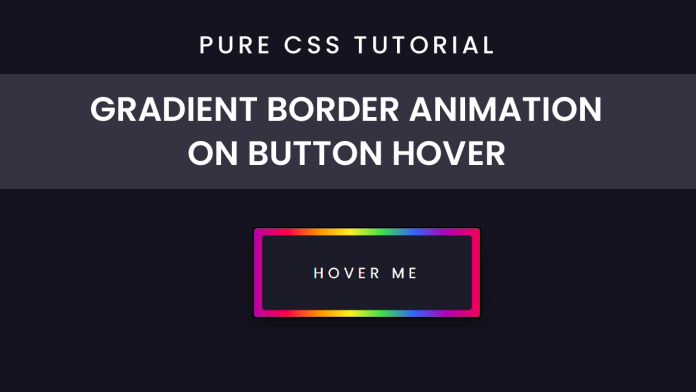
Hello friends. In today’s tutorial, I will teach you how to create a ‘Button On Hover Border Animation’. All you need is HTML and CSS, to create this project. This a beginner-friendly project. If you are looking for more complicated projects you can check out the playlist here.
Video Tutorial:
Before we move on to the actual tutorial, you can check out the video tutorial of this post here. If you like video tutorials like this subscribe to my YouTube channel, where I post new projects based on HTML, CSS, and Javascript regularly.
Project Folder Structure:
Let’s build the project folder structure before we begin writing the code. We create a project folder called ‘Button Gradient Border On Hover Effect’. Inside this folder, we have two files. These files are index.html and style.css.
HTML:
We begin with the HTML Code. First, create a file called – ‘index.html’. Copy the code below and paste it into your HTML file. We simply create a button here and later style it using CSS.
<!DOCTYPE html>
<html lang="en">
  <head>
    <meta name="viewport" content="width=device-width, initial-scale=1.0" />
    <title>Button Gradient Border On Hover Effect</title>
    <!-- Stylesheet -->
    <link rel="stylesheet" href="style.css" />
  </head>
  <body>
    <button></button>
  </body>
</html>
CSS:
Next, we style our button using CSS. For this copy, the code provided to you below and paste it into your stylesheet.
We begin by setting the size and alignment of the button, hiding the overflow, and setting a ‘border-radius’ for curved edges. Then we use the ‘before’ property to create a pseudo-element which we will use to create the border. We need a multicolor gradient border and would need the colors to repeat themselves to create a loop hence we provide a background using ‘repeating-linear-gradient’.
Apart from these we provide sizing and align the pseudo-element perfectly with the button. Then using the ‘after’ pseudo-element we write text inside the button and align it to the center of our button. Finally, for the animation, we change the ‘bakground-position’ and set the transition to linear for a smooth animation effect.
body {
  padding: 0;
  margin: 0;
  background-color: #151320;
}
button {
  height: 7.5em;
  width: 18.75em;
  position: absolute;
  transform: translate(-50%, -50%);
  top: 50%;
  left: 50%;
  box-shadow: 0 1.25em 2.18em rgba(0, 0, 0, 0.3);
  overflow: hidden;
  cursor: pointer;
  border-radius: 0.31em;
}
button:before {
  content: "";
  height: 100%;
  width: 100%;
  position: absolute;
  top: 0;
  left: 0;
  background: repeating-linear-gradient(
    to right,
    #fd004c 2.62em,
    #fe9000 5.25em,
    #fff020 7.87em,
    #3edf4b 10.5em,
    #3363ff 15.75em,
    #fd004c 18.75em
  );
  background-size: 125em;
}
button:after {
  content: "HOVER ME";
  position: absolute;
  background-color: #1c1b29;
  height: 85%;
  width: 93%;
  top: 7.5%;
  left: 3.5%;
  border-radius: 0.2em;
  color: #ffffff;
  font-family: "Poppins", sans-serif;
  font-size: 1.2em;
  letter-spacing: 0.3em;
  display: grid;
  place-items: center;
}
button:hover:before {
  background-position: -106.25em 0;
  transition: 10s linear;
}
That’s all for this tutorial. If you face any issues while creating this code you can download the source code by clicking on the ‘Download Code’ button below. Now all you have to do is extract the files from the zipped folder


that’s good article and good
i like it