Introduction:
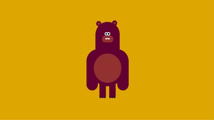
Welcome to this fun and engaging tutorial where you will learn how to create an adorable bear using just HTML and CSS. This project is perfect for beginners who want to practice their CSS skills and create something visually appealing. Follow along with the video tutorial on my YouTube channel for a step-by-step guide.
Things You Will Learn:
In this tutorial, you will:
- Understand the basics of positioning and styling elements with CSS.
- Learn how to use pseudo-elements like
:beforeand:after. - Explore how to create shapes and designs using only CSS properties.
- Discover how media queries can make your design responsive.
Video Tutorial:
I would suggest you to watch the video down below for a better understanding of how we have implemented the functionality of this project. If you find the video helpful give it a like and subscribe to my YouTube channel where I post new tips, tricks, and tutorials related to HTML, CSS, and Javascript.
Project Folder Structure:
Before we start coding we take a look at the project folder structure. We start by creating a folder called – ”Bear CSS Art”. Inside this folder, we have 2 files. These files are :
- index.html
- style.css
HTML:
We begin with the HTML code. Copy the code below and paste it into your HTML document.
<!DOCTYPE html>
<html lang="en">
  <head>
    <meta name="viewport" content="width=device-width, initial-scale=1.0" />
    <title>Bear CSS Art</title>
    <link rel="stylesheet" href="style.css" />
  </head>
  <body>
    <div class="container">
      <div class="hands"></div>
      <div class="ear"></div>
      <div class="bear"></div>
      <div class="eye"></div>
      <div class="nose"></div>
      <div class="legs"></div>
    </div>
  </body>
</html>
CSS:
Next, we style our bear using CSS. For this copy the code provided to you below and paste it into your stylesheet.
* {
  padding: 0;
  margin: 0;
  box-sizing: border-box;
}
body {
  background-color: #dea601;
}
.container {
  height: 31.25em;
  width: 31.25em;
  position: absolute;
  transform: translate(-50%, -50%);
  top: 50%;
  left: 50%;
}
.bear {
  height: 12.5em;
  width: 9.37em;
  background-color: #620031;
  position: absolute;
  transform: translateX(-50%);
  left: 50%;
  top: 1.25em;
  border-radius: 6.25em 6.25em 0 0;
}
.bear:after {
  position: absolute;
  content: "";
  height: 10.62em;
  width: 10.62em;
  background-color: #933131;
  border-radius: 50%;
  top: 10.31em;
  left: -1.87em;
  border: 1.25em solid #620031;
}
.hands,
.hands:before {
  position: absolute;
  height: 15em;
  width: 4.37em;
  background-color: #620031;
}
.hands {
  top: 11.25em;
  left: 7.5em;
  border-radius: 6.25em 0 3.12em 3.12em;
}
.hands:before {
  content: "";
  top: 0;
  left: 11.87em;
  border-radius: 0 6.25em 3.12em 3.12em;
}
.eye,
.eye:before {
  box-sizing: content-box;
  position: absolute;
  height: 0.62em;
  width: 0.62em;
  background-color: #000000;
  border-radius: 50%;
  border: 0.31em solid #ffffff;
}
.eye {
  top: 5em;
  left: 14.5em;
  border: 0.31em solid #ffffff;
}
.eye:before {
  content: "";
  left: 0.62em;
  bottom: -0.31em;
}
.ear,
.ear:before {
  position: absolute;
  box-sizing: content-box;
  height: 0.93em;
  width: 0.93em;
  background-color: #933131;
  border-radius: 50%;
  border: 0.5em solid #620031;
}
.ear {
  left: 11.25em;
  top: 0.93em;
}
.ear:before {
  content: "";
  left: 5.62em;
  bottom: -0.31em;
}
.nose {
  position: absolute;
  background-color: #933131;
  height: 2.5em;
  width: 4.37em;
  transform: translateX(-50%);
  left: 50%;
  top: 6.25em;
  border-radius: 2.5em;
}
.nose:before {
  position: absolute;
  content: "";
  height: 0.46em;
  width: 0.93em;
  background-color: #ffffff;
  border-radius: 0 0 0.93em 0.93em;
  top: 0.93em;
  left: 1.25em;
  box-shadow: 0.93em 0 #ffffff;
}
.legs,
.legs:before {
  position: absolute;
  height: 5em;
  width: 2.5em;
  background-color: #620031;
}
.legs {
  top: 23.43em;
  left: 12.5em;
}
.legs:before {
  content: "";
  left: 3.75em;
}
.legs:after {
  position: absolute;
  content: "";
  width: 0.81em;
  height: 0.62em;
  background-color: #310031;
  top: 5em;
  border-radius: 0 0 0.62em 0.62em;
  box-shadow: 0.83em 0 #310031, 1.62em 0 #310031, 4.56em 0 #310031,
    3.75em 0 #310031, 5.37em 0 #310031;
}
@media screen and (max-width: 600px) {
  .container {
    font-size: 9px;
  }
}
Conclusion:
You have now created a cute bear using just HTML and CSS. This project demonstrates how powerful CSS can be in creating intricate designs without any images. Continue practicing and experimenting with different CSS properties to enhance your skills. Don’t forget to check out the video tutorial on my YouTube channel for more tips and tricks. Happy coding!


