Introduction:
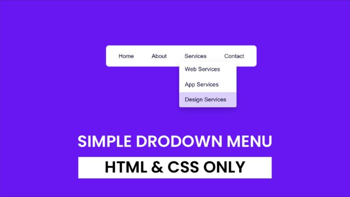
A well-designed navigation bar enhances a website’s usability, providing easy access to essential sections. This tutorial demonstrates how to create a responsive navigation bar with dropdown functionality using only HTML and CSS. The dropdown menu appears when you hover over a menu item, ensuring smooth interaction without using JavaScript.
Things You Will Learn:
- How to structure a navigation bar with HTML
- Styling navigation items for a polished design
- Creating a dropdown menu using CSS only
- Adding hover effects to improve user experience
Video Tutorial:
Do take a look at my YouTube channel. Whether you are looking to start a new career or just looking to enhance your existing skill set, we have got you covered. Subscribe now and take your first step towards becoming a professional web developer!
Project Folder Structure:
Now before we move on to actual coding we create a project folder structure. We name the project folder as – ‘Simple Dropdown Menu’. Within this folder we have 2 files. These files are:
- index.html
- style.css
HTML:
We begin with the HTML code. Copy the code below and paste it into your HTML document.
<!DOCTYPE html>
<html lang="en">
  <head>
    <meta charset="UTF-8" />
    <meta name="viewport" content="width=device-width, initial-scale=1.0" />
    <title>Simple Menu with Dropdown</title>
    <link rel="stylesheet" href="style.css" />
  </head>
  <body>
    <div class="navbar">
      <a href="#">Home</a>
      <a href="#">About</a>

      <div class="menu">
        <button class="menu-button">Services</button>
        <div class="dropdown-content">
          <a href="#">Web Services</a>
          <a href="#">App Services</a>
          <a href="#">Design Services</a>
        </div>
      </div>

      <a href="#">Contact</a>
    </div>
  </body>
</html>
CSS:
Next, you’ll apply the styles by inserting this CSS code into your stylesheet.
body {
  font-family: Arial, sans-serif;
  display: flex;
  justify-content: center;
  align-items: center;
  height: 100vh;
  margin: 0;
  background-color: #6817f3;
}

.navbar {
  display: flex;
  gap: 20px;
  background-color: #ffffff;
  padding: 10px 20px;
  border-radius: 8px;
  color: #0f0330;
}

.navbar a,
.menu-button {
  background-color: #ffffff;
  text-decoration: none;
  padding: 10px 15px;
  border-radius: 4px;
  font-size: 16px;
}

.menu {
  position: relative;
  display: inline-block;
}

/* Dropdown button */
.menu-button {
  cursor: pointer;
  border: none;
}

/* Dropdown content */
.dropdown-content {
  display: none;
  position: absolute;
  background-color: #ffffff;
  min-width: 160px;
  box-shadow: 0px 8px 16px rgba(0, 0, 0, 0.2);
  border-radius: 4px;
  z-index: 1;
}

/* Show dropdown on hover */
.menu:hover .dropdown-content {
  display: block;
}

.dropdown-content a {
  color: #0f0330;
  padding: 12px 16px;
  text-decoration: none;
  display: block;
}

.dropdown-content a:hover {
  background-color: #d3c2fb;
}
Conclusion:
You have built a responsive navigation bar with dropdown functionality using HTML and CSS. This tutorial showed you how to create hover-based dropdown menus and style them for a modern look. Experiment by adding animations, adjusting colors, or integrating it into your project. Stay creative and keep building!


