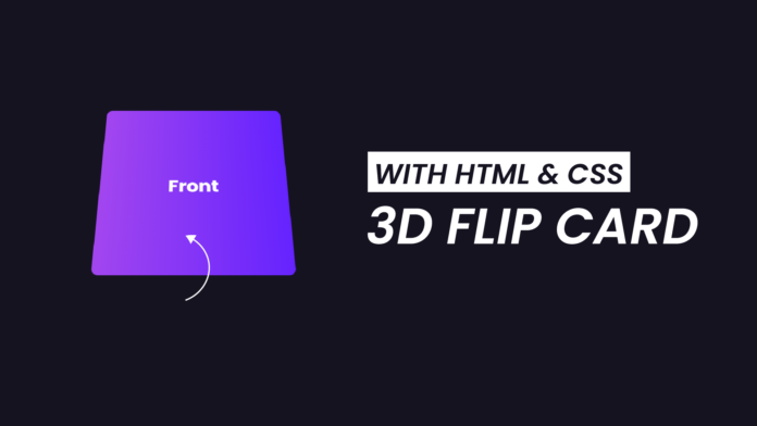
The 3D card flip effect is a popular design trick that flips a card to reveal another side when hovered over. It can be used for product showcases, portfolio displays, or any scenario where you want to provide additional details in a visually appealing way.
This effect is created using CSS’s transform and perspective properties combined with animations. By the end of this blog, you’ll have a clear understanding of how to create a smooth and engaging 3D flip card effect from scratch. Learn how to create 3D Flip Product card here.
Things You Will Learn:
In this tutorial, we’ll cover:
- Structuring a card with HTML.
- Using CSS for 3D transformations and hover effects.
- Styling with gradients and fonts for a professional look.
Youtube Video:
Watch our youtube video to get a deeper knowledge on how this code works.
HTML Code: Structuring the Flip Card
Our HTML structure consists of a container that holds a card. The card has two sides: front and back, which will flip on hover. Here’s the code:
<!DOCTYPE html>
<html lang="en">
  <head>
    <meta charset="UTF-8" />
    <meta name="viewport" content="width=device-width, initial-scale=1.0" />
    <title>3D Card Flip</title>
    <!-- Google Fonts -->
    <link
      href="https://fonts.googleapis.com/css2?family=Poppins&display=swap"
      rel="stylesheet"
    />
    <!-- Stylesheet -->
    <link rel="stylesheet" href="style.css" />
  </head>
  <body>
    <div class="container">
      <div class="card">
        <div class="front">
          <h3>Front</h3>
        </div>
        <div class="back">
          <h3>Back</h3>
        </div>
      </div>
    </div>
  </body>
</html>
CSS Code: Adding Style and Animation
Now, let’s style the card and add the flipping animation.
/* Reset and Body Styling */
* {
  padding: 0;
  margin: 0;
  box-sizing: border-box;
}
body {
  background-color: #151320;
}

/* Container Styling */
.container {
  position: absolute;
  perspective: 1000px; /* Enables 3D effect */
  height: 400px;
  width: 300px;
  cursor: pointer;
  padding: 1.5em 0;
  transform: translate(-50%, -50%);
  top: 50%;
  left: 50%;
}
.container:hover .card {
  transform: rotateX(180deg); /* Flips the card on hover */
}

/* Card Styling */
.card {
  transform-style: preserve-3d;
  width: 100%;
  height: 100%;
  transition: 0.5s ease; /* Smooth animation */
}

/* Front and Back Sides Styling */
.front,
.back {
  position: absolute;
  color: #ffffff;
  top: 0;
  bottom: 0;
  height: 100%;
  width: 100%;
  transform-style: preserve-3d;
  backface-visibility: hidden; /* Hides the reverse side */
  display: flex;
  justify-content: center;
  align-items: center;
  border-radius: 10px;
  font-family: "Poppins", sans-serif;
  font-weight: 400;
  font-size: 30px;
}

/* Front Side */
.front {
  background: linear-gradient(to right, #a246ef, #6523fe); /* Gradient background */
}

/* Back Side */
.back {
  transform: rotateX(180deg); /* Flips the back side */
  background-color: #28253a;
}
Key Points Explained
- Perspective Property:
- The
perspectiveproperty in.containerprovides a 3D viewing effect. A lower value creates a stronger 3D effect.
- The
- Card Flip Animation:
- Using the
transformproperty withrotateX(180deg)flips the card along the X-axis. Thetransitionproperty ensures a smooth animation.
- Using the
- Backface Visibility:
- The
backface-visibilityproperty hides the back side of the card when it’s not facing the viewer.
- The
- Styling with Gradients and Fonts:
- The
linear-gradientbackground for the front and a solid color for the back create a visually striking effect. - The Poppins font adds a modern, clean look.
- Learn 3D Text Effects here.
-
Conclusion:
In this tutorial, we built a 3D card flip effect from scratch using HTML and CSS. This effect is perfect for making your website more dynamic and interactive. By experimenting with colors, shapes, and animations, you can adapt this technique to fit any design project.
Try it out and let us know how it worked for you! 💻
Happy coding! 🎉
-
- The


