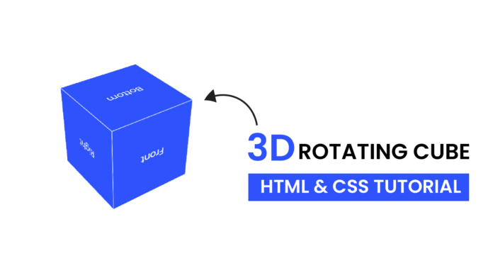
3D animations bring an extra layer of interactivity and modernity to web designs. Using CSS, you can create incredible 3D effects without the need for additional libraries or tools. In this tutorial, we’ll build a visually appealing 3D Rotating Cube using HTML and CSS.
Video Tutorial:
Final Output
The result is a 3D cube with six faces that rotates smoothly, creating an eye-catching animation. Each face of the cube is labeled for better visualization.
HTML: The Structure
The HTML sets up the cube and its faces.
<!DOCTYPE html>
<html lang="en">
  <head>
    <meta name="viewport" content="width=device-width, initial-scale=1.0" />
    <title>3D Rotating Cube</title>
    <link rel="stylesheet" href="style.css" />
  </head>
  <body>
    <div class="cube-container">
      <div class="cube">
        <div class="face front">Front</div>
        <div class="face back">Back</div>
        <div class="face left">Left</div>
        <div class="face right">Right</div>
        <div class="face top">Top</div>
        <div class="face bottom">Bottom</div>
      </div>
    </div>
  </body>
</html>
Key Elements
-
Cube Container:
The.cube-containerprovides the 3D perspective, simulating depth for the cube.<div class="cube-container">
2.Cube Faces:
The cube is made up of six faces, each styled and positioned using CSS. Labels likeFront,Back,Left, etc., help to identify the faces during rotation.<div class="face front">Front</div>
CSS: Adding Style and Animation
The CSS creates the 3D effect, defines the cube’s rotation, and adds animation.
body {
  margin: 0;
  display: flex;
  justify-content: center;
  align-items: center;
  height: 100vh;
  background-color: #ffffff;
  font-family: "Poppins", sans-serif;
  color: white;
}
.cube-container {
  perspective: 1000px;
}
.cube {
  position: relative;
  height: 200px;
  width: 200px;
  transform-style: preserve-3d;
  animation: rotateCube 5s infinite linear;
}
.face {
  position: absolute;
  width: 200px;
  height: 200px;
  background-color: #2e53fc;
  border: 1px solid white;
  display: flex;
  justify-content: center;
  align-items: center;
  font-size: 1.5em;
}
.front {
  transform: translateZ(100px);
}
.back {
  transform: rotateY(180deg) translateZ(100px);
}
.left {
  transform: rotateY(-90deg) translateZ(100px);
}
.right {
  transform: rotateY(90deg) translateZ(100px);
}
.top {
  transform: rotateX(90deg) translateZ(100px);
}
.bottom {
  transform: rotateX(-90deg) translateZ(100px);
}
@keyframes rotateCube {
  0% {
    transform: rotateX(0deg);
  }
  25% {
    transform: rotateX(90deg) rotateY(90deg);
  }
  50% {
    transform: rotateX(180deg) rotateY(180deg);
  }
  75% {
    transform: rotateX(270deg) rotateY(270deg);
  }
  100% {
    transform: rotateX(360deg) rotateY(360deg);
  }
}
How It Works
- The cube container sets up the 3D perspective.
- Each face is absolutely positioned to create the 3D structure using
transform. - The cube rotates infinitely using a
rotateCubeanimation.
Conclusion
Creating a 3D rotating cube with just HTML and CSS demonstrates the power of modern web development. This tutorial showcases how simple CSS properties like perspective, transform-style, and keyframes can be combined to create stunning animations.
Try this in your next project, or expand it with some of the enhancements suggested above for an even more engaging design!


