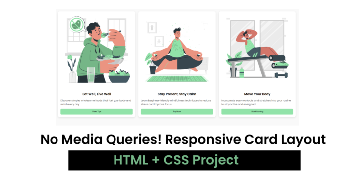
If you’re looking to enhance your front-end skills with a simple and visually appealing project, this responsive card layout is the perfect place to start. Whether you’re showcasing wellness tips, product features, or service highlights, cards are a great way to present information in bite-sized pieces.
In this tutorial, we’ll walk through how to create a clean and modern card layout using only HTML and CSS. The design is fully responsive, meaning it adjusts gracefully to different screen sizes — ideal for both desktop and mobile users.
🛠 What We’re Building
We’ll be building three wellness-themed cards that include:
- An image
- A headline
- A short description
- A call-to-action button
Each card will sit inside a responsive grid that adapts based on screen width.
💻 The HTML Structure
We begin with a simple HTML layout:
<div class="grid-container">
  <div class="card">
    <img src="healthy food.png" alt="image" />
    <h2>Eat Well, Live Well</h2>
    <p>Discover simple, wholesome foods that fuel your body</p>
    <button>View Tips</button>
  </div>
  ...
</div>
Each .card contains an image, a heading, a paragraph, and a button. You can duplicate the card structure to add more entries.
🎨 Styling with CSS
Here’s where the magic happens. The CSS brings the layout to life:
body {
  font-family: "Poppins", sans-serif;
  background-color: #f9f9f9;
  padding: 20px;
}

.grid-container {
  display: grid;
  grid-template-columns: repeat(auto-fit, minmax(250px, 1fr));
  gap: 20px;
}

.card {
  background-color: white;
  border-radius: 12px;
  box-shadow: 0 4px 12px rgba(0, 0, 0, 0.1);
  overflow: hidden;
  display: flex;
  flex-direction: column;
}

.card img {
  width: 100%;
  height: auto;
}

.card h2 {
  margin: 16px;
  font-size: 1.25rem;
  text-align: center;
}

.card p {
  margin: 0 16px 16px;
  font-size: 0.95rem;
  color: #555;
  flex-grow: 1;
}

.card button {
  margin: 0 16px 16px;
  padding: 10px 20px;
  background-color: #92e3a9;
  border: none;
  border-radius: 5px;
  cursor: pointer;
}
✅ Final Thoughts
This simple responsive card design is easy to implement and perfect for portfolio websites, blogs, or health & wellness content. You can customize the text, images, and colors to match your personal style or brand.
Want to level up? Try adding hover effects, animations, or even linking the buttons to other pages.


