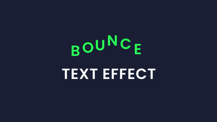
Animations can bring life to your websites, and even a simple text animation can create a stunning visual impact. In this blog post, we’ll walk through a fun project — a bouncing “Hello” text — created entirely with HTML and CSS, no JavaScript required!
Let’s break it down step by step.
🔧 What We’re Building
We’ll create a vibrant, bouncing “Hello” animation where each letter jumps with a slight delay, giving a wave-like effect. Perfect for splash screens, loading pages, or just a cool touch to any UI.
The HTML Structure:
<h1 class="bounce-text">
  <span>H</span><span>e</span><span>l</span><span>l</span><span>o</span>
</h1>
We use a <h1> tag with individual <span> elements wrapping each letter. This allows us to animate each letter independently.
🎨 Styling with CSS
* {
  padding: 0;
  margin: 0;
  box-sizing: border-box;
  font-family: "Poppins", sans-serif;
}
body {
  background-color: #222327;
}
.bounce-text {
  color: #28ff55;
  position: absolute;
  transform: translate(-50%, 50%);
  left: 50%;
  top: 50%;
  line-height: 0;
  display: flex;
  gap: 5px;
  font-size: 3rem;
  font-weight: bold;
  justify-content: center;
}
.bounce-text span {
  display: inline-block;
  animation: bounce 0.6s infinite ease-in-out;
}
.bounce-text span:nth-child(1) {
  animation-delay: 0s;
}
.bounce-text span:nth-child(2) {
  animation-delay: 0.1s;
}
.bounce-text span:nth-child(3) {
  animation-delay: 0.2s;
}
.bounce-text span:nth-child(4) {
  animation-delay: 0.3s;
}
.bounce-text span:nth-child(5) {
  animation-delay: 0.4s;
}
@keyframes bounce {
  0%, 100% {
    transform: translateY(0);
  }
  50% {
    transform: translateY(-15px);
  }
}
This entire CSS code creates a centered, animated “Hello” text effect. It begins by resetting default browser styles using the universal selector (*), ensuring consistent layout with box-sizing: border-box and applying a modern font globally.
The body is given a dark background (#222327) to provide contrast and enhance the neon green text visibility.
The .bounce-text class is applied to a container (<h1>) holding each letter. It uses position: absolute along with left: 50%, top: 50%, and transform: translate(-50%, 50%) to center the text both vertically and horizontally. The text is styled with a bright green color (#28ff55), a large font size (3rem), bold weight, and flex layout to space out the letters using gap: 5px.
Each letter is wrapped in a <span> to allow individual animation. The .bounce-text span rule applies a keyframe animation called bounce that runs continuously (infinite) with a smooth start and end (ease-in-out). The animation-delay is adjusted for each letter using nth-child, creating a staggered wave-like bounce effect.
Finally, the @keyframes bounce defines the animation: the letter stays at its position at the start (0%) and end (100%), but rises 15 pixels at the midpoint (50%), simulating a bounce.


Exactly what I needed, thanks so much!