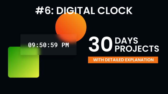
Creating a live digital clock is a great beginner project to practice working with time in JavaScript and combining it with structured HTML and styled CSS. In this post, we’ll break down the code behind a minimal yet visually engaging clock that updates every second.
HTML Structure:
The HTML lays the foundation for the clock. Inside the <body>, we have a container <div class="container"> that holds two decorative elements (.shape1 and .shape2) and the main clock display inside a <div class="clock">. The actual time is shown inside the <div id="time">, which is dynamically updated using JavaScript. A link to Google Fonts imports the Roboto Mono font, giving the clock a modern, digital vibe. The script.js and style.css files are linked to provide interactivity and design, respectively.
<!DOCTYPE html>
<html lang="en">
  <head>
    <meta charset="UTF-8" />
    <meta name="viewport" content="width=device-width, initial-scale=1.0" />
    <title>Digital Clock</title>
    <link
      href="https://fonts.googleapis.com/css2?family=Roboto+Mono:wght@600&display=swap"
      rel="stylesheet"
    />
    <link rel="stylesheet" href="style.css" />
  </head>
  <body>
    <div class="container">
      <div class="shape1"></div>
      <div class="shape2"></div>
      <div class="clock">
        <div id="time"></div>
      </div>
    </div>
    <script src="script.js"></script>
  </body>
</html>
CSS Styling :
Although the CSS isn’t shown here, the class names like .container, .shape1, .shape2, and .clock suggest a visually appealing layout—possibly using gradients, geometric shapes, or animations. The use of a monospaced font (Roboto Mono) further emphasizes a clean, digital feel, making each digit uniformly aligned and easy to read.
* {
  margin: 0;
  padding: 0;
  box-sizing: border-box;
}
body {
  background-color: #02070d;
}
.container {
  width: 450px;
  position: absolute;
  top: 50%;
  left: 50%;
  transform: translate(-50%, -50%);
  top: 50%;
  left: 50%;
  font-family: "Roboto Mono";
  color: #ffffff;
}
.clock {
  width: 100%;
  background-color: rgba(255, 255, 255, 0.06);
  padding: 50px 25px;
  border: 1.5px solid rgba(255, 255, 255, 0.06);
  box-shadow: 0 25px 30px rgba(0, 0, 0, 0.15);
  backdrop-filter: blur(15px);
  text-align: center;
}
#time {
  font-size: 50px;
}
.shape1,
.shape2 {
  position: absolute;
  z-index: -1;
}
.shape1 {
  height: 250px;
  width: 250px;
  background: linear-gradient(45deg, #f12711, #f5af19);
  border-radius: 50%;
  bottom: 100px;
  right: -80px;
}
.shape2 {
  height: 250px;
  width: 250px;
  background: linear-gradient(135deg, #0e9000, #eaf03e);
  top: 100px;
  left: -100px;
  border-radius: 20px;
}
JavaScript Logic
The real magic happens in script.js. Using setInterval(), a function runs every second to update the time. Inside the function:
-
new Date()retrieves the current time. -
The hour, minutes, and seconds are extracted.
-
A period (“AM” or “PM”) is calculated based on the hour.
-
Each time component is padded with a leading zero if it’s less than 10 using a ternary operator.
-
The formatted string (e.g.,
08:45:09 PM) is constructed by joining the components with colons and appending the period. -
Finally,
time.textContentupdates the DOM to reflect the new time.
This process repeats every second, creating the effect of a real-time digital clock.
const time = document.getElementById("time");
setInterval(() => {
  const now = new Date();
  let hr = now.getHours();
  let min = now.getMinutes();
  let sec = now.getSeconds();
  let period = hr >= 12 ? "PM" : "AM";

  const formattedTime =
    [
      hr < 10 ? "0" + hr : hr,
      min < 10 ? "0" + min : min,
      sec < 10 ? "0" + sec : sec,
    ].join(":") +
    " " +
    period;

  time.textContent = formattedTime;
}, 1000);
This digital clock project is a great example of how HTML, CSS, and JavaScript can work together to build a live, dynamic web element. With just a few lines of code, you can display the current time in a polished format and practice key front-end skills like DOM manipulation, working with time data, and responsive styling. Whether you’re a beginner or brushing up your JavaScript fundamentals, this is a small project with big learning potential.


