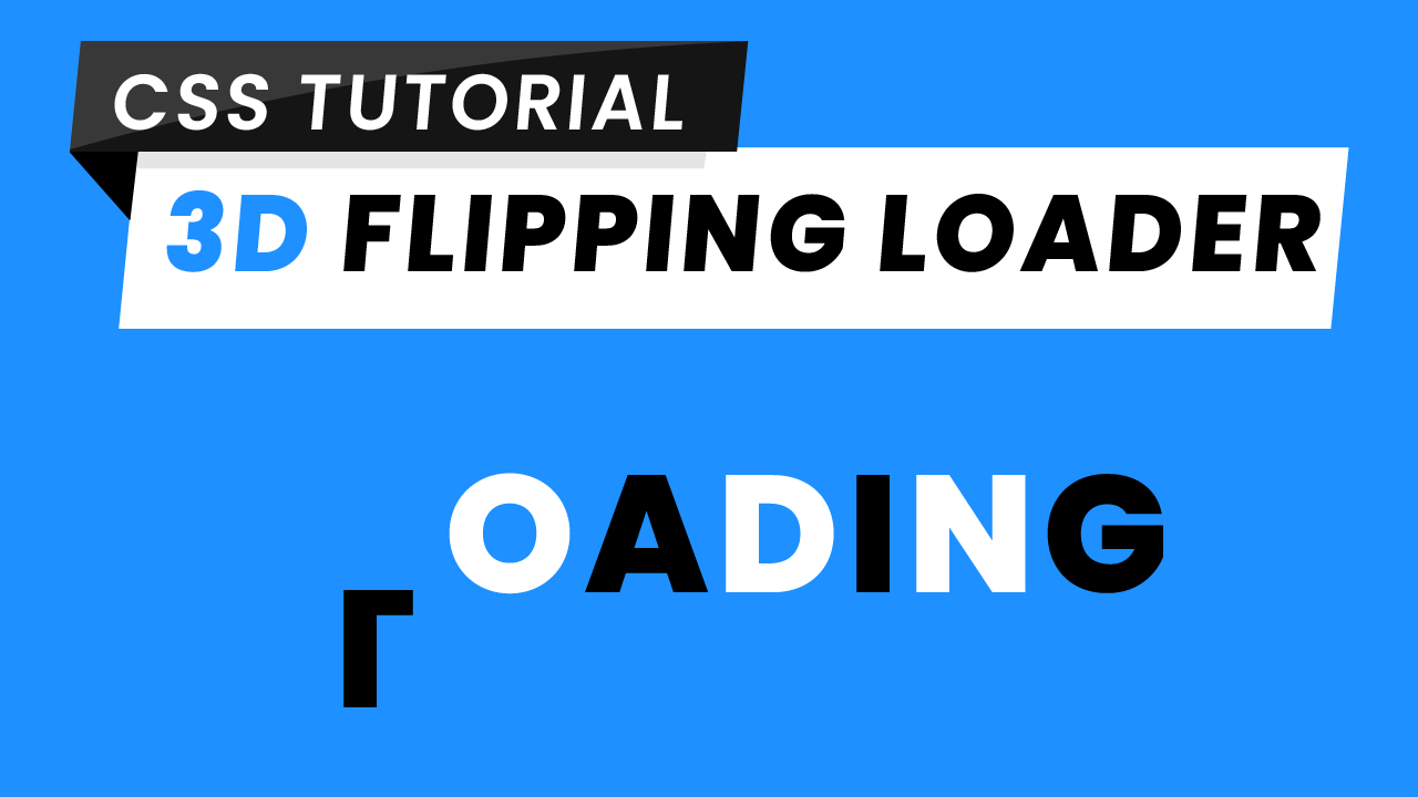
Loading Pages are something the website visitors see while the website continues to load its content. These loading animations keep the visitor engaged while they wait for the page to load. In short, they make waiting less frustrating for the visitor. So no doubt these animations should be eye-catching and entertaining enough to keep the visitors engaged. But eye-catching loaders need not be complex. You can create some really captivating loaders using some simple CSS properties and keyframes.
During development, you can find yourself in dilemma choosing between CSS Loading Animations and Loading GIFs. But choosing a CSS Loading Animation has a lot of benefits over a Loading GIF like:
1. Easy to Customize: It is much easier to change the animation duration, speed curve, colours, iterations etc with CSS than it is with GIFs giving you better control.
2. Scaling: With CSS there is no quality loss on scaling which is a typical thing to happen while using GIFs.
Today lets us create a stunning 3D loader. The trick here is to use just the right perspective and some really simple CSS Transforms like Rotate. Also, what is cooler than a 3D Animation?
HTML
Let us begin with HTML. We start by creating a div element with ‘loader’ class that acts as a container for our other components. Next we are going to create 7 span elements for each of the 7 letters of ‘LOADING’. And that’s all the HTML we will need for this animation.
<div class="loader">
    <span>L</span>
    <span>O</span>
    <span>A</span>
    <span>D</span>
    <span>I</span>
    <span>N</span>
    <span>G</span>
</div>
CSS
Centering The Loader:
Moving on to CSS code. Let us start by setting a pleasant shade of blue (Hex-code: #1E90FF) as a background to our page. The first thing we want to do is centre our loader. We will use flex layout for the centering purpose. You can watch a tutorial on how you can use flex to centre any text, image or div element watch here.
body {
     background-color: #1e90ff;
     padding: 0;
     margin: 0;
     height: 100vh;
     width: 100vw;
     display: flex;
     align-items: center;
     justify-content: center;
}
Adding Depth With Perspective.:
We use the perspective property to set some depth for our animations. Here we are using a moderate value of 700px. Here Note that lower the value of perspective higher is the intensity of the 3D effect.
.loader {
     perspective: 700px;
}
Adding Transitions and Animations:
Moving on to our span elements lets add some basic typography styling. Now we set the transition-origin to 0 70%. It simply means the origin or centre of all our animations on these span elements will be 70% from the top. Let’s set the transform style to preserve-3D so the animation doesn’t look flat.
And the most awaited part of code, Animations. We want animations to occur over and over again continuously hence we set the animation-iteration-count to infinite. We have set it using the shorthand method in animation attribute. Set the animation-duration to 2.6 seconds. We also use shorthand method to set the animation-timing-function to linear so that animation speed curve has same value from start to end ensuring a smooth animation.
.loader>span {
    font-size: 130px;
    font-family: "Poppins",sans-serif;
    display: inline-block;
    animation: flip 2.6s infinite linear;
    transform-origin: 0 70%;
    transform-style: preserve-3d;
}
Setting Up the Keyframes:
Keyframes are where the magic happens. We need Keyframes to flip the letters twice over the horizontal axis. For this, let us add transform rotateY(360deg) at 35% and 100% which results in the first flip to be quicker than the second flip giving smooth transitions towards the end animation.
@keyframes flip {
    35% {
       transform: rotateX(360deg);
     }
    100% {
       transform: rotateX(360deg);
     }
}
Adding Delays:
We set each of alternate letters of ‘LOADING’ to white color by using the ‘:nth-child(even)’ selector which selects all the span elements which are even children. This results in alternate black and white coloured letters.
Lastly, we need the letters to flip one after the other in perfect sync. For that, we add a small progressive delay in each of the span element. Here we are using delay in steps of 0.3s. And we are done.
.loader>span:nth-child(even) {
    color: white;
}
.loader>span:nth-child(2) {
    animation-delay: 0.3s;
}
.loader>span:nth-child(3) {
    animation-delay: 0.6s;
}
.loader>span:nth-child(4) {
    animation-delay: 0.9s;
}
.loader>span:nth-child(5) {
    animation-delay: 1.2s;
}
.loader>span:nth-child(6) {
    animation-delay: 1.5s;
}
.loader>span:nth-child(7) {
    animation-delay: 1.8s;
}
Answering one of the common questions ‘When should I use a loader?’
– You should use a loader if it takes more than 5 seconds for your website to load.
That’s it for this tutorial. I hope you guys enjoyed this tutorial. You can stay updated with latest tutorials by subscribing us on Youtube. You can also find us on Instagram.


Hey, Miltali
I’m Rishabh, your all designs are excellent looking. There are lot of things, which i learnt from your blogs and YouTube videos. Even i’m your follower on SoloLearn. If you don’t mind, may i know which theme using in your website. your website looking great. I’m waiting ….