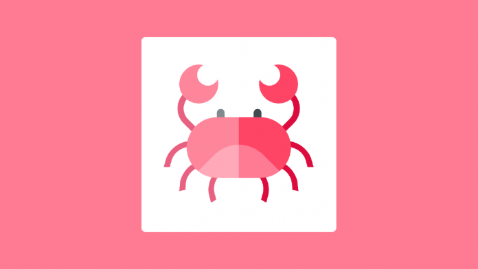
Hey everyone. Welcome to today’s tutorial. In today’s tutorial, we will learn, how to create a cute crab illustration art. To create this drawing, we need HTML and CSS.
This is a fun tutorial. The only reason to create this kind of tutorial is to explore and experiment with new CSS properties in a fun way. I would suggest beginners go through these kinds of tutorials. If you want to improve your CSS skills, you can check out this playlist here. This playlist consists of a bunch of CSS art tutorials.
Video Tutorials:
If you prefer to learn by watching a video tutorial instead of reading this blog post, you should check out the video below. Also, subscribe to my youtube channel, where I post new tutorials related to web development every alternate day.
Project Folder Structure:
Before we start coding, let us look at the project folder structure. We create a project folder called – ‘CSS Crab Art’. Inside this folder, we have two files. These files are index.html which is the HTML document and style.css which is the stylesheet.
HTML:
We start with the HTML code. The HTML code creates elements necessary to build the structure of the crab. First, copy the code below and paste it into your HTML document.
We create a div with the class name ‘container’. Inside the container, there are ten other div elements. These elements form crab hands, crab eyes, legs, and body.
<!DOCTYPE html>
<html>
  <head>
    <title>Crab CSS Art</title>
    <meta name="viewport" content="width=device-width, initial-scale=1" />
    <link rel="stylesheet" href="style.css" />
  </head>
  <body>
    <div class="container">
      <div class="crab-hand-l"></div>
      <div class="crab-hand-r"></div>
      <div class="crab-eyes"></div>
      <div class="crab-leg-l leg-l-1"></div>
      <div class="crab-leg-r leg-r-1"></div>
      <div class="crab-leg-l leg-l-2"></div>
      <div class="crab-leg-r leg-r-2"></div>
      <div class="crab-leg-l leg-l-3"></div>
      <div class="crab-leg-r leg-r-3"></div>
      <div class="crab-body"></div>
    </div>
  </body>
</html>
CSS:
Now we style these divs to shape them into hands, claws, legs, the body and eyes. We also use the need to position them. For this we use CSS. Now copy the code provided to you below and paste it into your stylesheet.
Other Tutorials You Might Like:
That’s it for this tutorial. Our crab illustration is now ready. You can go ahead and customize it the way you want.
* {
  padding: 0;
  margin: 0;
  box-sizing: border-box;
}
body {
  background-color: #ff7b94;
}
.container {
  height: 28.12em;
  width: 28.12em;
  background-color: #ffffff;
  position: absolute;
  transform: translate(-50%, -50%);
  top: 50%;
  left: 50%;
  border-radius: 0.6em;
}
.container:after {
  position: absolute;
  content: "";
  background-color: rgba(255, 255, 255, 0.35);
  height: 100%;
  width: 50%;
  border-radius: 0.6em 0 0 0.6em;
}
.crab-body {
  background-color: #fe4566;
  height: 8.7em;
  width: 15em;
  position: absolute;
  transform: translate(-50%, -50%);
  top: calc(50% + 1.87em);
  left: 50%;
  border-radius: 8.7em;
  overflow: hidden;
}
.crab-body:before {
  content: "";
  position: absolute;
  background-color: #ff7b94;
  height: 15em;
  width: 15em;
  border-radius: 5em;
  transform: rotate(45deg);
  top: 5em;
}
.crab-hand-l,
.crab-hand-r {
  height: 5em;
  width: 5em;
  border-bottom: 0.9em solid #dc0c3e;
  position: absolute;
  top: 7.8em;
}
.crab-hand-l {
  border-left: 0.9em solid #dc0c3e;
  border-radius: 0 0 0 3.1em;
  transform: rotate(45deg);
  left: 5em;
}
.crab-hand-r {
  border-right: 0.9em solid #dc0c3e;
  border-radius: 0 0 3.1em 0;
  transform: rotate(-45deg);
  right: 5em;
}
.crab-hand-l:before,
.crab-hand-r:before {
  position: absolute;
  content: "";
  height: 3.1em;
  width: 3.1em;
  background-color: transparent;
  border-radius: 50%;
  box-shadow: 0 1.87em 0 1.25em #fe4566;
  bottom: 5em;
}
.crab-hand-l:before {
  left: -1.87em;
}
.crab-hand-r:before {
  right: -1.87em;
}
.crab-eyes {
  background-color: #414c51;
  height: 1.25em;
  width: 1.1em;
  position: absolute;
  top: 10.37em;
  left: 10.93em;
  border-radius: 0.6em 0.6em 0 0;
  box-shadow: 5.3em 0 #414c51;
}
.crab-leg-l,
.crab-leg-r {
  height: 3.75em;
  width: 3.12em;
  border-top: 0.9em solid #dc0c3e;
  position: absolute;
}
.crab-leg-l {
  border-left: 0.9em solid #dc0c3e;
  border-radius: 2.8em 0 0 0;
}
.crab-leg-r {
  border-right: 0.9em solid #dc0c3e;
  border-radius: 0 2.8em 0 0;
}
.leg-l-1 {
  transform: skew(-15deg);
  top: 15em;
  left: 3.75em;
}
.leg-r-1 {
  transform: skew(15deg);
  top: 15em;
  right: 3.75em;
}
.leg-l-2 {
  transform: rotate(-10deg) skew(-15deg);
  left: 5.62em;
  top: 18.12em;
}
.leg-r-2 {
  transform: rotate(10deg) skew(15deg);
  right: 5.62em;
  top: 18.12em;
}
.leg-l-3 {
  transform: rotate(-30deg) skew(-15deg);
  left: 9.37em;
  top: 19.37em;
}
.leg-r-3 {
  transform: rotate(30deg) skew(15deg);
  right: 9.37em;
  top: 19.37em;
}
If you face any issues while creating this drawing, you can download the source code by clicking on the ‘Download Code’ button below. Also, I would love to hear from you guys. So if you have any queries, suggestions or feedback you drop them in the comments below.
Happy Coding!


