Introduction:
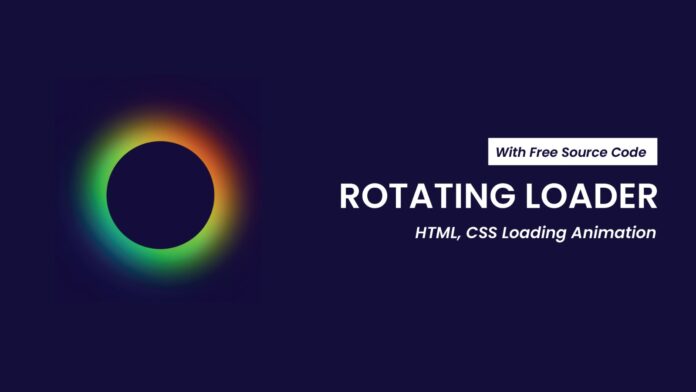
In this tutorial, you will learn how to create a visually striking rotating loader using only HTML and CSS. A rotating loader is an excellent way to engage users while a page or data is loading. The smooth spinning animation combined with colorful, blurred circles creates an impressive effect that enhances user experience.
Things You Will Learn:
In this tutorial, you will learn:
- How to center content vertically and horizontally with CSS Flexbox.
- How to create a rotating animation with CSS
@keyframes. - How to use CSS pseudo-elements and blurring effects to design a dynamic loader.
Video Tutorial:
I would suggest you to watch the video down below for better understanding on we have implemented the functionality of this project. If you find the video helpful give it a like and subscribe to my YouTube channel where I post new tips, tricks and tutorials related to HTML, CSS and JavaScript.
Project Folder Structure:
Now before we move on to actual coding we create a project folder structure. We name the project folder as – ”Rotating Loader | HTML & CSS Loading Animation”. Within this folder we have 2 files. These files are:
- index.html
- style.css
HTML:
We begin with the HTML code. Copy the code below and paste it into your HTML document.
<!DOCTYPE html>
<html lang="en">
  <head>
    <meta name="viewport" content="width=device-width, initial-scale=1.0" />
    <title>Rotating Loader</title>
    <link rel="stylesheet" href="style.css" />
  </head>
  <body>
    <div class="loader">
      <span></span>
      <span></span>
      <span></span>
      <span></span>
    </div>
  </body>
</html>
CSS:
Next, we style our loader using CSS. For this copy, the code provided to you below and paste it into your stylesheet.
body {
  background-color: #0d003c;
  margin: 0;
  padding: 0;
  height: 100vh;
  display: flex;
  justify-content: center;
  align-items: center;
}
.loader {
  position: relative;
  height: 200px;
  width: 200px;
  border-radius: 50%;
  animation: spin 0.8s linear infinite;
}
@keyframes spin {
  100% {
    transform: rotate(360deg);
  }
}
.loader span {
  position: absolute;
  width: 100%;
  height: 100%;
  border-radius: 50%;
  background: linear-gradient(#dd0000, #fecf11, #22ff00, #096bff);
}
.loader span:nth-child(1) {
  filter: blur(20px);
}
.loader span:nth-child(2) {
  filter: blur(30px);
}
.loader span:nth-child(3) {
  filter: blur(40px);
}
.loader span:nth-child(4) {
  filter: blur(50px);
}
.loader:after {
  content: "";
  position: absolute;
  top: 5px;
  left: 5px;
  right: 5px;
  bottom: 5px;
  background-color: #0d003c;
  border-radius: 50%;
}
Conclusion:
You’ve successfully created a rotating loader with a beautiful gradient and blurring effect using just HTML and CSS. This loader can enhance your website’s user experience by keeping users visually engaged while content is loading. The design is entirely customizable, from the colors to the animation speed, and can easily fit any project. Don’t forget to check out the video tutorial for further customization ideas!


