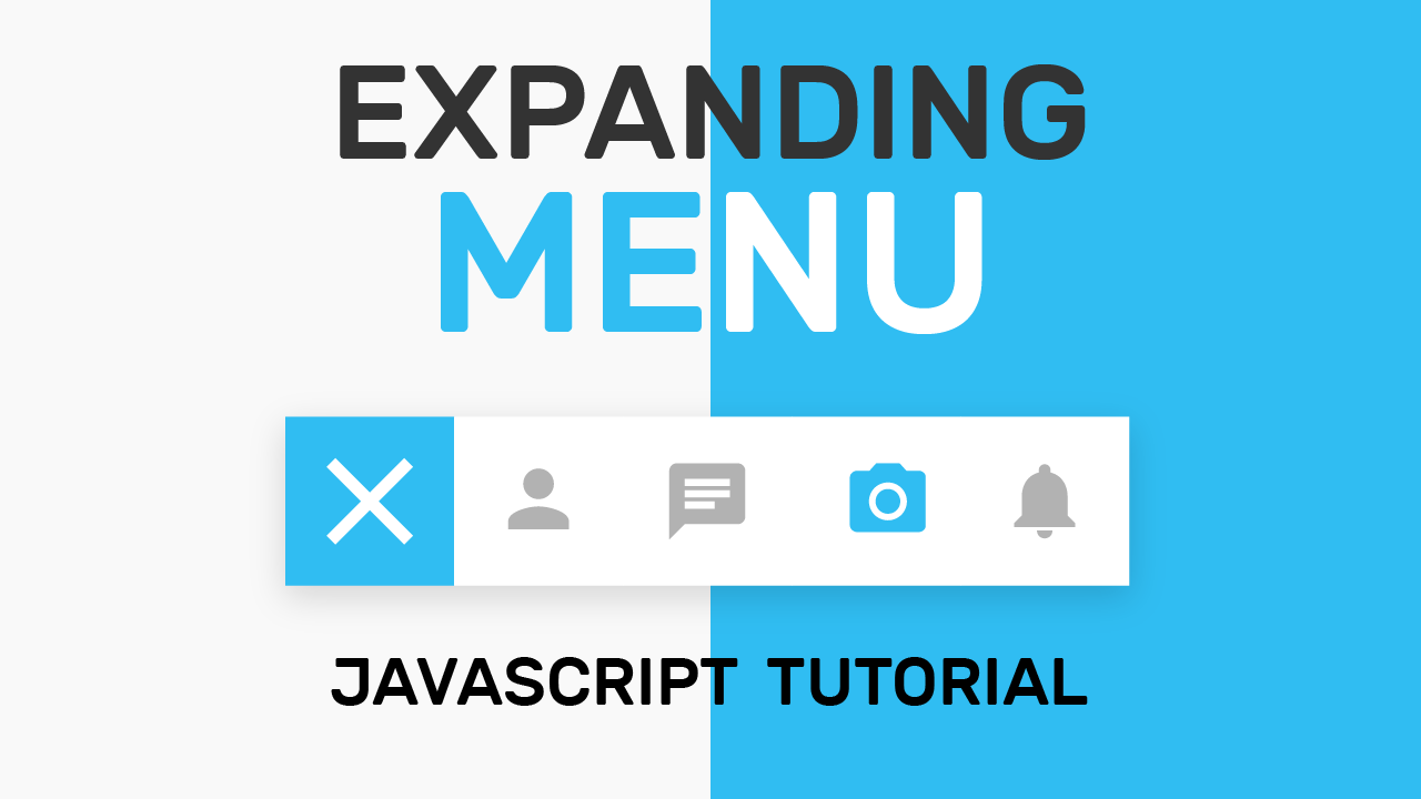
A Toolbar Menu is a collection of crucial application-specific functions or tools like Add a Photo, Send a Message, etc. Icons, Buttons, and similar elements are often used to represent these tools. Various Software and applications commonly use these toolbars in the form of a horizontal menu. In this tutorial, we create a Toolbar menu that collapses and expands on a click. This way, the user can toggle between hiding and showing content depending on the need of the toolbar. Here, we provide a Button with the ‘+’ icon to incorporate the toggle function. We create this toolbar menu using HTML, CSS, and some easy-peasy Javascript. So let’s get started.
We are using Material Icons for this project, so before we move on to the actual coding, let us first include the Material icons CDN into our HTML.
For this, copy and paste the following snippet between the <head> tag of your HTML.
<link rel="stylesheet" href="https://fonts.googleapis.com/icon?family=Material+Icons">
You can learn more about various ways you can use material icons here. You can alternatively use Fontawesome Icons that are super-easy to use too.
HTML
Getting to the actual coding, Let us start by creating an <div> element with class name ‘menu’ to contain the toggle button and toolbar items. Next, we create two <div> elements to wrap the toggle button and menu items, one for each of them.
The first <div> has a class name and id called ‘toggle.’ We need to indicate the toolbar menu is expandable; hence, we use an ‘add’ icon with id ‘toggle1’.
The second <div> has a class name and id called ‘items’. It consists of four hyperlinks, each containing an icon. The four icons we have used here are ‘person’, ‘message’, ‘camera_alt’, and ‘notifications’. With this, we wind up the coding in the HTML section and proceed to the CSS.
<div class="menu" >
  <div class="toggle" id="toggle" onclick="expand()">
    <i class="material-icons" id="toggle1">
      add
    </i>
  </div>
  <div class="items" id="items">
    <a href="#" id="item1">
      <i class="material-icons">
        person
      </i>
    </a>
    <a href="#" id="item2">
      <i class="material-icons">
        message
      </i>
    </a>
    <a href="#" id="item3">
      <i class="material-icons">
        camera_alt
      </i>
    </a>
    <a href="#" id="item4">
      <i class="material-icons">
        notifications
      </i>
    </a>
  </div>
</div>
CSS
Centering the Toolbar Menu:
We start coding the CSS by setting up a shade of off-white with hex code #eeeeee. Then we clean up the default margins and padding by setting them both to 0. Now we center the toolbar menu using flex.
body{
   background-color: #eeeeee;
   padding: 0;
   margin: 0;
   height: 100vh;
   width: 100vw;
   display: flex;
   align-items: center;
   justify-content: center;
}
Styling the Toolbar Menu:
We need the toggle button and toolbar to be arranged horizontally within the toolbar menu; therefore, we use ‘row’ as the flex-direction.
.menu{
   display: flex;
   flex-direction: row;
   position: relative;
}
Styling the Toggle Button:
We style the toggle <div> by setting the background color to #30BDF2. The dimensions for this <div> are 80*80pixels. We again use the flex method to center the icon inside this <div>. See how easy and useful flex can be for centering stuff?
.toggle{
   background-color:#30BDF2;
   height: 80px;
   width: 80px;
   color:white ;
   display: flex;
   align-items: center;
   justify-content: center;
   transition: 1s;
}
Styling the Menu Items:
Initially, we need to hide these items; hence, we set the scaling of these to 0. We set the transition duration of these items to 0.5s so we can have smooth transitions during the expanding and collapsing of the toolbar menu. The toolbar menu expands and collapses from the left side; we, therefore, set the transform-origin to the left.
.items{
   display: flex;
   flex-direction: row;
   transform: scaleX(0);
   transform-origin: left;
   transition: 0.5s;
}
Styling the Anchor Tags:
Next, we select all anchor tags who are children of div with class name items. They have the same dimensions as that of the toggle <div>. We eliminate the underlines by setting ‘text-decoration’ to ‘none’.
.items>a{
   display: flex;
   background-color: white;
   height: 80px;
   width:80px;
   color:#b2b2b2 ;
   text-decoration: none;>
   align-items: center;
   justify-content: center;
}
Styling the Icons:
We style the material icons similar to how we style text. Let us scale up the size of the ‘+’ icon a bit by setting ‘font-size’ to ’60px’.
We set a ‘font-size’ of ’30px’ to the tool icons.
.toggle>.material-icons{
   font-size: 60px;
}
a>.material-icons{

   font-size: 30px;

}
Adding the Hover Effect:
We indicate the hover state of icons by scaling up the icons by a bit every time the mouse hovers over them.
a:hover>.material-icons{
   font-size: 40px;
   color:#30BDF2;
}
Javascript
Moving on to the javascript code, we declare a variable ‘state’ that defines the state of toggle. Here, ‘false’ indicates the toolbar menu to be in a collapsed state while ‘true’ indicates the toolbar menu to be in an expanded state.
Initially, we assign ‘false’ to the ‘state’ variable because the collapsed is the initial state of the toolbar menu.
When we click the ‘toggle’ <div>, the expand() function is triggered.
Case 1: State is ‘false’
If the state is false i.e., toolbar menu is in the collapsed state, it scales the ‘items’ <div>, so the toolbar now appears expanded with a smooth transition.
The ‘+’ icon is rotated by 45 degrees, so that it now looks like a ‘close’ icon. And that’s a little trick we use here to avoid using an extra icon and make some quick transition. We set the state to ‘true’, indicating it to be in the expanded state now.
Case 2: State is Not ‘false’
If the state is anything other than false, we scale the toolbar menu back to ‘0’, thereby hiding the menu.
Also the, ‘+’ icon, which now looks like a ‘close’ icon, is rotated back to 0 degrees to make it look like ‘plus’ icon again. Lastly, we assign ‘false’ to the state variable indicating the menu is in the collapsed state.
var state=false;
  function expand(){
    if(state==false){
      document.getElementById('items').style.transform='scaleX(1)';
      document.getElementById('toggle1').style.transform='rotate(45deg)';
        state=true;
  }
    else{
      document.getElementById('items').style.transform='scaleX(0)';
      document.getElementById('toggle1').style.transform='rotate(0deg)';
	state=false;
  }
}
That’s it for this tutorial. I hope you guys enjoyed this tutorial. You can stay updated with latest tutorials by subscribing us on Youtube. You can also find us on Instagram.


Awesome! This is amazing work, congrat Mitali
This website is great Mitali. So happy for you
Nice mitali mam, it’s very helpful to your youtube subscribers.
Awesome Mitali. I really like the arts you are creating. But can you change ‘exapanding’ to ‘expanding’.
Hi Mitali , I am Chinmay , great work awesome , you have done great work would love to connect with you
I am wondering how you made the leave a comment/reply part. Like… Did you use PHP and my SQL? or something like WordPress, or Wix?
Awesome!
Awesome, you are the best web designer i have ever seen
I am your fan.
Do you agree with the perspective or information presented? Why or why not?