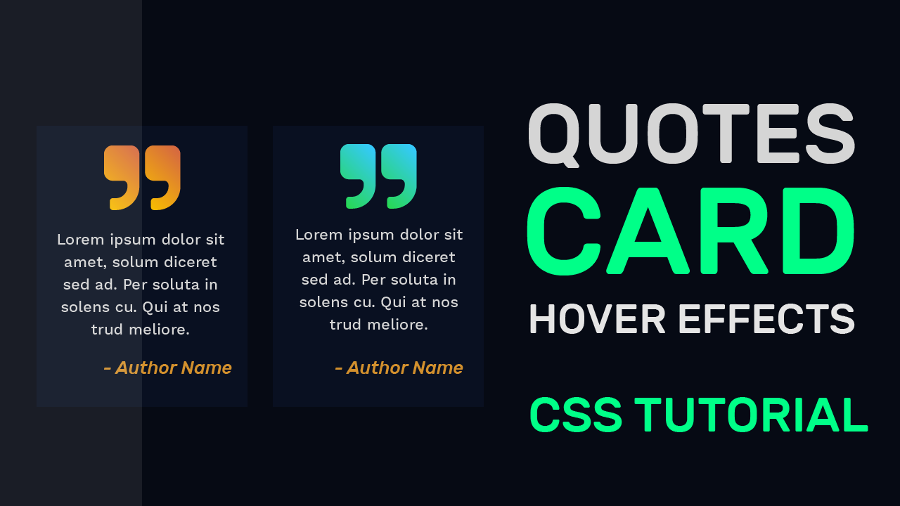
In this tutorial, I am going to show how you can create Quotes Card with a stunning hover effect using nothing but just CSS.For this, we are going to create two Cards with stunning Dark Theme.
HTML
Starting with the HTML section, let us begin with the card layout. We start by creating 2 cards with dimension 300*400 px. Each of these Cards will consist of 3 parts:
1.The Quotes Icon.
2.The Quote.
3.The Quote Author.
I have used ‘quote right’ icon from Fontawesome version 4.7. You can learn more about various ways you can use Fontawesome in your project here.
For section two, we are using a div element containing the quoted text. Let us give a class ‘text’ to this div element. I have used some dummy ‘Lorem Ipsum’ text for this section.
The last section of our Card will consist of a div element with two class names:
First: ‘author’ Common for both Cards.
Second: ‘a1’ and ‘a2’ for Card 1 and Card 2 respectively.
We are done with the HTML section.
<div class="card">
   <i class="fa1 fa fa-quote-right" aria-hidden="true"></i>
   <div class="text">
      Lorem ipsum dolor sit amet, solum diceret sed ad.
      Per soluta insolens cu. Qui at nostrud meliore,
      an quo dicam appetere
   </div>
   <div class="author a1">- Author Name</div>
</div>
<div class="card">
   <i class="fa2 fa fa-quote-right" aria-hidden="true"></i>
   <div class="text">
      Lorem ipsum dolor sit amet, solum diceret sed ad.
      Per soluta insolens cu. Qui at nostrud meliore,
      an quo dicam appetere
   </div>
   <div class="author a2">- Author Name</div>
</div>
CSS
Centering Cards:
Moving on to CSS, first let us get rid of unwanted padding and margin in our HTML document by setting the padding and margin to 0 each. For the body background colour, I have chosen a dark blue colour with hex: #060A14. For Centering the Cards, I am using flex layout. We need the Cards to be placed with some spacing around them so we set the justify-content attribute to a value of ‘space-around’.
body{
   background-color: #060A14;
   padding: 0;
   margin: 0;
   height: 100vh;
   width: 100vw;
   display: flex;
   align-items: center;
   justify-content: space-around;
   }
Styling Cards:
Coming to the Cards, We start by setting the width and height of the card i.e 300*400px. We use a shade of blue slightly lighter than the body background colour which makes the Cards seem lifted towards the light and also makes them slightly distinguishable from the background. We again use flex method to Center the contents of Cards horizontally as well as vertically.
.card{
   height: 400px;
   width: 300px;
   background-color:#091021;
   position: relative;
   display: flex;
   justify-content: center;
   text-align: center;
  }
Quote Icon:
We style the Fontawesome icons by the class name ‘fa’. Each Icon is set to a font size of 120px and is positioned absolutely 10px from the top. Currently, the colour of the Quotes Icon is set to a transparent shade of black to make the Quotes card look ‘disabled’ or ‘inactive’
.fa{
   color:rgba(255,255,255,0.1);
   font-size: 120px;
   position:absolute;
   top:10px;
 }
Typography for Quote Text:
For ‘text’ class we use the same transparent black colour as that of the icon.
We set margins to have high spacing from the top and moderate spacing from the sides. I have used a sans-serif font to promote readability.
.text{
   color:rgba(255,255,255,0.1);
   position: relative;
   font-size: 20px;
   font-family: 'Work Sans',sans-serif;
   margin: 145px 12px 0 12px;
   line-height: 30px;
}
Author Name:
The author name is positioned absolutely to bottom right corner of the card. We emphasis the author name by using italic font style.
.author{
   position: absolute;
   bottom: 50px;
   right: 15px;
   font-size: 23px;
   font-family: 'Rubik',sans-serif;
   color: rgba(255,255,255,0.05);
   font-style: italic;
}
Hover Effect For Card:
Let us now work on the Hover effect, We use ‘:hover’ selector with the Card class to indicate the mouse over Card. On hover the card moves towards the top with a subtle box shadow around it which gives a effect of the Card being lifted from the surface.
.card:hover{
   box-shadow:0 10px 10px 2px rgba(0,0,0,0.1);
   transform: translateY(-5px);
}
Gradient Background For Icons:
We set each of icon to a gradient background on hover. You can learn how to use gradient as text background in this tutorial.
.card:hover .fa1{
   background:linear-gradient(45deg,#F7BC01,#D56741);
   -webkit-text-fill-color:transparent;
   -webkit-background-clip:text;
}
.card:hover .fa2{
   background:linear-gradient(45deg,#27d853,#35c9ff  );
   -webkit-text-fill-color:transparent;
   -webkit-background-clip:text;
}
Final Touch:
Similarly, let us now make final few changes for our text and author font colours by setting them both to some pleasant bright colours. This gives the previously ‘disabled’ looking card a ‘active’ look with a quick transition.
.card:hover .text{
   color: #d5d5d5;
}
.card:hover .a1{
   color: #d2902d;
}
.card:hover .a2{
   color: #39c65c;
}
That’s it for this tutorial. I hope you guys enjoyed this tutorial. You can stay updated with latest tutorials by subscribing us on Youtube.


This is superb @mitali…. Keep it up….
👏👏👏
And also you have done a great job by making your own website…..
Good Day…!!
Wow
That’s amazing
I saw your web from solo learn
It really awesome.