Does the text on your website look boring? Do you want your headings to be eyecatching? If yes, then this tutorial is just the right one for you.
One of the easiest ways to make your headings captivating is to add some cool effects to them. This way you can get the users attention to the most crucial stuff on your website. So in today’s tutorial, let us learn how you add one of these text effects to your heading with Pure CSS.
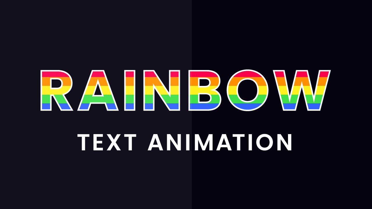
For today’s tutorial, we are going to create a rainbow text effect. This animated text effect consists of a bunch of coloured strips that look like a rainbow. These coloured strips infinitely scroll down.
Initially, looking at the output, it might look as if we use s separate element for each of these coloured bars. Also, we don’t even need the ‘::before’ and ‘::after’ pseudo-elements. But, all we need is our heading. Sounds interesting? doesn’t it? Even if you are a CSS beginner, this text effect isn’t that difficult. Let us start with the tutorial.
Video Tutorial:
You can watch the video tutorial from my youtube channel here:
HTML:
We begin the tutorial by starting to code the HTML first. Create an HTML file with the name ‘index.html’. Copy the code from down below and paste it into your CSS file. For the HTML code, all we need is an H1 heading with the text ‘RAINBOW’ in it. You can use any text that you want. I have used Poppins font for this effect, you are free to use any font of your choice. All you need to do is to add the respective google font link in your HTML file.
<!DOCTYPE html>
<html lang="en">
<head>
    <title>Rainbow Text</title>
    <!--Google Font-->
    <link href="https://fonts.googleapis.com/css2?family=Poppins:wght@700&display=swap" rel="stylesheet">
    <!--Stylesheet-->
    <link rel="stylesheet" href="style.css">
</head>
<body>
    <h1>RAINBOW</h1>
</body>
</html>
CSS:
Next, we code the CSS. We start by creating a file called “style.css” and copy-paste the contents below into your stylesheet.
We initiate by doing a basic CSS reset. We remove all the margins and padding that are applied to elements by the browser by default. We also set the ‘box-sizing’ property to ‘border-box’.
*{
    padding: 0;
    margin: 0;
    box-sizing: border-box;
}
Next, we add a dark grey sort of colour as the background of our document body. This grey background makes the rainbow text pop up.
body{
    background-color: #050310;
}
We style the H1 heading now. We begin by centring the text. In this case, we use the translate property along with absolute positioning to centre the heading. This centring method works perfectly for text with any font size. Next, we add some ‘letter-spacing’ to it so the letters appear more spaced.
After that is done, we add a linear-gradient as a background to the heading. We want our colours to show up separately without getting blended as it usually does in gradients. We achieve this by adding hard colour stops. Adding hard colour stops means the start point of the next colour is the exact same as the endpoint of the previous colour. This way the colours don’t blend with each other and can be seen distinctively.
To see this gradient background hidden behind the text, make the font colour transparent. We need the background only contained inside the text. So we set the ‘background-clip’ property to ‘text’. This cuts the background to only fit the text. Add a white stroke to make the text stand out even more.
h1{
    color: transparent;
    position: absolute;
    transform: translate(-50%,-50%);
    left: 50%;
    top: 50%;
    font-family: "Poppins",sans-serif;
    font-size: 110px;
    letter-spacing: 0.05em;
    background: linear-gradient(
        #fd004c 16.7%,
        #fe9000 16.7%,
        #fe9000 33.4%,
        #fff020 33.4%,
        #fff020 50.1%,
        #3edf4b 50.1%,
        #3edf4b 66.8%,
        #3363ff 66.8%,
        #3363ff 83.5%,
        #b102b7 83.5%
    );
    -webkit-text-stroke: 0.04em #ffffff;
    -webkit-background-clip: text;
            background-clip: text;
    line-height: 1.1em;
    animation: rainbow 50s linear infinite;
}
We follow this by adding an animation called ‘rainbow’. We add keyframes so as to move the background by 30em vertically every 50 seconds. Since the background is repeating itself, the animation looks continuous and flawless.
@keyframes rainbow{
    100%{
        background-position: 0 30em;
    }
}
If you liked the tutorial, be sure to drop a comment below. I would love to hear from you. For more such tutorial, stay tuned. You can download the code by clicking on the button below.


