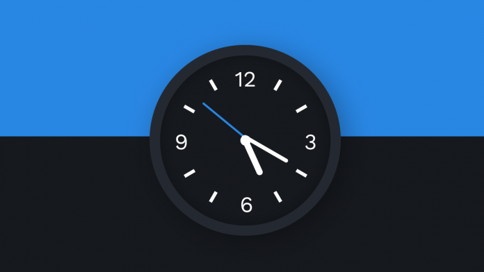
Hello and welcome to today’s tutorial. In today’s tutorial, we will create an analog clock. This is one of the most common and simplest projects for javascript beginners. So if you are a beginner this is a perfect project for you. Also, I have a whole playlist of javascript projects with source code. If you are interested in learning javascript with step-by-step projects you can check the playlist here.
For today’s tutorial, we need HTML, CSS and vanilla Javascript. We learn how to use date object to get the current time and how we can use basic calculations to convert them to degrees to set the hands of our clock.
Video Tutorial:
If you would like to code along with me you can check out the video tutorial below. Also do subscribe to my youtube channel for more such tutorials.
HTML:
We start by creating an HTML file index.html. Now copy the code provided below and paste it into your HTML file.
The HTML code consists of a div with a class name clock. The div consists of a clock template image. We use the image so you don’t have to worry about typing out the numbers and positioning them. I have provided the image along with the source code. You can download it by clicking on the download button below. Next, have three div with a common class name hand and ids – hour, minute and seconds.
<!DOCTYPE html>
<html lang="en">
<head>
    <meta name="viewport" content="width=device-width, initial-scale=1.0">
    <title>Analog Clock</title>
    <!-- Stylesheet-->
    <link rel="stylesheet" href="style.css">
</head>
<body>
    <div class="clock">
        <div class="hour hand" id="hour"></div>
        <div class="minute hand" id="minute"></div>
        <div class="seconds hand" id="seconds"></div>
        <img src="clock template.svg" alt="clock">
    </div>
    <!-- Script -->
    <script src="script.js"></script>
</body>
</html>
CSS:
Now, coming to CSS. Copy the code below and paste it into your stylesheet. Since we already have clock hours images, all we have to do in CSS is to style and position the hands.
We start by adding a gradient with colid stops to the document body. For the clock div, we add dimensions of 320px to height and width. We set the border radius to 50% to shape it into a circle. We also add a border to the clock. Now to make this clock stand out even more we add some shadows to it. We use the absolute positioning and translate method to centre the clock.
Next, set the position property of the image to relative. Now, centre each of the hands horizontally and set the transform-origin to the bottom.
Set different widths and heights to each of the hands to distinguish between them.
*{
    padding: 0;
    margin: 0;
    box-sizing: border-box;
}
body{
    height: 100vh;
    background: linear-gradient(
        to bottom,
        #2987e4 50%,
        #16191e 50%
    );
}
.clock{
    background: #16191e;
    height: 320px;
    width: 320px;
    position: absolute;
    transform: translate(-50%,-50%);
    top: 50%;
    left: 50%;
    box-sizing: content-box;
    border-radius: 50%;
    border: 15px solid #242931;
    box-shadow: 15px 15px 35px rgba(0,0,0,0.2),
    inset 0 0 30px rgba(0,0,0,0.4);
}
img{
    position: relative;
}
.hand{
    position: absolute;
    background-color: #ffffff;
    margin: auto;
    left: 0;
    right: 0;
    border-radius: 5px;
    transform-origin: bottom;
}
.hour{
    height: 60px;
    width: 10px;
    top: 100px;
}
.minute{
    height: 80px;
    width: 5px;
    top: 80px;
}
.seconds{
    height: 90px;
    width: 3px;
    top: 70px;
    background-color: #2987e4;
}
Javascript:
We add the functionally to this clock using javascript. Copy the code below and paste it into your javascript file. We get each of the hand’s elements and assign them to variables named – hour, minute and seconds.
Next, we use setInterval() to run the set clock code every 1000ms. This is because 1000ms is equal to 1 second and we want the hands to change every second.new Date() – Creates a date objectgetHours() – Gets the hours. Returns a value between 0 to 23.getMinutes() – Get the Minutes. Returns a value between 0 to 59.getSeconds() – Get the Seconds. Returns a value between 0 to 59.
Calculations:
There are 360 degrees in one rotation. To complete 360 degrees we need 12 hours. So we complete (360/12) 30 degrees in one hour.
Similarly, for 360 degrees we need 60minutes. Hence we complete 6 degrees for each minute. Similar calculations for seconds.
Once we get the degree values, all we have to do is use them to rotate each of the hands. And there you go. Your analog clock is now ready.
let hour = document.getElementById("hour");
let minute = document.getElementById("minute");
let seconds = document.getElementById("seconds");

let set_clock = setInterval(() => {
    let date_now = new Date();

    let hr = date_now.getHours();
    let min = date_now.getMinutes();
    let sec = date_now.getSeconds();

    let calc_hr = (hr * 30) + (min / 2);
    let calc_min = (min * 6) + (sec / 10);
    let calc_sec = sec * 6;

    hour.style.transform = `rotate(${calc_hr}deg)`;
    minute.style.transform = `rotate(${calc_min}deg)`;
    seconds.style.transform = `rotate(${calc_sec}deg)`;
}, 1000);
Hope you liked the tutorial. If you have any doubts, suggestions or feedbacks to post them below. You can download the source code by clicking the download button below.


Can you tell me that which app is used to open source code of these tutorials?
I find error.. Can you suggest tool to view these files on phone?
visual studio by microsoft
Where is the link for the .svg file???