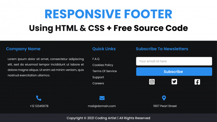
Hey everyone. Welcome to today tutorial. In today’s tutorial, we will learn how to create a responsive footer section. To build this footer, we need HTML and pure CSS.
I have a tutorial on building responsive header shapes on my youtube channel. If you are interested, you can check them out here.
Video Tutorial:
If you prefer to learn while coding along to a video tutorial, check the video down below. Also, do subscribe to my youtube channel as I post new tutorials every alternate day.
Project Folder Structure:
Let us first create the project folder structure. We name the project folder- “Responsive Footer”. Within this folder, we have two files. First is the HTML document – index.html and second is the stylesheet – style.css.
HTML:
Let us code the HTML first. The HTML code consists of a footer tag. Inside the footer, we have three divs with the class row. These rows also have one more class name, which is primary, secondary, and copyright.
The primary div consists of a column div with the class about. Inside this, we have a p tag. Another column here is the links. And lastly, we have the column with class subscribe.
The secondary row consists of divs that wrap p tags. And finally, we have a copyright div with a p tag.
<!DOCTYPE html>
<html lang="en">
<head>
<meta name="viewport" content="width=device-width, initial-scale=1.0" />
<title>Responsive Footer</title>
<!-- Font Awesome CDN -->
<link
rel="stylesheet"
href="https://cdnjs.cloudflare.com/ajax/libs/font-awesome/6.0.0-beta2/css/all.min.css"
/>
<!-- Google Fonts -->
<link
href="https://fonts.googleapis.com/css2?family=Poppins:wght@400;600&display=swap"
rel="stylesheet"
/>
<!-- Stylesheet -->
<link rel="stylesheet" href="style.css" />
</head>
<body>
<footer>
<div class="row primary">
<div class="column about">
<h3>Company Name</h3>
<p>
Lorem ipsum dolor sit amet consectetur adipisicing elit. Vitae,
voluptatem corporis error non, corrupti delectus unde, incidunt
dolorem quam porro tenetur autem? Maxime aspernatur quas, natus
nesciunt harum obcaecati voluptatum.
</p>
</div>
<div class="column links">
<h3>Quick Links</h3>
<ul>
<li>
<a href="#faq">F.A.Q</a>
</li>
<li>
<a href="#cookies-policy">Cookies Policy</a>
</li>
<li>
<a href="#terms-of-services">Terms Of Service</a>
</li>
<li>
<a href="#support">Support</a>
</li>
<li>
<a href="#careers">Careers</a>
</li>
</ul>
</div>
<div class="column subscribe">
<h3>Subscribe</h3>
<div>
<input type="email" placeholder="Your email id here" />
<button>Subscribe</button>
</div>
<div class="social">
<i class="fa-brands fa-facebook-square"></i>
<i class="fa-brands fa-instagram-square"></i>
<i class="fa-brands fa-twitter-square"></i>
</div>
</div>
</div>
<div class="row secondary">
<div>
<p>
<i class="fas fa-phone-alt"></i>
</p>
<p>+12 123456789</p>
</div>
<div>
<p><i class="fas fa-envelope"></i></p>
<p>mail@domain.com</p>
</div>
<div>
<p><i class="fas fa-map-marker-alt"></i></p>
<p>1234 Pearl Street</p>
</div>
</div>
<div class="row copyright">
<p>Copyright © 2021 Coding Artist | All Rights Reserved</p>
</div>
</footer>
</body>
</html>
CSS:
Now we style the footer and make it responsive using CSS. We start by removing padding and margins from the body. We also set the min-height of the body to 100vh. In the following step, we use the flex layout to align the footer at the bottom of the page.
The footer has a background colour of ‘#121315‘. And we set the font size to 16px. For all the elements inside the footer, we set the box-sizing to the border-box.
We add some paddings to each row. We set the column width in the ratio of 1:2:1.
Now for each column, we set the width to 100% and display it to flex. We style the quick links to remove the bullets and the underline below the text.
Other Tutorial You Might Like:
- Built Tabs Using HTML,CSS & Javascript
- Birthday Card With HTML and CSS
- Typing Test | HTML, CSS And Javascript
We add a simple hover effect on each link so they change their colour on the hover.
To style the buttons and input, we set the width to 100% and add a border-radius of 5px. We also add a background colour to the button.
Similarly, we also style the social icons and add hover effects to them.
We also add styles to the row with class secondary and row with class copyright.
Finally, we add media queries. The media query has a breakpoint at a max-width of 850px. At this breakpoint, each column of the row primary is at its 100% width. We also change the flex-direction of the secondary div to the column.
body {
  padding: 0;
  margin: 0;
  min-height: 100vh;
  display: flex;
  align-items: flex-end;
}
footer {
  background-color: #121315;
  color: #ffffff;
  font-size: 16px;
}
footer * {
  font-family: "Poppins", sans-serif;
  box-sizing: border-box;
  border: none;
  outline: none;
}
.row {
  padding: 2em 1em;
}
.row.primary {
  display: grid;
  grid-template-columns: 2fr 1fr 2fr;
  align-items: stretch;
}
.column {
  width: 100%;
  display: flex;
  flex-direction: column;
  padding: 0 2em;
  min-height: 15em;
}
h3 {
  width: 100%;
  text-align: left;
  color: #2a8ded;
  font-size: 1.6em;
  white-space: nowrap;
}
ul {
  list-style: none;
  display: flex;
  flex-direction: column;
  padding: 0;
  margin: 0;
}
li:not(:first-child) {
  margin-top: 0.8em;
}
ul li a {
  color: #ffffff;
  text-decoration: none;
}
ul li a:hover {
  color: #2a8ded;
}
.about p {
  text-align: justify;
  line-height: 2;
  margin: 0;
}
input,
button {
  font-size: 1em;
  padding: 1em;
  width: 100%;
  border-radius: 5px;
  margin-bottom: 5px;
}
button {
  background-color: #2a8ded;
  color: #ffffff;
}
div.social {
  display: flex;
  justify-content: space-around;
  font-size: 2.4em;
  flex-direction: row;
  margin-top: 0.5em;
}
.social i:hover {
  color: #2a8ded;
}
.row.secondary {
  display: flex;
  justify-content: space-around;
  text-align: center;
}
.row.secondary i {
  font-size: 1.8em;
  color: #2a8ded;
}
.row.secondary div {
  padding: 1em 0;
  width: 100%;
}
.row.secondary div:hover {
  background-color: #25262e;
}
.copyright {
  padding: 0.3em 1em;
  background-color: #25262e;
}
.copyright p {
  font-size: 0.9em;
  text-align: center;
}
@media screen and (max-width: 850px) {
  .row.primary {
    grid-template-columns: 1fr;
  }
  .row.secondary {
    flex-direction: column;
  }
}
And as easy as that we have created a responsive footer section with HTML and CSS. If you have any issues while creating this project, you can download the source code by clicking on the download button below. Also, do drop your ideas, suggestions and feedback in the comments below.


