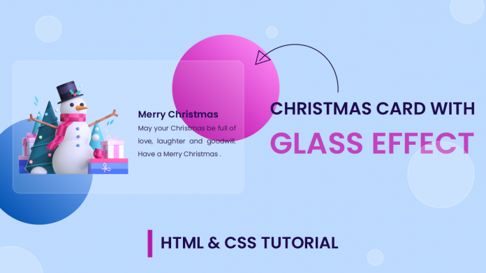
Hello everyone. Welcome to today’s tutorial. In today’s tutorial, we will learn how to create a Christmas card with a stunning glass effect. This glass effect looks simple and clean yet is captivating.
To create this project, we need HTML and CSS. This tutorial is a part of Christmas special CSS tutorials. You can check out the whole Christmas tutorial collection here.
Video Tutorial:
If you like to code along with me, you can check out the video version of this tutorial here down below. Also do subscribe to my youtube channel where I post new and exciting tutorials every alternate day. Along with tutorials, I also post all the tips, tricks and resources for web developers.
Project Folder Structure:
Let us first create the project folder structure before proceeding to the coding. The project folder consists of an HTML document, a stylesheet and an image. We name the HTML document – index.html. On the other hand, we assign the name for the CSS file – style.css. The image used in this tutorial is available for download along with the source code at the end of this tutorial.
HTML:
We begin with the HTML code. Now copy the code provided to you below and paste it into your HTML document.
The HTML document consists of a div with the class container. Inside this div, we have two divs. The first has a class name shape and the other has a class name card.
Within the card we have the snowman image We also have a text container that includes an h2 title and p tag.
<!DOCTYPE html>
<html lang="en">
  <head>
    <meta name="viewport" content="width=device-width, initial-scale=1.0" />
    <title>Glass Christmas Card</title>
    <!-- Google Font -->
    <link
      <link
      href="https://fonts.googleapis.com/css2?family=Poppins:wght@300;600&display=swap"
      rel="stylesheet"
    />
    <!-- Stylesheet -->
    <link rel="stylesheet" href="style.css" />
  </head>
  <body>
    <div class="container">
      <div class="shapes"></div>
      <div class="card">
        <img src="snowman-image.png" />
        <div class="text-container">
          <h2>Merry Christmas</h2>
          <p>
            May your Christmas be full of love, laughter and goodwill. Have a
            Merry Christmas .
          </p>
        </div>
      </div>
    </div>
  </body>
</html>
CSS:
Now that we have the structure ready. Let us now give this structure a classy modern look using CSS. Firstly copy the code below and paste it into your style.
We start by removing the margins and paddings from all the elements. Following this, we set the background colour for the body as ‘#bddaff’. We set dimensions for the container and create two circles using the shapes div. To add vibrance to these circles, we use gradients as their background.
We add the glass look to the card by simply adding a somewhat transparent background to the card. To enhance this effect we also add a slightly transparent border.
We position the image and text-container.
The text-container is placed outside the card. To hide the text-container we set the overflow of the card to hidden. On hover, the text-container moves inside the card thereby creating a stunning hover effect.
* {
  padding: 0;
  margin: 0;
  box-sizing: border-box;
  font-family: "Poppins", sans-serif;
}
body {
  background-color: #bddaff;
}
.container {
  height: 450px;
  width: 600px;
  position: absolute;
  transform: translate(-50%, -50%);
  left: 50%;
  top: 50%;
}
.shapes {
  height: 250px;
  width: 250px;
  background: linear-gradient(45deg, #b507a7, #fa80f0);
  border-radius: 50%;
  position: absolute;
  right: 0;
}
.shapes:before {
  content: "";
  position: absolute;
  height: 250px;
  width: 250px;
  top: 197px;
  background: linear-gradient(45deg, #0756b5, #80affa);
  border-radius: 50%;
  right: 347px;
}
.card {
  position: absolute;
  height: 300px;
  width: 550px;
  background-color: rgba(255, 255, 255, 0.15);
  border: 2px solid rgba(255, 255, 255, 0.2);
  transform: translate(-50%, -50%);
  top: 50%;
  left: 50%;
  border-radius: 8px;
  box-shadow: 0 0 40px rgba(0, 0, 0, 0.08);
  cursor: pointer;
  overflow: hidden;
}
.card img {
  position: absolute;
  width: 300px;
  filter: drop-shadow(0 0 20px rgba(26, 0, 68, 0.34));
  bottom: 0;
  left: 120px;
  transition: 0.5s;
}
.text-container {
  position: absolute;
  height: 100%;
  display: flex;
  flex-direction: column;
  justify-content: center;
  font-size: 14px;
  width: 250px;
  right: -250px;
  transition: 0.5s;
}
.card h2 {
  color: #1f0b50;
  text-transform: uppercase;
}
.card p {
  font-weight: 300;
  text-align: justify;
  color: #261844;
  line-height: 1.8;
  letter-spacing: 0.3px;
}
.card:hover img {
  width: 250px;
  left: 15px;
  bottom: 20px;
}
.card:hover .text-container {
  right: 15px;
}
That’s it for this tutorial. I would love to hear from you so don’t forget to drop your queries, suggestions and feedback down below. Also if you face any issues while creating this card do download the source code by simply clicking on the download button below.
Happy Coding!


