Video Tutorial:
If you would like to learn by watching a video tutorial rather than reading this blog post, check out the video here down below. Also, subscribe to my youtube channel, where I post new tutorials every alternate day. Along with these tutorials, I also post tips, tricks, and multiple-choice questions.
Project Folder Structure:
Let us start by creating a project folder structure. We create a folder called ‘Cute Duck Art’. Within this folder, we have two files- index.html and style.css. The first file is the HTML document, while the second file is the stylesheet.
HTML:
We start with HTML code. We use HTML to create the structure needed for our illustration. Copy the code below and paste it into your HTML document.
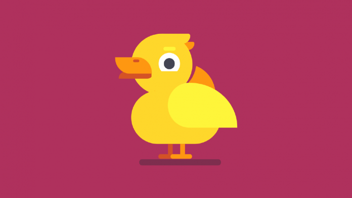
In the HTML code, we have a container div. Inside this container, we have five divs. We assign the class name for these divs as – duck-body, feather, eye, beak and leg.
<!DOCTYPE html>
<html lang="en">
  <head>
    <meta name="viewport" content="width=device-width, initial-scale=1.0" />
    <title>Cute Duck CSS Art</title>
    <!-- Stylesheet -->
    <link rel="stylesheet" href="style.css" />
  </head>
  <body>
    <div class="container">
      <div class="duck-body"></div>
      <div class="feather"></div>
      <div class="eye"></div>
      <div class="beak"></div>
      <div class="leg"></div>
    </div>
  </body>
</html>
CSS:
Let us use CSS to style and shape these elements to look like a duck. Copy the code provided below and paste it into your stylesheet. We use the ‘duck-body’ div to create the round shape for the duck’s head. Next, we use the ‘duck-body’ before and after pseudo-elements to create the tail feather and body of the duck.
Further, we use the feather div to create the wing. We then use the before and after elements to create the little feathers on the duck’s head.
In the next step, we use the eye div and its pseudo-elements to create the eye, eye-ball and eye-brow.
Next, we shape the beak element to look like the upper and lower beak.
Finally, we use box shadows and leg elements to create both the legs for the duck.
*,
*:before,
*:after {
  padding: 0;
  margin: 0;
  box-sizing: border-box;
}
body {
  background-color: #af315d;
}
.container {
  height: 500px;
  width: 420px;
  position: absolute;
  transform: translate(-50%, -50%);
  top: 50%;
  left: 50%;
}
.duck-body {
  background-color: #fed72b;
  height: 150px;
  width: 150px;
  border-radius: 50%;
  position: absolute;
  top: 100px;
  left: 100px;
}
.duck-body:before {
  position: absolute;
  content: "";
  background-color: transparent;
  height: 150px;
  width: 150px;
  box-shadow: 80px 45px 0 #fe9711;
  border-radius: 50%;
  left: 10px;
  top: -5px;
  transform: rotate(30deg);
}
.duck-body:after {
  position: absolute;
  content: "";
  background-color: #fed72b;
  height: 130px;
  width: 220px;
  position: absolute;
  top: 140px;
  border-radius: 70px;
}
.feather {
  position: absolute;
  background-color: #fef53a;
  width: 170px;
  height: 110px;
  top: 220px;
  left: 190px;
  border-radius: 31% 69% 69% 31%/ 50% 100% 0 50%;
}
.feather:before {
  position: absolute;
  content: "";
  background-color: #fe9711;
  width: 80px;
  height: 20px;
  top: -100px;
  left: -15px;
  z-index: -1;
  border-radius: 0 5px 20px 0;
}
.feather:after {
  position: absolute;
  content: "";
  background-color: #fed72b;
  width: 70px;
  height: 25px;
  top: -120px;
  left: -15px;
  border-radius: 0 5px 20px 0;
}
.eye {
  position: absolute;
  background-color: #434453;
  height: 27px;
  width: 27px;
  top: 160px;
  left: 180px;
  border-radius: 50%;
  box-shadow: 0 0 0 13px #fefefe;
}
.eye:before {
  position: absolute;
  content: "";
  background-color: #fef53a;
  height: 10px;
  width: 30px;
  border-radius: 5px;
  bottom: 45px;
  left: -1px;
}
.eye:after {
  position: absolute;
  content: "";
  background-color: #fed72b;
  height: 20px;
  width: 50px;
  top: 32px;
  left: -10px;
}
.beak {
  background-color: #d55326;
  height: 20px;
  width: 80px;
  position: absolute;
  top: 190px;
  left: 70px;
  border-radius: 35% 10% 16% 0 / 100% 0 30% 10%;
}
.beak:before {
  position: absolute;
  content: "";
  height: 40px;
  width: 90px;
  background-color: #fe9711;
  border-radius: 0 40% 0 40%/0 100% 0 100%;
  bottom: 12px;
  right: -1px;
}
.beak:after {
  position: absolute;
  content: "";
  height: 7px;
  width: 15px;
  background-color: #d45326;
  bottom: 40px;
  right: 30px;
  border-radius: 5px;
}
.leg {
  position: absolute;
  background-color: #fe9711;
  width: 12px;
  height: 30px;
  top: 370px;
  left: 220px;
  box-shadow: -30px 0 #d45326;
}
.leg:before {
  position: absolute;
  content: "";
  background-color: #fe9711;
  width: 52px;
  height: 12px;
  left: -23px;
  top: 25px;
  border-radius: 5px;
  box-shadow: -30px 0 #d45326;
}
.leg:after {
  position: absolute;
  content: "";
  background-color: #7e2e4e;
  height: 15px;
  width: 200px;
  top: 38px;
  left: -100px;
  border-radius: 7px;
}
Our duck illustration is now ready. If you have any issues while creating this CSS Art, you can download the source code by clicking on the download button below.
Also, If you have any queries, suggestions, or feedback do drop them in the comments below.
Happy Coding!


