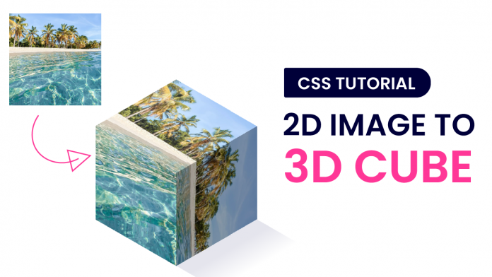
Hey everyone. Welcome to today’s tutorial. In today’s tutorial, we will learn how to create a 3D image cube from a 2D image. If you look at the output, it might seem a little complicated, but I assure you that this is a simple and quick tutorial. Only with a few easy steps, we are going to achieve this effect.
In this tutorial we make use of different transforms, hence I would say this is an intermediate-level CSS project. If you are looking for more such tutorials to improve your CSS skills, you should check out this playlist here. This playlist contains a bunch of tutorials that will help you enhance your CSS skills.
Video Tutorial:
If you are interested to learn with the help of a video tutorial, instead of reading this blog post, you can check out the video down below.
Project Folder Structure:
Before we start coding, let us take a look at our project folder structure. We create a project folder called 3D image cube. Inside this folder, we have to file these files index.html and style.css.
Apart from these files, we have an image file. The size of this image file is 2000 x 2000 px. We crop this image into three separate images. The first image is the top left corner of the image with the size 1000 x 1000 pixels. The second images of the same size are in the top right corner of the image. While the last image is the cropped version of the bottom left corner of our image.
HTML:
We begin with the HTML code. Copy the code below and paste it into your HTML document.
<!DOCTYPE html>
<html lang="en">
  <head>
    <meta name="viewport" content="width=device-width, initial-scale=1.0" />
    <title>3D Cube From Image</title>
    <link rel="stylesheet" href="style.css" />
  </head>
  <body>
    <div class="container">
      <div class="face left">
        <img src="left.jpg" />
      </div>
      <div class="face right">
        <img src="right.jpg" />
      </div>
      <div class="face top">
        <img src="top.jpg" />
      </div>
    </div>
  </body>
</html>
CSS:
Next, we style these elements and the images to make them look like a cube by using CSS. For this copy, the code provided to you below and paste it into your style sheet.
body {
  padding: 0;
  margin: 0;
  overflow: hidden;
}
.container {
  height: 0;
  width: 0;
  position: absolute;
  margin: auto;
  left: 0;
  right: 0;
  top: 0;
  bottom: 0;
}
.face {
  position: relative;
  transform-origin: 0 0;
  height: 16em;
  width: 16em;
}
.left {
  transform: rotate(90deg) skewX(-30deg) scaleY(0.864);
}
.right {
  transform: rotate(-30deg) skewX(-30deg) scaleY(0.864);
  bottom: 16em;
}
.top {
  transform: rotate(210deg) skew(-30deg) scaleY(0.864);
  bottom: 32em;
}

img {
  width: 100%;
}
.left img {
  transform: rotate(-90deg);
}
.right img {
  transform: rotate(90deg);
}
.top img {
  transform: rotate(180deg);
}
.top:after,
.right:after {
  position: absolute;
  content: "";
  height: 100%;
  width: 100%;
  left: 0;
  top: 0;
}
.top:after {
  background-color: rgba(255, 255, 255, 0.15);
}
.right:after {
  background-color: rgba(0, 0, 0, 0.35);
}
.top:before {
  position: absolute;
  content: "";
  background: linear-gradient(
    to left,
    rgba(1, 2, 83, 0.1) 15%,
    rgba(1, 2, 83, 0) 50%
  );
  height: 100%;
  width: 100%;
  left: -200%;
  top: -100%;
}
@media screen and (max-width: 700px) {
  .container {
    font-size: 0.6em;
  }
}
You can use any image of your choice. That’s it for this tutorial. If you face any issues while creating this project, you can download the source code by clicking on the download button below. If you have any queries, suggestions, or feedback comment below.
Happy coding!


Hai, I think I am unable to download the source code. Maybe a quick fix will do?
There’s still no source code, please fix!