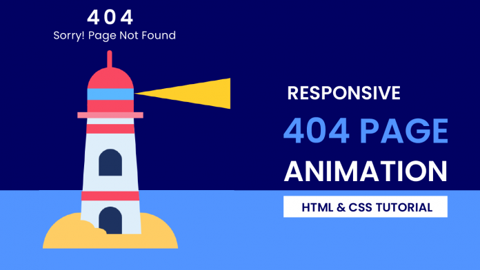
Hey everyone. Welcome to today’s tutorial. In this tutorial, we will learn how to create a 404-page animation. To build this animation, we need HTML and CSS.
This is a beginner-friendly CSS project. If you are looking for more such projects, you can check out this playlist here. This playlist consists of more than 50 + tutorials that will help you learn CSS. This playlist is suitable for all kinds of CSS learners.
In this project, we see a lighthouse that is searching for something. We create this lighthouse from scratch using HTML and CSS. We also animated using CSS. This is responsive CSS animation. It is displayed perfectly on mobile phones, tablets as well as monitors.
Video Tutorial:
If you are interested to learn through video tutorials rather than reading this blog post, you can check out the video down below. Also, subscribe to my YouTube channel, where I post new tips, tricks and tutorials regularly.
Project Folder Structure:
Before we start coding, let us take a look at the project folder structure. Create a project folder called 404-page animation. Inside this folder, we have two files. These files are index.html and style.css.
HTML:
The first file is the HTML document and the second one is the style sheet.
We begin with HTML code. Now copy the code below and paste it into an HTML document. HTML creates the structure and layout of our animation.
<!DOCTYPE html>
<html lang="en">
  <head>
    <meta name="viewport" content="width=device-width, initial-scale=1.0" />
    <title>404 Page Animation</title>
    <!-- Google Fonts -->
    <link
      href="https://fonts.googleapis.com/css2?family=Poppins:wght@400;600&display=swap"
      rel="stylesheet"
    />
    <!-- Stylesheet -->
    <link rel="stylesheet" href="style.css" />
  </head>
  <body>
    <div class="text">
      <h2>404</h2>
      <h3>Sorry! Page Not Found</h3>
    </div>
    <div class="container">
      <div class="sand"></div>
      <div class="tower">
        <div class="pole"></div>
        <div class="door"></div>
        <div class="light-base"></div>
        <div class="dome"></div>
        <div class="light"></div>
      </div>
      <div class="sand-extra"></div>
    </div>
  </body>
</html>
CSS:
We next animate illustrations created with HTML using CSS. For this copy, the code provided to you below and paste it into your style sheet.
body {
  height: 100vh;
  padding: 0;
  margin: 0;
  background: linear-gradient(#010163 80%, #5294ff 80%);
}
.container {
  height: 32.87em;
  width: 21.87em;
  position: absolute;
  transform: translateX(-50%);
  left: 50%;
  bottom: 0;
}
.sand {
  background-color: #fecd64;
  height: 6.25em;
  width: 100%;
  border-radius: 10.93em 10.93em 0 0;
  position: absolute;
  top: 26.62em;
}
.tower {
  height: 0;
  width: 7.5em;
  border-bottom: 18.75em solid #deeefa;
  border-left: 1.25em solid transparent;
  border-right: 1.25em solid transparent;
  position: absolute;
  left: 5.93em;
  top: 11.31em;
}
.tower:before {
  position: absolute;
  content: "";
  top: 11.87em;
  left: -1em;
  width: 9.18em;
  height: 0;
  border-bottom: 1.56em solid #f94862;
  border-left: 0.12em solid transparent;
  border-right: 0.12em solid transparent;
}
.tower:after {
  position: absolute;
  content: "";
  top: 0.93em;
  right: -0.18em;
  height: 0;
  width: 7.62em;
  border-bottom: 1.56em solid #f94862;
  border-left: 0.12em solid transparent;
  border-right: 0.12em solid transparent;
}
.pole {
  height: 3em;
  width: 0.8em;
  background-color: #f94862;
  border-radius: 0.5em 0.5em 0 0;
  position: absolute;
  left: 3.2em;
  bottom: 8em;
}
.door {
  width: 3.75em;
  height: 4.37em;
  background-color: #1d3260;
  border-radius: 2.18em 2.18em 0 0;
  position: absolute;
  left: 1.87em;
  top: 14.37em;
  box-shadow: 0 -9.37em #1d3260;
}
.light-base {
  background-color: #f7859a;
  height: 1em;
  width: 10.62em;
  position: absolute;
  left: -1.56em;
  bottom: 0;
}
.light-base:before {
  position: absolute;
  content: "";
  background-color: #f94862;
  height: 1.25em;
  width: 7.5em;
  bottom: 1em;
  left: 1.56em;
  right: 0.06em;
}
.dome {
  position: absolute;
  height: 6.25em;
  width: 7.5em;
  background: linear-gradient(
    to bottom,
    #f94862 3.43em,
    #5ab7ff 3.43em,
    #5ab7ff 5.31em,
    #f94862 5.31em
  );
  bottom: 2em;
  border-radius: 3.75em 3.73em 0 0;
}
.light {
  width: 7.5em;
  border-right: 15.62em solid #fecf2b;
  border-top: 2.5em solid transparent;
  border-bottom: 2.5em solid transparent;
  position: absolute;
  bottom: 1.5em;
  left: 0;
  animation: search 4s infinite;
}
@keyframes search {
  50% {
    transform: translateX(-15.62em) rotateY(180deg);
  }
}
.sand-extra {
  height: 3.12em;
  width: 4.37em;
  background-color: #fecd64;
  border-radius: 50%;
  position: absolute;
  bottom: 1.87em;
  left: 4.06em;
  box-shadow: 2.5em 0.62em 0 -0.62em #fecd64;
}
.text {
  width: 90%;
  position: absolute;
  font-family: "Poppins", sans-serif;
  text-align: center;
  top: 5em;
  margin: auto;
  left: 0;
  right: 0;
  line-height: 1;
}
h2 {
  font-size: 3.8em;
  color: #ffffff;
  letter-spacing: 0.4em;
  margin-bottom: 0;
}
h3 {
  font-size: 1.2em;
  font-weight: 500;
  color: #ffffff;
  letter-spacing: 0.2em;
}
@media screen and (min-width: 800px) {
  .container {
    font-size: 18px;
  }
  .text {
    font-size: 12px;
    top: 3em;
  }
}
@media screen and (max-width: 550px) {
  .text,
  .container {
    font-size: 12px;
  }
}
That’s it for this tutorial. You can now go ahead and customise the Lighthouse the way you want. You can also change the text above.
If you face any difficulties while creating this project you can download the source code by clicking on the download button below. Also if you have any queries suggestions or feedback comment below.
Happy coding.


