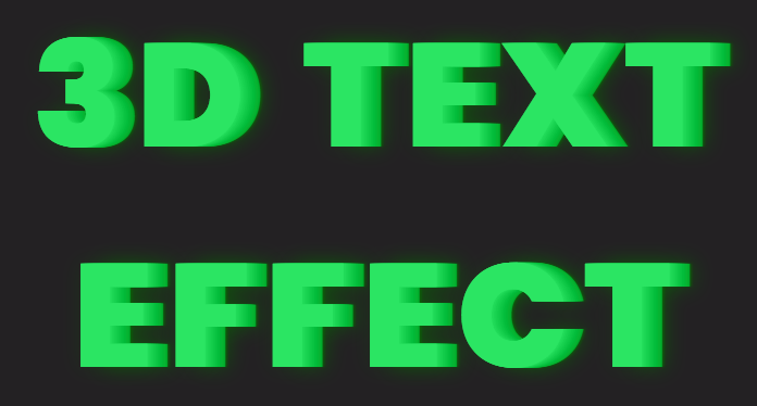
Hello friends. In today’s tutorial, I will teach you how to create a ‘3D Text Effect’. All you need is HTML and CSS, to create this project. This a beginner-friendly project. If you are looking for more complicated projects you can check out the playlist here.
Video Tutorial:
Before we move on to the actual tutorial, you can check out the video tutorial of this post here. If you like video tutorials like this subscribe to my YouTube channel, where I post new projects based on HTML, CSS, and Javascript regularly.
Project Folder Structure:
Let’s build the project folder structure before we begin writing the code. We create a project folder called ‘3D Text Effect’. Inside this folder, we have two files. These files are index.html and style.css.
HTML:
We begin with the HTML Code. First, create a file called – ‘index.html’. Copy the code below and paste it into your HTML file. We simply create a heading here and later style it using CSS.
<!DOCTYPE html>
<html lang="en">
  <head>
    <meta name="viewport" content="width=device-width, initial-scale=1.0" />
    <title>3D Text Effect</title>
    <!-- Google Font -->
    <link
      href="https://fonts.googleapis.com/css2?family=Rubik:wght@800&display=swap"
      rel="stylesheet"
    />
    <!-- Stylesheet -->
    <link rel="stylesheet" href="style.css" />
  </head>
  <body>
    <h1>3D TEXT <br />EFFECT</h1>
  </body>
</html>
CSS:
Next, we style our heading using CSS. For this copy, the code provided to you below and paste it into your stylesheet.
We begin by setting the font size after which we set the width to 100% to make the text span the full width of its container. Further, we set the text alignment to center and the position to absolute. Then we use the transform property to translate the text horizontally and vertically by -50% and set the top and left values to align the text in the center of the window. Then we set the font family, line spacing, and color for improving the appearance of the text. Finally, the text-shadow property is used to create the 3D effect. It sets multiple shadows with different offsets and shades of green to give a 3D appearance to the text.
h1 {
  font-size: 4.5em;
  width: 100%;
  text-align: center;
  position: absolute;
  transform: translate(-50%, -50%);
  top: 50%;
  left: 50%;
  font-family: "Rubik", sans-serif;
  letter-spacing: 0.1em;
  color: #2be563;
  text-shadow: 0 0 0 rgb(38, 224, 94), 1px 0 0 rgb(33, 219, 89),
    2px 0 0 rgb(28, 214, 84), 3px 0 0 rgb(23, 209, 79), 4px 0 0 rgb(18, 204, 74),
    5px 0 0 rgb(13, 199, 69), 6px 0 0 rgb(8, 194, 64), 7px 0 0 rgb(3, 189, 59),
    8px 0 0 rgb(2, 184, 54), 9px 0 0 rgb(7, 179, 49), 10px 0 0 rgb(12, 174, 44),
    11px 0 10px rgba(4, 110, 0, 0.6), 11px 0 1px rgba(4, 110, 0, 0.5),
    0 0 10px rgba(4, 110, 0, 0.2);
}
That’s all for this tutorial. If you face any issues while creating this code you can download the source code by clicking on the ‘Download Code’ button below. Now all you have to do is extract the files from the zipped folder.


