Introduction:
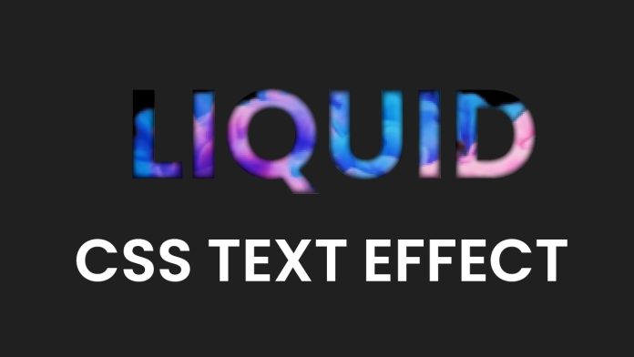
In this tutorial, we will explore an exciting technique to create a captivating liquid effect text using HTML and CSS. By applying a combination of positioning, background images, and text styling, we’ll achieve a visually stunning result that will enhance the aesthetics of your website. Let’s dive in and discover how to bring this eye-catching effect to life!
Things You Will Learn:
- Applying a custom font using CSS.
- Utilizing absolute positioning and transform properties for precise text placement.
- Implementing background images to create a liquid effect.
- Adjusting background size, position, and repeat properties for optimal visual impact.
- Utilizing webkit-specific CSS properties for advanced text styling.
Video Tutorial:
To follow along with this tutorial, you can watch the step-by-step video guide available on my YouTube channel.
Project Folder Structure:
To get started, let’s set up our project folder structure as follows:
- index.html
- style.css
- liquid-effect.gif
HTML:
Within the index.html file, we will construct the basic structure of our webpage and apply necessary markup. Here’s a sample HTML code snippet to guide you:
<!DOCTYPE html>
<html lang="en">
  <head>
    <meta name="viewport" content="width=device-width, initial-scale=1.0" />
    <title>Liquid Text Effect</title>
    <!-- Google Fonts -->
    <link
      href="https://fonts.googleapis.com/css2?family=Poppins:wght@700&display=swap"
      rel="stylesheet"
    />
    <!-- Stylesheet -->
    <link rel="stylesheet" href="style.css" />
  </head>
  <body>
    <h1>LIQUID EFFECT</h1>
  </body>
</html>
CSS:
Now, let’s move on to the style.css file and define the necessary CSS rules to create our liquid effect text. Take a look at the example code snippet below:
body {
  background-color: #202020;
}
h1 {
  font-family: "Poppins", sans-serif;
  width: 100vw;
  position: absolute;
  transform: translate(-50%, -50%);
  left: 50%;
  top: 50%;
  text-align: center;
  font-size: 5em;
  background: url(liquid-effect.gif);
  background-size: 150%;
  background-position: center;
  background-repeat: no-repeat;
  -webkit-text-fill-color: transparent;
  -webkit-background-clip: text;
}
Conclusion:
Congratulations! By following this tutorial, you have learned how to create an impressive liquid effect text using HTML and CSS. Through the combination of positioning, background images, and text styling techniques, you have gained the skills to add an eye-catching element to your web projects. Remember to experiment with different fonts, background images, and sizes to unleash your creativity and personalize the effect to match your website’s style. Have fun exploring and implementing this unique text effect in your future endeavors!


