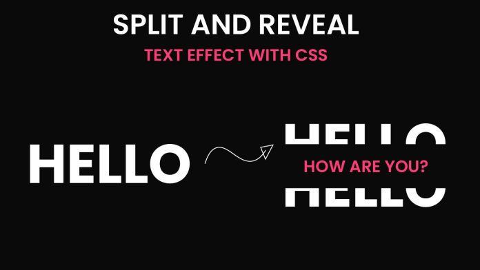
Introduction:
In this blog post, we will explore how to create an impressive CSS animation using HTML and CSS. By following this tutorial, you will learn how to build a captivating user interface element that incorporates smooth transitions and eye-catching effects. Whether you are a beginner or an experienced developer, this tutorial will provide valuable insights into creating engaging web designs.
Things You Will Learn:
- How to structure your project folder
- HTML markup for the animation
- CSS styling for the animation
- How to create text effects for splitting and revealing text on hover
Video Tutorial:
To supplement this written tutorial, I have created a video tutorial on my YouTube channel that demonstrates the step-by-step process of building this CSS animation. You can find the video tutorial below.
Project Folder Structure:
Before we delve into the code, let’s discuss the project folder structure. To keep things organized, it’s essential to structure your project in a logical manner. Here’s a suggested folder structure for this CSS animation project:
- index.html
- style.css
HTML:
To begin, create an HTML file called index.html. Inside the file, we will set up the basic structure of our animation using semantic HTML elements.
<!DOCTYPE html>
<html lang="en">

<head>
  <meta name="viewport" content="width=device-width, initial-scale=1.0" />
  <title>Split & Reveal Text</title>
  <!-- Google Fonts -->
  <link href="https://fonts.googleapis.com/css2?family=Poppins:wght@700&display=swap" rel="stylesheet" />
  <!-- Stylesheet -->
  <link rel="stylesheet" href="style.css" />
</head>

<body>
  <div class="container">
    <p>How Are You?</p>
    <h1>HELLO</h1>
    <h1>HELLO</h1>
  </div>
</body>

</html>
CSS:
In the style.css file, we will define the styling rules for our animation. The CSS code includes the necessary properties to create the desired visual effects. It incorporates customizations such as background colors, font styles, positioning, and transition properties.
* {
  padding: 0;
  margin: 0;
  box-sizing: border-box;
  font-family: "Poppins", sans-serif;
}
body {
  background-color: #0a0a0a;
}
.container {
  position: absolute;
  transform: translate(-50%, -50%);
  left: 50%;
  top: 50%;
  height: 14.37em;
  width: 28.12em;
  cursor: pointer;
}
h1 {
  background-color: #0a0a0a;
  color: #ffffff;
  text-align: center;
  font-size: 9.37em;
  position: absolute;
}
p {
  color: #ff3c78;
  width: 100%;
  font-size: 2.5em;
  font-weight: 500;
  position: absolute;
  transform: translateY(-50%);
  top: 50%;
  text-align: center;
}
.container:hover h1:nth-child(2) {
  clip-path: polygon(0 0, 100% 0, 100% 50%, 0 50%);
  transform: translateY(-50px);
  transition: 0.3s;
}
.container:hover h1:nth-child(3) {
  clip-path: polygon(0 50%, 100% 50%, 100% 100%, 0 100%);
  transform: translateY(50px);
  transition: 0.3s;
}
Conclusion:
In this tutorial, we explored the process of creating a stunning CSS animation using HTML and CSS. By following the step-by-step instructions provided, you learned how to structure your project folder, write HTML markup, and apply CSS styles to bring the animation to life. Remember to watch the accompanying video tutorial on my YouTube channel for a comprehensive visual guide.
Thank you for joining me in this tutorial! If you have any questions or need further assistance, please leave a comment below or reach out to me on my YouTube channel. Happy coding!


