Introduction:
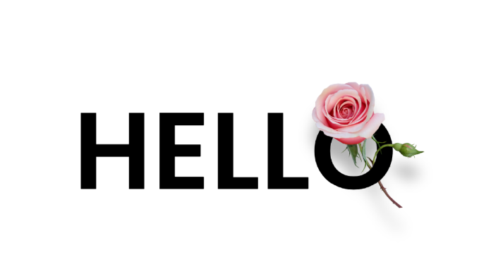
Welcome to this blog post where we will explore a captivating code tutorial that demonstrates how to create a Stunning 3D Text Effect using HTML and CSS. In this tutorial, you will learn how to combine these two languages to design an eye-catching effect that will enhance your web projects. So let’s dive in!
Things You Will Learn:
- How to structure the project folder
- HTML markup for creating the layout
- CSS styling for animation and visual effects
Video Tutorial:
To accompany this blog post, I have created a comprehensive video tutorial on my YouTube channel, where you can follow along with the coding process and gain a deeper understanding of each step.
Project Folder Structure:
Before we begin, let’s take a quick look at the recommended folder structure for this project:
- index.html
- styles.css
- rose.png (image file)
HTML:
The HTML code in this tutorial is straightforward and focuses on creating a simple container to hold the text and images. The structure includes a <div> element with a class of “container” where we position the text and images using CSS. Additionally, we include two <img> tags, one for the background image and the other for the foreground image, and an <h1> tag for the text.
<!DOCTYPE html>
<html lang="en">
  <head>
    <meta name="viewport" content="width=device-width, initial-scale=1.0" />
    <title>Stunning Text Effect</title>
  </head>
  <body>
    <div class="container">
      <img src="rose.png" class="img-back" />
      <h1>HELLO</h1>
      <img src="rose.png" class="img-front" />
    </div>
  </body>
</html>
CSS:
The CSS code is responsible for the visual appeal of our text animation. It includes styling for the container, text, and images. We utilize various properties such as position, transform, and clip-path to achieve the desired effect. Additionally, we apply drop shadows and adjust image sizes to enhance the overall appearance.
.container {
       height: 12em;
       width: 30em;
       position: absolute;
       transform: translate(-50%, -50%);
       left: 50%;
       top: 50%;
     }
     h1 {
       font-size: 10em;
       font-family: "Poppins", sans-serif;
       position: absolute;
       line-height: 0;
     }
     img {
       position: absolute;
       width: 12.5em;
       right: -3em;
     }
     .img-back {
       filter: drop-shadow(0 2em 0.6em rgba(0, 0, 0, 0.3));
     }
     .img-front {
       clip-path: polygon(0 0, 100% 0, 100% 50%, 0 50%);
     }
Conclusion:
In conclusion, this code tutorial has provided you with the knowledge and skills to create an impressive text animation using HTML and CSS. By following the step-by-step instructions and exploring the accompanying video tutorial, you can now incorporate this engaging effect into your own web projects. Feel free to experiment and customize the code to suit your creative vision. Have fun coding and remember to visit my YouTube channel for more exciting tutorials!


