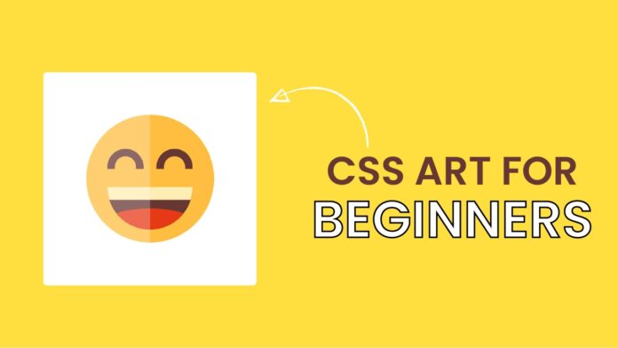
Introduction:
In this tutorial, we will walk through the process of creating a charming emoji face using HTML and CSS. We’ll break down the code step by step and explain how each element contributes to the final design. By the end of this tutorial, you will have a good understanding of HTML and CSS techniques for creating visually appealing and interactive web elements.
Things You Will Learn:
- Building a responsive container for your emoji.
- Constructing a smiley face with eyes, mouth, and a cute color scheme.
- Using CSS to create shapes and apply styling for a playful look.
Video Tutorial:
If you are interested to learn by watching a video tutorial rather than reading a blog post you can check out the video down below. Also, subscribe to my YouTube channel where I post new tutorials every alternate day.
Project Folder Structure:
Now before we move on to actual coding we create a project folder structure. We name the project folder – ”CSS Art for Beginners”. Within this folder, we have 2 files. These files are:
- index.html
- style.css
HTML:
We begin with the HTML code. Copy the code below and paste it into your HTML document.
<!DOCTYPE html>
<html lang="en">
  <head>
    <meta name="viewport" content="width=device-width, initial-scale=1.0" />
    <title>Happy Emoji CSS</title>
    <link rel="stylesheet" href="style.css" />
  </head>
  <body>
    <div class="container">
      <div class="emoji">
        <div class="mouth"></div>
      </div>
    </div>
  </body>
</html>
CSS:
Next, we style our code using CSS. For this copy, the code provided to you below and paste it into your stylesheet.
* {
  padding: 0;
  margin: 0;
  box-sizing: border-box;
}
body {
  background-color: #ffdf40;
}
.container {
  height: 31.25em;
  width: 31.25em;
  background-color: #ffffff;
  border-radius: 0.5em;
  position: absolute;
  transform: translate(-50%, -50%);
  top: 50%;
  left: 50%;
}
.emoji {
  height: 18.75em;
  width: 18.75em;
  background-color: #ffbe40;
  position: absolute;
  transform: translate(-50%, -50%);
  top: 50%;
  left: 50%;
  border-radius: 50%;
}
.emoji:before,
.emoji:after {
  position: absolute;
  content: "";
  height: 1.87em;
  width: 3.12em;
  border: 1.12em solid #663733;
  border-radius: 5em 5em 0 0;
  border-bottom: none;
  top: 5em;
}
.emoji:before {
  left: 3.12em;
}
.emoji:after {
  right: 3.12em;
}
.mouth {
  position: absolute;
  background-color: #663733;
  height: 6.25em;
  width: 12.5em;
  border-radius: 0 0 6.25em 6.25em;
  margin: auto;
  left: 0;
  right: 0;
  top: 10.62em;
  overflow: hidden;
}
.mouth:before {
  position: absolute;
  content: "";
  height: 1.87em;
  width: 100%;
  background-color: #ffedb3;
}
.mouth:after {
  position: absolute;
  content: "";
  height: 3.75em;
  width: 100%;
  background-color: #e63a17;
  top: 3.12em;
  border-radius: 50% 50% 0 0;
}
.container:after {
  content: "";
  position: absolute;
  height: 100%;
  width: 50%;
  background-color: rgba(255, 255, 255, 0.25);
}
Conclusion:
Creating a playful emoji face using HTML and CSS is a fun project that helps you learn essential web development skills. You’ve now gained experience in structuring HTML elements and applying CSS styling to create visually appealing designs. Remember to explore further and experiment with different colors, shapes, and expressions to make your emoji even more unique. Have fun coding and happy designing!


