Introduction:
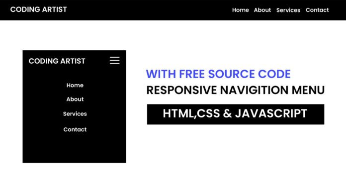
In this tutorial, I’ll show you how to create a mobile-friendly navigation menu using HTML, CSS, and JavaScript. This menu toggles on and off with a click, making it easy for users to access your site’s navigation on small screens. You’ll find it simple and adaptable for any website.
Things You Will Learn:
- How to structure a mobile menu using HTML
- Applying basic CSS to style the menu and hide/show functionality
- Implementing JavaScript to toggle the menu’s visibility
Video Tutorial:
If you are interested to learn by watching a video tutorial rather reading a blog post you can check out the video down below. Also subscribe to my YouTube channel where I post new tutorials every alternate day.
Project Folder Structure:
Let us explore the project folder structure. The project folder consists of 3 files. The HTML file creates the elements required to build the structure and layout of our project. Next, the CSS file styles the elements that we have created with CSS. And Finally Javascript adds functionality to our project. The files used are:
- index.html
- style.css
- script.js
HTML:
We begin with the HTML code. Copy the code below and paste it into your HTML document.
<!DOCTYPE html>
<html lang="en">
  <head>
    <meta name="viewport" content="width=device-width, initial-scale=1.0" />
    <title>Responsive Navigation Menu</title>
    <link rel="stylesheet" href="style.css" />
  </head>
  <body>
    <nav class="navbar">
      <div class="logo">Coding Artist</div>
      <div class="menu-toggle" id="mobile-menu">
        <span class="bar"></span>
        <span class="bar"></span>
        <span class="bar"></span>
      </div>
      <ul class="nav-list">
        <li><a href="#home">Home</a></li>
        <li><a href="#about">About</a></li>
        <li><a href="#services">Services</a></li>
        <li><a href="#contact">Contact</a></li>
      </ul>
    </nav>
    <script src="script.js"></script>
  </body>
</html>
CSS:
Next, we style our code using CSS. For this copy, the code provided to you below and paste it into your stylesheet.
* {
margin: 0;
padding: 0;
box-sizing: border-box;
}
body {
font-family: "Poppins", sans-serif;
}
.navbar {
display: flex;
justify-content: space-between;
align-items: center;
background-color: #000000;
padding: 10px 20px;
}
.logo {
color: #ffffff;
font-size: 24px;
}
.nav-list {
list-style: none;
display: flex;
padding: 15px;
}
.nav-list li {
position: relative;
margin: 0 15px 0 0;
}
.nav-list a {
color: #ffffff;
text-decoration: none;
transition: color 0.3s;
}
.nav-list a:hover {
color: #4570ff;
}

/*Mobile Styles */
.menu-toggle {
display: none;
flex-direction: column;
cursor: pointer;
}
.bar {
height: 3px;
width: 25px;
background-color: #ffffff;
margin: 3px 0;
}

/* Media Queries */
@media (max-width: 768px) {
.nav-list {
display: none;
flex-direction: column;
width: 100%;
position: absolute;
top: 47px;
left: 0;
background-color: #000000;
}
.nav-list li {
padding: 15px;
text-align: center;
}
.nav-list.active {
display: flex;
}
.menu-toggle {
display: flex;
}
}
JS:
Finally, we add functionality using Javascript. For this once again copy the code below and paste it into your script file.
const mobileMenu = document.getElementById("mobile-menu");
const navList = document.querySelector(".nav-list");
mobileMenu.addEventListener("click", () => {
navList.classList.toggle("active");
});
Conclusion:
Congratulations! You’ve created a simple yet functional mobile menu toggle using JavaScript. This toggle menu is highly useful for mobile navigation, especially when screen space is limited. You can further customize the menu’s appearance and behavior to fit your site’s needs.


