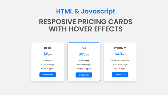
Creating clean, visually appealing pricing sections is essential for modern websites, especially those offering digital products or subscription services. In this tutorial, we’ll explore how to build a beautiful and interactive pricing card layout using just HTML and CSS—no JavaScript required!
HTML Structure:
The HTML sets up a section containing three pricing cards: Basic, Pro, and Premium. Each card is wrapped inside a <div> with the class pricing-card, and contains a plan name, price, a list of features, and a call-to-action button. The “Pro” card stands out with an additional featured class, giving it special styling.
<!DOCTYPE html>
<html lang="en">
  <head>
    <meta charset="UTF-8" />
    <meta name="viewport" content="width=device-width, initial-scale=1.0" />
    <title>Pricing Cards With Hover Effect</title>
    <link
      href="https://fonts.googleapis.com/css2?family=Poppins:wght@300;500;600&display=swap"
      rel="stylesheet"
    />
    <link rel="stylesheet" href="style.css" />
  </head>
  <body>
    <section class="pricing-section">
      <div class="pricing-card">
        <h3>Basic</h3>
        <h2>$9<span>/mo</span></h2>
        <ul>
          <li>1 Website</li>
          <li>10GB Storage</li>
          <li>Email Support</li>
        </ul>
        <button>Choose Plan</button>
      </div>
      <div class="pricing-card featured">
        <h3>Pro</h3>
        <h2>$29<span>/mo</span></h2>
        <ul>
          <li>5 Websites</li>
          <li>50GB Storage</li>
          <li>Priority Support</li>
        </ul>
        <button>Choose Plan</button>
      </div>
      <div class="pricing-card">
        <h3>Premium</h3>
        <h2>$49<span>/mo</span></h2>
        <ul>
          <li>Unlimited Websites</li>
          <li>200GB Storage</li>
          <li>24/7 Support</li>
        </ul>
        <button>Choose Plan</button>
      </div>
    </section>
  </body>
</html>
CSS Styling:
The CSS brings the cards to life with a modern and clean design. The cards are styled with rounded corners, shadows, and centered content to keep everything neat and readable. The .pricing-section uses flexbox to align the cards in a row with spacing and wraps them on smaller screens.
Each card features a soft hover animation using transform: scale(1.05) that slightly enlarges the card to create a responsive, interactive feel. The background color also changes on hover to improve visual feedback.
* {
  padding: 0;
  margin: 0;
  box-sizing: border-box;
}
body {
  font-family: "Poppins", sans-serif;
  background: #f2f2f2;
  padding: 50px;
  display: flex;
  justify-content: center;
}
.pricing-section {
  display: flex;
  gap: 30px;
  flex-wrap: wrap;
}
.pricing-card {
  background-color: #ffffff;
  padding: 30px;
  border-radius: 15px;
  width: 280px;
  text-align: center;
  box-shadow: 0 10px 20px rgba(0, 0, 0, 0.1);
  transition: transform 0.3s ease, background 0.3s ease;
  cursor: pointer;
}
.pricing-card:hover {
  transform: scale(1.05);
  background: #f0f8ff;
}
.pricing-card h3 {
  font-weight: 600;
  font-size: 1.4rem;
  color: #333333;
  margin-bottom: 10px;
}
.pricing-card h2 {
  font-size: 2rem;
  color: #0077ff;
  margin-bottom: 20px;
}
.pricing-card h2 span {
  font-size: 0.9rem;
  color: #666666;
}
.pricing-card ul {
  list-style: none;
  margin-bottom: 20px;
}
.pricing-card ul li {
  margin: 10px 0;
  color: #444444;
}
.pricing-card button {
  background-color: #0077ff;
  color: #ffffff;
  border: none;
  padding: 12px 25px;
  border-radius: 8px;
  font-size: 1rem;
  transition: background 0.3 ease;
}
.pricing-card button:hover {
  background: #005ecb;
}
.featured {
  border: 2px solid #0077ff;
}


