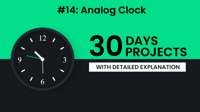
Creating an analog clock using web technologies is a fun and rewarding way to practice DOM manipulation, positioning, and working with real-time data. In this post, we’ll walk through how the HTML, CSS, and JavaScript work together to bring this clock to life.
🧱 HTML Structure
We start with a simple and semantic HTML structure. The main container is a <div> with the class clock, which holds three divs representing the hour, minute, and second hands of the clock. Each hand is given a unique ID to make it easy to control later with JavaScript. We also use an image of a clock face (clock template.svg) positioned behind the hands to give it a realistic look.
<!DOCTYPE html>
<html lang="en">
  <head>
    <meta charset="UTF-8" />
    <meta name="viewport" content="width=device-width, initial-scale=1.0" />
    <title>Analog Clock</title>
    <link rel="stylesheet" href="style.css" />
  </head>
  <body>
    <div class="clock">
      <div class="hour hand" id="hour"></div>
      <div class="minute hand" id="minute"></div>
      <div class="seconds hand" id="seconds"></div>
      <img src="clock template.svg" alt="clock" />
    </div>
    <script src="script.js"></script>
  </body>
</html>
🎨 Styling the Clock with CSS
The CSS gives our clock its look and feel. The body uses a vertical gradient background, split evenly between a light green and dark gray. The .clock div is styled as a perfect circle with a shadow and border to give depth and a realistic appearance.
Each hand (.hand) is absolutely positioned, and we use transform-origin: bottom so that they rotate around one end. The .hour, .minute, and .seconds classes each define different lengths and thicknesses to match how real clocks look. The second hand is colored differently to stand out — a bright green (#02de89).
* {
  padding: 0;
  margin: 0;
  box-sizing: border-box;
}
body {
  height: 100vh;
  background: linear-gradient(to bottom, #02de89 50%, #16191e 50%);
}
.clock {
  background: #16191e;
  height: 320px;
  width: 320px;
  position: absolute;
  transform: translate(-50%, -50%);
  top: 50%;
  left: 50%;
  border-radius: 50%;
  box-sizing: content-box;
  box-shadow: 15px 15px 35px rgba(0, 0, 0, 0.2),
    inset 0 0 30px rgba(0, 0, 0, 0.4);
  border: 15px solid #242931;
}
img {
  position: relative;
}
.hand {
  position: absolute;
  background-color: #ffffff;
  margin: auto;
  left: 0;
  right: 0;
  border-radius: 5px;
  transform-origin: bottom;
}
.hour {
  height: 60px;
  width: 10px;
  top: 100px;
}
.minute {
  height: 80px;
  width: 3px;
  top: 80px;
}
.seconds {
  height: 90px;
  width: 3px;
  top: 70px;
  background-color: #02de89;
}
🧠 JavaScript Logic
The real magic happens in the script.js file. We first grab references to the three clock hands using their IDs. Then we use setInterval() to update the hands every second based on the current time.


