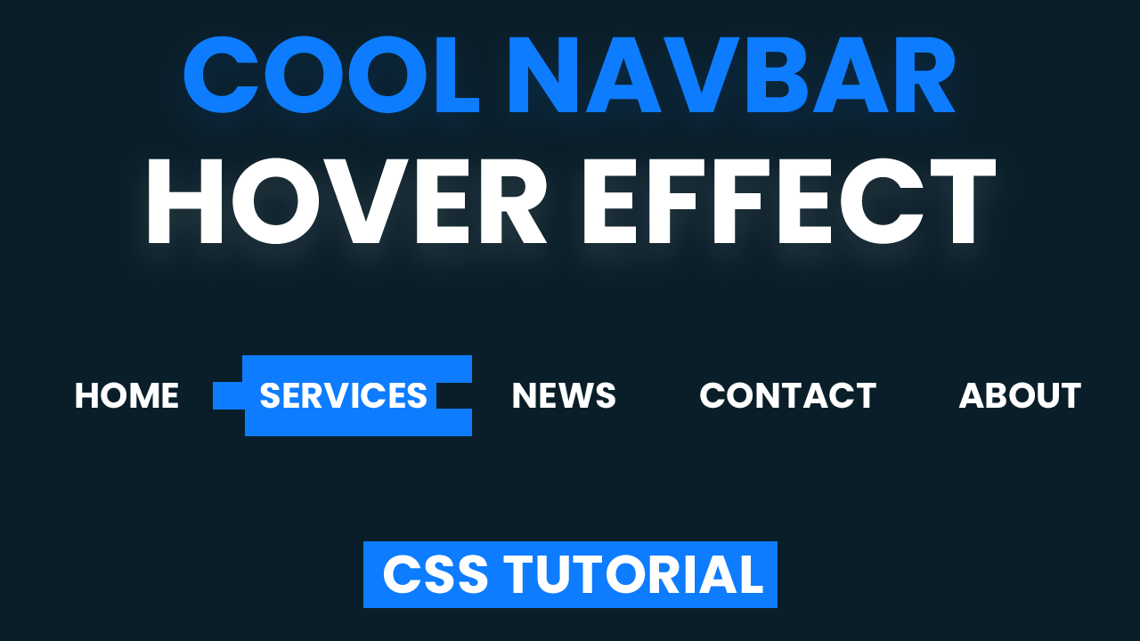
Navigation Bar is no doubt one of the essential parts of a website. A Navigation Bar consists of a bunch of links that help the user to move around between different webpages by clicking these links. Link Hover Effect is an interactive way to indicate the mouse has hovered over the hyperlinks with some transitions. Link Hover Effects can be something as simple as text color change/background color change or something fancy as what we will create in this tutorial. Today let us create a trendy Navigation Bar Link Hover Effect that looks super-sleek and is oh-so-easy to create.
HTML
We start with the HTML section by creating a nav element that consists of all our navigation links. Next, let us create an unordered list with <ul> element that includes 5 List Items i.e <li> element.
Each of the <li> element comprises a hyperlink. Each hyperlink links to a webpage within the website through the ‘href’ attribute. For Demo’s purpose, I have used a ‘#’ as the content of the ‘href’ attribute. And Well, we are already done with creating the layout of our navigation bar. Now, all we need to do is add some CSS.
<nav>
   <ul>
      <li>
           <a href="#">HOME</a>
      </li>
      <li>
           <a href="#">SERVICES</a>
      </li>
      <li>
           <a href="#">NEWS</a>
      </li>
      <li>
           <a href="#">CONTACT</a>
      </li>
      <li>
           <a href="#">ABOUT</a>
      </li>
   </ul>
</nav>
CSS
Centering Navigation Bar:
Coming to the CSS Section, We start by getting rid of paddings and margins that are added to our document by default. Now, let us centre the <nav> element. You can use any method of your choice to center the Navigation Bar, but here I am using flex layout as I find it most easy to use and best suited when dimensions of the container and its content are both unknown. We set the background to a darker shade of blue with hex code #0a1e29.
body {
   background-color: #0a1e29;
   padding: 0;
   margin: 0;
   height: 100vh;
   width: 100vw;
   display: flex;
   align-items: center;
}
Styling for <nav> element:
We want the Navigation bar to occupy all the width of screen viewport; hence, we set the width of <nav> to 100vw.
nav {
   width: 100vw;
}
Removing the Bullet Points:
Next, we get rid of bullets preceding each of the list items by assigning ‘none’ value to the ‘list-style-type’. Once again, we use flex to center and space the list items within the <nav> element.
ul {
   list-style-type: none;
   margin: 0;
   padding: 0;
   display: flex;
   align-items: center;
   flex-direction: row;
   justify-content: space-around;
}
Styling the List Items:
We relatively position each of List Items with a padding of 20px on the left and right side of <li> element.
li {
   position: relative;
   padding: 0 20px;
   height: 100%;
   display: flex;
}
Basic Typography and Styling for Hyperlinks:
Coming to the anchor tags, we need them to be on top of the stack order all the time, so we set the z-index to 1, which is relatively a higher number than other elements.And finally, we add some basic typography styling to make the text more readable.
a {
   z-index: 1;
   color: white;
   text-decoration: none;
   font-family: 'Poppins',sans-serif;
   font-weight: 500;
   font-size: 18px;
   padding: 10px 5px;
}
Pseudo-Elements:
We now need three pseudo-elements li:before, li:after and a:before to create the three blue lines that highlight the hyperlink on hover. Each of these pseudo-elements must consist of a ‘content’ attribute for proper functioning. We then set the height of each pseudo-element to 33.33% that is 1/3rd of the height of <li>. We want them to remain hidden until the hyperlinks are hovered; hence, we set the width to 0.
For positioning, we use absolute positioning. We alternate the direction of sliding in the pseudo-elements by setting li:before to left:0 and setting li:after and li:before to right:0. Lastly, we add 0.5s to the transition attribute to make sure the transitions are smooth.
li::before {
   content: "";
   position: absolute;
   height: 33.33%;
   width: 0;
   background-color: #0D7CFF;
   right: 0;
   z-index: 0;
   top: 33.33%;
   transition: all 0.5s;
}
li::after {
   content: "";
   position: absolute;
   height: 33.33%;
   width: 0;
   background-color: #0D7CFF;
   left: 0;
   z-index: 0;
   bottom: 0;
   transition: all 0.5s;
}
a::before {
   position: absolute;
   content: "";
   height: 33.33%;
   width: 0;
   background-color: #0D7CFF;
   bottom: 66.66%;
   left: 0;
   transition: all 0.5s;
}
Adding the Hover Effect:
And for the final most step of this tutorial, we add hover state to the <li> element. On Hovering the <li> element, the width of pseudo-element is changed to 100% covering up and highlighting the entire list item. And we are done with the hover effect! Our stunning Navigation Bar Hover Effect is now ready. You can now play around with colors and styling to customize the Navigation Bar even more.
li:hover:before,
li:hover::after,
li:hover a::before{
   width: 100%;
}
So what are your thoughts on this hover effect? Do you prefer minimal hover effects or a fancy hover effect like this one.
That’s it for this tutorial. I hope you guys enjoyed this tutorial. You can stay updated with latest tutorials by subscribing us on Youtube. You can also find us on Instagram.


Good job bro! =)