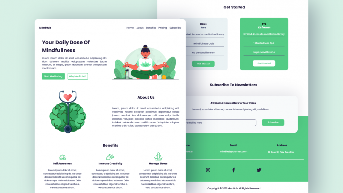
Welcome to today’s tutorial. In today’s tutorial, we are going to create a responsive design for a Meditation website. For this project, we are going to use HTML, CSS and a little bit of javascript.
Prerequisite:
- Good knowledge of CSS.
- Basic knowledge of CSS flex layout and grid layout.
- Basic knowledge of media queries.
- A little knowledge of javascript would be great.
Video Tutorial:
I have created a video tutorial on my youtube channel. This tutorial is broken down into simple and easy steps.
Other Tutorial You Might Like:
- Input stepper with CSS and Vanilla Javascript
- CSS Low Highlight Text Effect
- Coffee Machine Animation CSS
Website Features:
The complete responsive website consists of a responsive navbar that collapses to the side nav in mobile and tablet devices. The side nav is toggleable on click with a smooth slide in and slides out transition.
The navbar links have a subtle yet captivating link hover effect. We also create a sticky header.
It also consists of a scroll indicator bar on the top of the website that shows the percentage of the website scrolled. We also have a scroll to top button that appears when the user scrolls a certain distance from the top. On click, this button takes you to the top of the webpage.
Download Source Code:
You can download this source code and many other source codes by becoming my patron on Patreon. I post exclusive source codes on my Patreon Page. You can click on the button provides below to go to my Patreon page.
Download Images/Icons:
If you have any trouble creating the project or downloading the source code/ assets, comment below. Also, I would love to hear your suggestions and feedbacks. If you like this tutorial, be sure to subscribe to my youtube channel for more such videos.


v v hv hv v h gh hv
llllllllll
really
Je voudrais un site de TOP UP
hey
hello