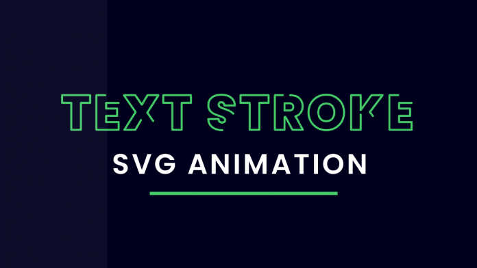
Welcome to today’s tutorial. In today’s tutorial, we will learn how to create a text stroke animation using SVG. If you look at the output, it might look complicated but it is super easy and quick to create. I have a playlist of the tutorial of text animation and effects. If you are interested you can check it here.
Video Tutorial:
If you would like to code along with me, you can check out the video tutorial version of this tutorial down below. Also, I post a new tutorial every alternate day on my youtube channel, so be sure to subscribe so you don’t miss any tutorials.
Project Folder Structure:
Let us take a quick look at the project folder structure. The project consists of only two files. First is the HTML document – index.html. Second is the Stylesheet – style.css.
SVG:
First, we use a vector drawing software or any online SVG editor to create some SVG text. For this purpose, I am using ‘Adobe Illustrator’. we start by creating a new artboard of the size 1280 x 250px. Now in this artboard, you can write any text of your choice, with any font and style. Next, export this as an SVG file. Now open this SVG file and copy the code from this file and place it into the HTML file.
HTML:
In HTML, we have no other element except the SVG code we just pasted.
<!DOCTYPE html>
<html lang="en">
  <head>
    <meta name="viewport" content="width=device-width, initial-scale=1.0" />
    <title>Text Stroke Animation</title>
    <!-- Stylesheet -->
    <link rel="Stylesheet" href="style.css" />
  </head>
  <body>
    <svg
      id="Layer_1"
      data-name="Layer 1"
      xmlns="http://www.w3.org/2000/svg"
      viewBox="0 0 1280 250"
    >
      <path d="M123.83,76.56H206v22.5H178.92v79.18H150.65V99.06H123.83Z" />
      <path
        d="M289.4,99.2H252.62v16.59h32.45v21.49H252.62v18.31H289.4v22.65h-65V76.56h65Z"
      />
      <path
        d="M355,149.54l-16.88,28.7H306l33-52.07L304.83,76.56h33.31l19.18,28,16.45-28h32.16l-32.6,51.2,34.76,50.48H374.78Z"
      />
      <path d="M419.92,76.56h82.21v22.5H475v79.18H446.74V99.06H419.92Z" />
      <path
        d="M594.14,179.25c-22.65,0-40.24-10.82-41.4-32.6h30.15c.57,7.65,5.05,10.24,10.24,10.24s8.94-2.59,8.94-7.35c-.14-16.3-49.47-8.66-49-44C553,85.65,569.62,75,591.11,75c23.36,0,38.65,11.4,39.66,31.59H600.05c-.29-6.35-4.18-9.23-9.37-9.23-4.19-.15-7.5,2.31-7.5,7.21,0,15.14,48.89,10.24,48.89,42.83C632.07,165.26,618.22,179.25,594.14,179.25Z"
      />
      <path d="M647.36,76.56h82.2v22.5H702.45v79.18H674.18V99.06H647.36Z" />
      <path
        d="M792.44,76.56c25.24,0,37.94,14.42,37.94,32.59,0,13.27-7.22,24.81-22.36,29.43L831,178.24H799.37l-20.19-37.5h-3v37.5H747.88V76.56Zm-2.3,23.65h-14v21.2h14c7.64,0,11.53-3.75,11.53-10.67C801.67,104.39,797.78,100.21,790.14,100.21Z"
      />
      <path
        d="M899.75,179.25c-28.85,0-52.21-21.64-52.21-52.21S870.9,75,899.75,75,951.81,96.46,951.81,127,928.59,179.25,899.75,179.25Zm0-26.25c14.56,0,23.36-10.24,23.36-26,0-16-8.8-26.11-23.36-26.11-14.71,0-23.37,10.1-23.37,26.11C876.38,142.76,885,153,899.75,153Z"
      />
      <path
        d="M1000.56,133.67v44.57H972.29V76.56h28.27V120.4l31.58-43.84h32.6l-37.36,49.32,39.23,52.36h-34.18Z"
      />
      <path
        d="M1149.83,99.2h-36.78v16.59h32.45v21.49h-32.45v18.31h36.78v22.65h-65V76.56h65Z"
      />
    </svg>
  </body>
</html>
CSS:
We now code the CSS. We start with our regular CSS reset. This reset removes the unwanted margins and paddings from all the elements.
Next, we set a darker color as the background of our document body. I have used – #00001d as the background-color.
We now centre the SVG element using the transforms.
Now we style the text a little bit by setting the fill to none and stroke to #44ca67. Now we set the values for stroke-width, stroke-dasharray and stroke-dashoffset.
Other Tutorials You Might Like:
- Pokemon Card Generator Javascript
- Disable Text Selection Using CSS
- Responsive Countdown To A Certain Date
- Dynamic Circular Progress Bar With Javascript
We set the stroke-linecap and stroke-linejoin to round to give the text a more modern look. Lastly, we add animation with the name draw-stroke and a duration of 5 seconds. We set the animation direction to forwards.
Finally, we set the keyframes by setting stroke-dashoffset to 0 in the 100% of keyframes.
* {
  padding: 0;
  margin: 0;
  box-sizing: border-box;
}
body {
  background-color: #00001d;
}
svg {
  position: absolute;
  transform: translate(-50%, -50%);
  top: 50%;
  left: 50%;
}
svg path {
  fill: none;
  stroke: #44ca67;
  stroke-width: 6px;
  stroke-dasharray: 600px;
  stroke-dashoffset: 600px;
  stroke-linecap: round;
  stroke-linejoin: round;
  animation: draw-stroke 5s linear forwards;
}
@keyframes draw-stroke {
  100% {
    stroke-dashoffset: 0;
  }
}


Wow Very good Design
Please add the link of the svg to the description of the text stroke swag animation that you have created by the coding artist.