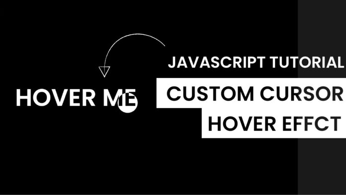
Introduction:
Welcome to our latest blog post where we dive into the exciting world of interactive web development! Today, we’ll explore how to create a custom mouse hover effect with Javascript that reacts to both mouse and touch inputs. This tutorial is perfect for developers looking to enhance user interaction on their web projects.
Things You Will Learn:
In this tutorial, you will learn:
- Detecting Touch Devices: Understand how to identify if the user’s device supports touch.
- Dynamic Element Positioning: Learn to move an HTML element based on user interaction.
- Event Handling: Discover how to handle mouse and touch events in JavaScript.
- Responsive Design Techniques: Implement code that works seamlessly across various devices.
- CSS Styling for Interactivity: Use CSS to visually respond to user interactions.
Video Tutorial:
Here is the video tutorial for this project. If you like the tutorial subscribe to my YouTube channel. I post new projects based on HTML, CSS, and Javascript on my channel regularly.
Project Folder Structure:
Before we start coding we take a look at the project folder structure. We start by creating a folder called – ”Custom Mouse Hover Effect With Javascript”. Inside this folder, we have 3 files. These files are :
- index.html
- style.css
- script.js
HTML:
We begin with the HTML code. Copy the code below and paste it into your HTML document.
<!DOCTYPE html>
<html lang="en">
  <head>
    <meta name="viewport" content="width=device-width, initial-scale=1.0" />
    <title>Custom Mouse Hover Effect</title>
    <!-- Google Fonts -->
    <link
      href="https://fonts.googleapis.com/css2?family=Poppins:wght@600&display=swap"
      rel="stylesheet"
    />
    <!-- Stylesheet -->
    <link rel="stylesheet" href="style.css" />
  </head>
  <body>
    <h1 id="title">HOVER ME</h1>
    <div id="move-div"></div>
    <!-- Script -->
    <script src="script.js"></script>
  </body>
</html>
CSS:
Next, we style our code using CSS. For this copy, the code provided to you below and paste it into your stylesheet.
* {
  margin: 0;
  padding: 0;
  cursor: none;
}
body {
  background-color: #000000;
  color: #ffffff;
  overflow: hidden;
}
#title {
  display: inline;
  font-family: "Poppins", sans-serif;
  font-size: 6em;
  position: absolute;
  transform: translate(-50%, -50%);
  left: 50%;
  top: 50%;
  text-align: center;
  text-transform: uppercase;
}
#move-div {
  transform: translate(-50%, -50%);
  position: absolute;
  width: 2em;
  height: 2em;
  background-color: #ffffff;
  border-radius: 50%;
  mix-blend-mode: difference;
}
JS:
Finally, we add functionality using Javascript. For this once again copy the code below and paste it into your script file.
let div = document.getElementById("move-div");
let title = document.getElementById("title");

//Detect touch device
function isTouchDevice() {
  try {
    //We try to create Touch Event (it would fail for desktops and throw error)
    document.createEvent("TouchEvent");
    return true;
  } catch (e) {
    return false;
  }
}

const move = (e) => {
  //Try catch to avoid any errors for touch screens(Error thrown when user doesn't move his finger)
  try {
    /*
    PageX and PageY return the position of clients cursor from the top left of screen
    */
    var x = !isTouchDevice() ? e.pageX : e.touches[0].pageX;
    var y = !isTouchDevice() ? e.pageY : e.touches[0].pageY;
  } catch (error) {}
  //Set left and top of div based on mouse position
  div.style.left = x + "px";
  div.style.top = y + "px";
  const rect = title.getBoundingClientRect();
  if (x > rect.left && x < rect.right && y > rect.top && y < rect.bottom) {
    div.style.width = 5 + "em";
    div.style.height = 5 + "em";
  } else {
    div.style.width = 2 + "em";
    div.style.height = 2 + "em";
  }
};

//For mouse
document.addEventListener("mousemove", (e) => {
  move(e);
});

//For touch
document.addEventListener("touchmove", (e) => {
  move(e);
});
Conclusion:
This tutorial shows how combining HTML, CSS, and JavaScript can create interactive and responsive web elements. Such skills are vital in modern web development, enhancing user experience and engagement. Experiment with different styles and behaviors to see how you can apply these concepts to your projects. Happy coding!


Hi, Love your site. Can you tell me how to do this with a Showit website?