Introduction:
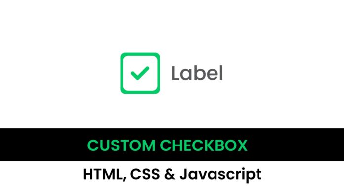
In this tutorial, you will create a visually appealing, interactive checkbox using HTML and CSS. The checkbox will change color and display a checkmark when selected, all without using JavaScript. This project is perfect if you want to add unique checkbox styles to your web forms.
Things You Will Learn:
In this tutorial, you will:
- How to style checkbox using pure CSS
- Implementing Font Awesome icons in HTML
- Working with Flexbox for centering elements
- Creating hover and checked state effects for inputs
Video Tutorial:
Here is the video tutorial for this project. If you like the tutorial subscribe to my YouTube channel. I post new projects based on HTML, CSS and Javascript on my channel regularly.
Project Folder Structure:
Let us explore the project folder structure. The project folder consists of 2 files. The HTML file creates the elements required to build the structure and layout of our project. Next, the CSS file styles the elements that we have created with CSS. And Finally Javascript adds functionality to our project. The files used are:
- index.html
- style.css
HTML:
We begin with the HTML code. Copy the code below and paste it into your HTML document.
<!DOCTYPE html>
<html lang="en">
  <head>
    <meta name="viewport" content="width=device-width, initial-scale=1.0" />
    <title>Custom Checkbox</title>
    <!-- Google Font -->
    <link rel="preconnect" href="https://fonts.googleapis.com" />
    <link rel="preconnect" href="https://fonts.gstatic.com" crossorigin />
    <link
      href="https://fonts.googleapis.com/css2?family=Poppins&display=swap"
      rel="stylesheet"
    />
    <!--Font Aweome CDN-->
    <link
      rel="stylesheet"
      href="https://cdnjs.cloudflare.com/ajax/libs/font-awesome/6.6.0/css/all.min.css"
    />
    <!--Styleshet-->
    <link rel="stylesheet" href="style.css" />
  </head>
  <body>
    <div class="wrapper">
      <input type="checkbox" id="check" />
      <label for="check">Label</label>
    </div>
  </body>
</html>
CSS:
Next, we style our code using CSS. For this copy, the code provided to you below and paste it into your stylesheet.
.wrapper {
  height: 12.5em;
  width: 25em;
  position: absolute;
  transform: translate(-50%, -50%);
  top: 50%;
  left: 50%;
  display: flex;
  justify-content: space-around;
}
input[type="checkbox"] {
  appearance: none;
  -webkit-appearance: none;
  height: 5em;
  width: 5em;
  background-color: #d5d5d5;
  border-radius: 0.5em;
  cursor: pointer;
  display: flex;
  outline: none;
  align-items: center;
  justify-content: center;
}
label {
  color: #4c4c4c;
  font-size: 3.4em;
  font-family: "Poppins", sans-serif;
  cursor: pointer;
}
input[type="checkbox"]:after {
  font-family: "Font Awesome 6 Free";
  content: "\f14a";
  font-weight: 900;
  font-size: 4em;
  color: #ffffff;
  display: none;
}
input[type="checkbox"]:hover {
  background-color: #a5a5a5;
}
input[type="checkbox"]:checked {
  background-color: #02cb67;
}
input[type="checkbox"]:checked:after {
  display: block;
}
Conclusion:
You’ve now created a custom-styled checkbox using HTML and CSS. The checkbox hover and checked states make it responsive and visually engaging. Add this feature to your project, and experiment with other color and size options to personalize it further. Check out the video for a step-by-step walk through and more tips on CSS styling!


