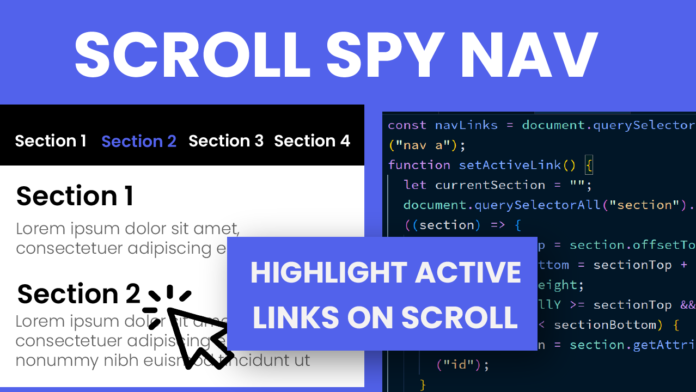
Creating a Scroll Spy Navigation is a fun and useful project when you want a navigation menu that highlights the section you’re currently viewing. It gives your website a professional and interactive touch. In this blog post, we’ll break down the HTML, CSS, and JavaScript that make it happen.
Video Tutorial:
HTML:
The HTML provides the basic layout of the webpage. We start with a <header> containing a <nav> element. This navigation bar includes four links, each pointing to different sections of the page using href="#sectionID". Below the header, there are four <section> elements. Each section is given a unique ID (section1, section2, etc.) and contains a heading and a paragraph. This clean structure makes it easy for users (and the script) to know which section is which.
<!DOCTYPE html>
<html lang="en">
  <head>
    <meta charset="UTF-8" />
    <meta name="viewport" content="width=device-width, initial-scale=1.0" />
    <title>Scroll Spy Navigation</title>
    <link
      href="https://fonts.googleapis.com/css2?family=Poppins&display=swap"
      rel="stylesheet"
    />
    <link rel="stylesheet" href="style.css" />
  </head>
  <body>
    <header>
      <nav id="navbar">
        <a href="#section1">Section 1</a>
        <a href="#section2">Section 2</a>
        <a href="#section3">Section 3</a>
        <a href="#section4">Section 4</a>
      </nav>
    </header>
    <section id="section1">
      <h2>Section 1</h2>
      <p>
        Lorem ipsum dolor sit, amet consectetur adipisicing elit. Soluta facilis
        doloremque cupiditate tempora. Nesciunt repellat porro veritatis
        officiis. Ipsa, repellendus.
      </p>
    </section>
    <section id="section2">
      <h2>Section 2</h2>
      <p>
        Lorem ipsum dolor sit, amet consectetur adipisicing elit. Soluta facilis
        doloremque cupiditate tempora. Nesciunt repellat porro veritatis
        officiis. Ipsa, repellendus.
      </p>
    </section>
    <section id="section3">
      <h2>Section 3</h2>
      <p>
        Lorem ipsum dolor sit, amet consectetur adipisicing elit. Soluta facilis
        doloremque cupiditate tempora. Nesciunt repellat porro veritatis
        officiis. Ipsa, repellendus.
      </p>
    </section>
    <section id="section4">
      <h2>Section 4</h2>
      <p>
        Lorem ipsum dolor sit, amet consectetur adipisicing elit. Soluta facilis
        doloremque cupiditate tempora. Nesciunt repellat porro veritatis
        officiis. Ipsa, repellendus.
      </p>
    </section>
    <script src="script.js"></script>
  </body>
</html>
CSS:
The CSS styles the page and makes it visually appealing.
First, a global reset is applied with box-sizing: border-box and zero margin and padding. The header is styled to be fixed at the top, ensuring it stays visible as you scroll. It has a black background and centers the navigation links. The navigation links are styled with white color, smooth color transitions, and spacing between them. When a link is active (i.e., corresponding to the current section), its color changes to a vibrant blue.
Each section is given a height of 100vh (full viewport height) and alternating background colors for better visual separation. Headings and paragraphs inside the sections are styled with proper font sizes and spacing to maintain readability.
* {
  box-sizing: border-box;
  margin: 0;
  padding: 0;
}
body {
  font-family: "Poppins", sans-serif;
}
header {
  position: fixed;
  top: 0;
  left: 0;
  right: 0;
  background-color: #000000;
  color: #ffffff;
  padding: 15px 0;
  z-index: 1000;
  display: flex;
  justify-content: center;
}
nav {
  display: flex;
  gap: 40px;
}
nav a {
  text-decoration: none;
  color: #ffffff;
  font-size: 18px;
  transition: color 0.3s ease;
}
nav a.active {
  color: #4747ff;
}
section {
  height: 100vh;
  padding: 50px 20px;
}
section:nth-child(odd) {
  background-color: #f7f7f7;
}
section:nth-child(even) {
  background-color: #e2e2e2;
}
section h2 {
  font-size: 36px;
}
section p {
  font-size: 18px;
  line-height: 1.7;
}
Javascript:
The JavaScript brings the scroll spy effect to life!
We first select all navigation links and then create a setActiveLink() function. This function checks the scroll position (window.scrollY) and identifies which section is currently visible on the screen by comparing the section’s offsetTop and offsetHeight. Once the current section is detected, the function adds the .active class to the corresponding navigation link and removes it from the others.
Finally, we attach setActiveLink() to the scroll event so that the active link updates dynamically as the user scrolls through the page.
const navLinks = document.querySelectorAll("nav a");
function setActiveLink() {
  let currentSection = "";
  document.querySelectorAll("section").forEach((section) => {
    const sectionTop = section.offsetTop - 50;
    const sectionBottom = sectionTop + section.offsetHeight;
    if (window.scrollY >= sectionTop && window.scrollY < sectionBottom) {
      currentSection = section.getAttribute("id");
    }
  });

  navLinks.forEach((link) => {
    link.classList.remove("active");
    if (link.getAttribute("href").substring(1) === currentSection) {
      link.classList.add("active");
    }
  });
}
window.addEventListener("scroll", setActiveLink);
Conclusion:
By combining simple HTML structure, elegant CSS styling, and powerful JavaScript logic, we can create an interactive scroll spy navigation system that enhances the user experience on any website. This project is a great example of how small touches, like an active link indicator, can make a big difference in making a site feel polished and professional. Keep experimenting by adding more sections, animations, or smooth scrolling to make your version even better!


