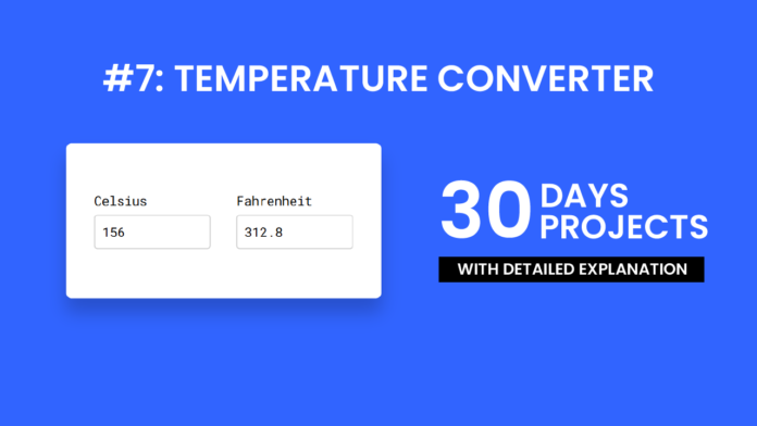
In this tutorial, we’ll walk through the creation of a simple temperature converter that allows users to convert between Celsius and Fahrenheit in real time. We’ll cover how each part—HTML, CSS, and JavaScript—contributes to building this small yet functional project.
HTML Structure:
The HTML section forms the backbone of the temperature converter. It defines two input fields: one for Celsius and one for Fahrenheit. Each input is wrapped inside a container for better layout control. Labels are used to indicate what each field represents. The oninput attribute on the input elements ensures that whenever a user types a number, the conversion function is triggered immediately. The layout is wrapped inside a div with a class of wrapper for styling purposes.
<!DOCTYPE html>
<html lang="en">
  <head>
    <meta name="viewport" content="width=device-width, initial-scale=1.0" />
    <title>Temperature Converter</title>
    <link
      href="https://fonts.googleapis.com/css2?family=Roboto+Mono&display=swap"
      rel="stylesheet"
    />
    <link rel="stylesheet" href="style.css" />
  </head>
  <body>
    <div class="wrapper">
      <div class="container">
        <label for="celsius">Celsius</label>
        <input
          type="number"
          id="celsius"
          value="0"
          oninput="celsiusToFahrenheit()"
        />
      </div>
      <div class="container">
        <label for="fahrenheit">Fahrenheit</label>
        <input type="number" id="fahrenheit" oninput="fahrenheitToCelsius()" />
      </div>
    </div>
    <script src="script.js"></script>
  </body>
</html>
CSS:
The CSS gives the temperature converter a clean and modern look. The page uses a blue background to contrast with the white converter box. The .wrapper class centers the box in the middle of the page using CSS transforms. Each input field has a light gray border and subtle focus effects, making the form interactive and visually appealing. The font used is Roboto Mono, a monospace typeface loaded from Google Fonts, giving the converter a technical, calculator-like feel.
* {
  padding: 0;
  margin: 0;
  box-sizing: border-box;
  font-family: "Roboto Mono", monospace;
  font-size: 18px;
}
body {
  background-color: #3164ff;
}
.wrapper {
  width: 450px;
  background-color: #ffffff;
  padding: 70px 40px;
  position: absolute;
  transform: translate(-50%, -50%);
  left: 50%;
  top: 50%;
  box-shadow: 0 20px 25px rgba(0, 0, 0, 0.2);
  border-radius: 8px;
  display: flex;
  justify-content: space-between;
}
.container {
  width: 45%;
}
input {
  width: 100%;
  height: 50px;
  border-radius: 5px;
  border: 2px solid #d2d2d2;
  outline: none;
  margin-top: 8px;
  padding: 0 10px;
}
input:focus {
  border-color: #3164ff;
}
Javascript:
The JavaScript provides the functionality behind the temperature conversion. Two functions—celsiusToFahrenheit() and fahrenheitToCelsius()—perform the math needed to convert temperatures based on user input. When a value is entered in one field, the corresponding value is automatically calculated and shown in the other. The conversion formulas used are:
-
°F = (°C × 9/5) + 32
-
°C = (°F − 32) × 5/9
The toFixed(2) method ensures the output is rounded to two decimal places for readability.
let celsius = document.getElementById("celsius");
let fahrenheit = document.getElementById("fahrenheit");

function celsiusToFahrenheit() {
  let output = (parseFloat(celsius.value) * 9) / 5 + 32;
  fahrenheit.value = parseFloat(output.toFixed(2));
}

function fahrenheitToCelsius() {
  let output = ((parseFloat(fahrenheit.value) - 32) * 5) / 9;
  celsius.value = parseFloat(output.toFixed(2));
  console.log(output);
}
celsiusToFahrenheit();
This project is a great starting point for beginners learning how HTML, CSS, and JavaScript work together. HTML structures the form, CSS styles the interface, and JavaScript brings it to life with dynamic behavior. Not only does this project improve your frontend skills, but it also shows how real-time calculations and interactivity can be implemented in simple web apps. Try expanding it by adding Kelvin conversions or validation features!


