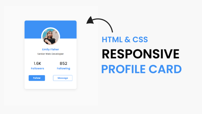
Profile cards are a great way to display user information in a clean and modern format. In this tutorial, we’ll build a responsive profile card featuring a profile image, user details, follower statistics, and interactive buttons like Follow and Message. This card adapts beautifully to different screen sizes and adds a polished look to any project.
Final Output
Here’s what the finished profile card will look like:.
The card features:
- A clean, modern gradient background.
- Circular profile image with a border effect.
- User name, role, and social stats.
- Interactive buttons with hover effects
How to Create a Responsive Profile Card Using HTML and CSS
Profile cards are a staple design element for many websites, showcasing user details with a clean, interactive interface. This tutorial will guide you through creating a responsive profile card that includes a profile image, user name, role, social statistics, and call-to-action buttons like Follow and Message.
The design uses modern CSS techniques, including gradients, box shadows, and media queries, to ensure responsiveness and visual appeal.
Final Output
Here’s what the finished profile card will look like:
(Replace with an actual image if available)
The card features:
- A clean, modern gradient background.
- Circular profile image with a border effect.
- User name, role, and social stats.
- Interactive buttons with hover effects.
Step 1: HTML Structure
The HTML provides the framework for the profile card. It includes the profile image, name, job title, statistics, and buttons.
<!DOCTYPE html>
<html lang="en">
  <head>
    <meta name="viewport" content="width=device-width, initial-scale=1.0" />
    <title>Responsive Profile Card</title>
    <!-- Google Font -->
    <link
      href="https://fonts.googleapis.com/css2?family=Poppins:wght@500&display=swap"
      rel="stylesheet"
    />
    <!-- Stylesheet -->
    <link rel="stylesheet" href="style.css" />
  </head>
  <body>
    <div class="container">
      <div class="card">
        <img src="profile-pic-female.jpg" alt="profile-pic" />
        <h4>Emily Fisher</h4>
        <h5>Senior Web Developer</h5>
        <div class="details">
          <div class="column">
            <h2>1.6K</h2>
            <span>Followers</span>
          </div>
          <div class="column">
            <h2>852</h2>
            <span>Following</span>
          </div>
        </div>
        <div class="buttons">
          <button>Follow</button>
          <button>Message</button>
        </div>
      </div>
    </div>
  </body>
</html>
HTML Breakdown
- Container: Centers the card on the page.
- Card: Contains all the elements like the image, user info, and buttons.
- Details: Displays social stats like followers and following.
- Buttons: Includes interactive elements for Follow and Message.
Step 2: CSS Styling
The CSS styles the card and ensures it’s responsive for different screen sizes.
*,
*:before,
*:after {
  padding: 0;
  margin: 0;
  box-sizing: border-box;
}
body {
  background-color: #fafafa;
}
.container {
  position: absolute;
  transform: translate(-50%, -50%);
  top: 50%;
  left: 50%;
}
.card {
  height: 26.25em;
  width: 20em;
  background: linear-gradient(to bottom, #3d91f5 6.87em, #ffffff 6.87em);
  padding: 3.12em 0;
  box-shadow: 1em 1.5em 3em rgba(0, 0, 0, 0.1);
  border-radius: 1em;
}
.card * {
  font-family: "Poppins", sans-serif;
  text-align: center;
  letter-spacing: 0.031em;
  font-weight: 600;
}
img {
  display: block;
  width: 6.25em;
  height: 6.25em;
  position: relative;
  border-radius: 50%;
  margin: 0 auto;
  box-shadow: 0 0 0 0.5em #ffffff;
}
.card h4 {
  color: #3d91f5;
  font-size: 1em;
  margin: 0.92em 0 0.3em 0;
}
.card h5 {
  color: #454545;
  font-weight: 400;
  font-size: 0.87em;
}
.details {
  width: 100%;
  margin-top: 1.87em;
  display: flex;
  justify-content: space-around;
}
.details h2 {
  font-weight: 400;
}
.details span {
  color: #3d91f5;
}
.buttons {
  width: 100%;
  display: flex;
  justify-content: space-around;
  margin-top: 1.87em;
}
button {
  padding: 0.5em 2em;
  border: none;
  border: 0.12em solid #3d91f5;
  border-radius: 0.31em;
}
.buttons button:first-child {
  background-color: #3d91f5;
  color: #ffffff;
}
.buttons button:last-child {
  background-color: transparent;
  color: #3d91f5;
}
@media screen and (max-width: 501px) {
  .container {
    font-size: 0.8em;
  }
}
CSS Highlights
- Gradient Background:
background: linear-gradient(to bottom, #3d91f5 6.87em, #ffffff 6.87em);
Creates a two-tone background that transitions seamlessly.
- Circular Profile Image:
img { border-radius: 50%; box-shadow: 0 0 0 0.5em #ffffff; } - Responsive Design:
@media screen and (max-width: 501px) {
.container {
font-size: 0.8em;
}
}
Scales down the card size for smaller devices, ensuring readability.
- Buttons Styling:
css
.buttons button:first-child {
background-color: #3d91f5;
color: #ffffff;
}
.buttons button:last-child {
background-color: transparent;
color: #3d91f5;
Differentiates the primary and secondary actions with contrasting colors.
Key Features of the Profile Card
- Minimalist Design: Simple layout with attention to typography and spacing.
- Responsive Scaling: Adapts to different screen sizes using media queries.
- Call-to-Action Buttons: Follow and Message buttons are visually distinct and functional.
- Social Stats: Displays followers and following count for better engagement.
Enhancements
You can further customize the card with:
- Hover Effects: Add hover animations to buttons for better interactivity.
- Dynamic Stats: Use JavaScript to dynamically update follower or following counts.
- Dark Mode: Add a toggle to switch the card to a dark theme.
Conclusion
This Responsive Profile Card is perfect for use in portfolios, social media platforms, or web dashboards. With its clean design, responsive layout, and interactivity, it enhances user experience while maintaining simplicity.
- Gradient Background:


