Video Tutorial:
If you would like to learn through a video tutorial rather than reading this blog post, you can check out this video here down below. For more such tutorials and resources, subscribe to my youtube channel.
Project Folder Structure:
Now let us begin by creating the project folder structure. We create a project folder called – “Cup Animation”. Inside this folder, we have four files. These files are index.html, style.css and 2 SVG files. The first two files are the HTML document and stylesheet respectively.
HTML:
Let us start with the HTML code. Firstly copy the code below and paste it into your CSS file.
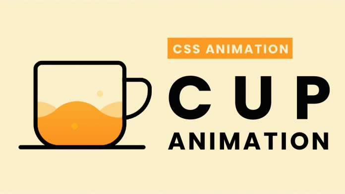
The HTML code consists of div with class name – cup. Inside this div, we have three more divs with a common class name – bubble. These divs also a unique classname.
<!DOCTYPE html>
<html lang="en">
  <head>
    <meta name="viewport" content="width=device-width, initial-scale=1.0" />
    <title>Cup Animation</title>
    <!-- Stylesheet -->
    <link rel="stylesheet" href="style.css" />
  </head>
  <body>
    <div class="cup">
      <div class="bubble bubble-1"></div>
      <div class="bubble bubble-2"></div>
      <div class="bubble bubble-3"></div>
    </div>
  </body>
</html>
CSS:
We now style these elements and animation to them using CSS. We start by removing paddings and margins from all the elements.
Next, we set ‘#faf0ca’ as the background colour for the body. We use the cup, ‘cup: before’ and ‘cup: after’ elements to shape the divs into the cup.
In the next step, we add two images as the background of the cup and set the position for each of them to ‘0 0’. We also add an animation to the cup element.
We set the ‘background-position’ of both the elements to ‘-100% 0’ at 100% of the keyframes. This way our waves animation is ready.
Now to add animation to the bubbles, we use transform with ‘translateY(-150px)’ value. This makes the bubbles seem to be rising. Apart from this we also set random ‘animation-delay’ and ‘animation-duration’ values for each bubble.
* {
  padding: 0;
  margin: 0;
  box-sizing: border-box;
}
body {
  background-color: #faf0ca;
}
.cup {
  height: 210px;
  width: 220px;
  border: 10px solid #030303;
  position: absolute;
  transform: translate(-50%, -50%);
  top: 50%;
  left: 50%;
  border-radius: 20px 20px 60px 60px;
  background: url("coffee-img-1.svg"), url("coffee-img-2.svg");
  background-position: 0 0, 0 0;
  background-repeat: repeat-x;
  animation: coffee 4s infinite linear;
}
@keyframes coffee {
  100% {
    background-position: -100% 0, -100% 0;
  }
}
.cup:before {
  content: "";
  position: absolute;
  height: 80px;
  width: 60px;
  border: 10px solid #030303;
  border-left: none;
  right: -75px;
  top: 30px;
  border-radius: 0 30px 80px 0;
}
.cup:after {
  position: absolute;
  content: "";
  height: 10px;
  width: 300px;
  background-color: #030303;
  left: -45px;
  bottom: -10px;
  border-radius: 10px;
}
.bubble {
  height: 15px;
  width: 15px;
  background-color: #fbbe08;
  border-radius: 50%;
  position: absolute;
  animation: bubbles forwards infinite;
  opacity: 0.6;
}
@keyframes bubbles {
  100% {
    transform: translateY(-150px);
    opacity: 0;
  }
}
.bubble-1 {
  left: 30px;
  bottom: 10px;
  animation-delay: 0.5s;
  animation-duration: 3s;
}
.bubble-2 {
  left: 80px;
  bottom: 35px;
  animation-delay: 1.2s;
  animation-duration: 4s;
}
.bubble-3 {
  left: 140px;
  bottom: 30px;
  animation-duration: 4s;
}
Our animation is now ready. If you have any issues while creating this project you can download the source code by clicking on the download button below. Also, don’t forget to drop your queries, suggestions and feedback in the comments below.
Happy Coding!


