Introduction:
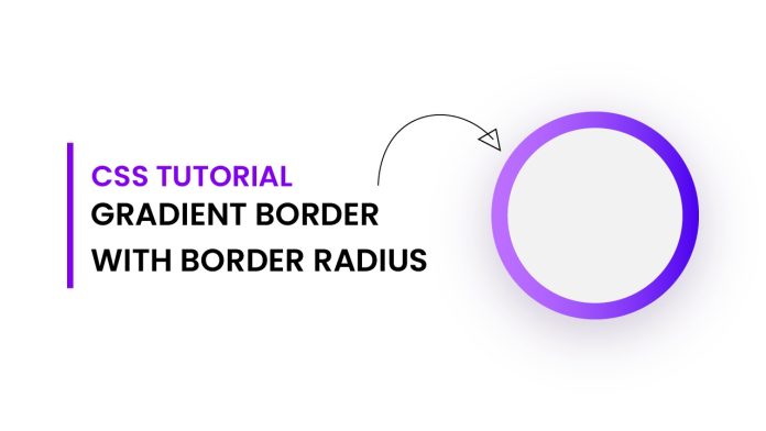
In this tutorial, we will explore how to create a visually captivating Border gradient with Border radius using HTML and CSS. This tutorial will guide you through the steps necessary to achieve an eye-catching design that will impress the visitors to your website. By following along, you will gain a solid understanding of CSS positioning, gradients, and border-radius properties, allowing you to enhance your web development skills.
Things You Will Learn:
- How to position elements using CSS.
- Creating and styling circular shapes using border-radius.
- Implementing gradients to enhance the visual appeal of your design.
Video Tutorial:
I have created a detailed video tutorial on this topic to make it easier for you to follow along. You can find the tutorial on my YouTube channel.
Project Folder Structure:
Before we dive into the code, let’s establish a basic folder structure for our project:
- index.html
- style.css
HTML:
Open the index.html file and add the following code:
<!DOCTYPE html>
<html lang="en">
  <head>
    <meta name="viewport" content="width=device-width, initial-scale=1.0" />
    <title>Border Gradient With Border Radius</title>
    <!-- Stylesheet -->
    <link rel="stylesheet" href="style.css" />
  </head>
  <body>
    <div class="box"></div>
  </body>
</html>
CSS:
Now, create a new file named styles.css and add the following code:
.box {
  height: 20em;
  width: 20em;
  background-color: white;
  position: absolute;
  margin: auto;
  border-radius: 50%;
  top: 0;
  bottom: 0;
  left: 0;
  right: 0;
}
.box:before {
  position: absolute;
  content: "";
  height: 120%;
  width: 120%;
  background-image: -webkit-linear-gradient(to right, #bb6eff, #4a00e0);
  background-image: linear-gradient(to right, #bb6eff, #4a00e0);
  left: -10%;
  top: -10%;
  z-index: -1;
  border-radius: 50%;
}
Conclusion:
Congratulations! By following this tutorial, you have successfully created a stunning circular gradient box using HTML and CSS. Through this project, you learned how to position elements using CSS, create circular shapes using the border-radius property, and implement gradients to enhance the visual appeal of your designs.
Feel free to customize the dimensions, colors, and gradients to suit your specific needs. With this newfound knowledge, you can now apply circular gradient boxes in various web design projects, adding a touch of elegance and modernity to your creations.


