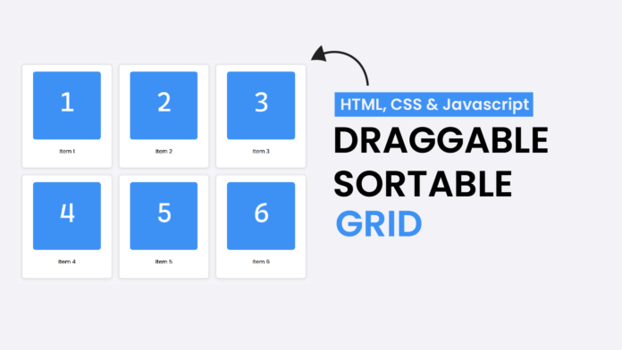
Have you ever wondered how draggable and sortable grids work in modern web applications? They’re not just interactive and visually appealing but also a great way to organize content dynamically. In this tutorial, we’ll build a draggable and sortable grid layout using HTML, CSS, and JavaScript—no libraries required!
This project is perfect for improving your drag-and-drop functionality skills while creating something practical and fun.
What You Will Learn:
- How to create a responsive grid layout using CSS.
- Make elements draggable with JavaScript.
- How to handle drag-and-drop events to reorder grid items.
Video Tutorial:
HTML
We start by defining a grid container and its draggable items. Each item includes an image and a label.
<!DOCTYPE html>
<html lang="en">
  <head>
    <meta charset="UTF-8" />
    <meta name="viewport" content="width=device-width, initial-scale=1.0" />
    <title>Draggable & Sortable Grid</title>
    <!-- Google Font -->
    <link
      href="https://fonts.googleapis.com/css2?family=Poppins:wght@500&display=swap"
      rel="stylesheet"
    />
    <!-- Stylesheet-->
    <link rel="stylesheet" href="style.css" />
  </head>
  <body>
    <div class="grid-container" id="sortableGrid">
      <div class="grid-item" draggable="true" id="item1">
        <img src="draggable images-01.png" alt="Item 1" />
        <p>Item 1</p>
      </div>
      <div class="grid-item" draggable="true" id="item2">
        <img src="draggable images-02.png" alt="Item 2" />
        <p>Item 2</p>
      </div>
      <div class="grid-item" draggable="true" id="item3">
        <img src="draggable images-03.png" alt="Item 3" />
        <p>Item 3</p>
      </div>
      <div class="grid-item" draggable="true" id="item4">
        <img src="draggable images-04.png" alt="Item 4" />
        <p>Item 4</p>
      </div>
      <div class="grid-item" draggable="true" id="item5">
        <img src="draggable images-05.png" alt="Item 5" />
        <p>Item 5</p>
      </div>
      <div class="grid-item" draggable="true" id="item6">
        <img src="draggable images-06.png" alt="Item 6" />
        <p>Item 6</p>
      </div>
    </div>

    <script src="script.js"></script>
  </body>
</html>
CSS
Here’s the CSS to create a responsive grid layout and add some hover and transition effects for each grid item.
body {
  font-family: "Poppins", sans-serif;
  margin: 0;
  padding: 20px;
  background-color: #f4f4f9;
}

.grid-container {
  display: grid;
  grid-template-columns: repeat(auto-fill, minmax(200px, 1fr));
  gap: 20px;
}

.grid-item {
  background-color: #ffffff;
  border: 2px solid #dddddd;
  border-radius: 8px;
  padding: 20px;
  text-align: center;
  box-shadow: 0 2px 10px rgba(0, 0, 0, 0.1);
  cursor: move;
  transition: all 0.3s ease;
}

.grid-item:hover {
  box-shadow: 0 4px 15px rgba(0, 0, 0, 0.2);
}

.grid-item img {
  max-width: 100%;
  border-radius: 8px;
}
Key CSS Features:
- Grid Layout:
- The
grid-template-columnsproperty ensures the layout is responsive and adapts to the screen size.
- The
- Hover Effects:
- Adding a shadow on hover enhances the user experience.
- Cursor Style:
- Since the
cursor: moveproperty gives a visual cue that items can be dragged.
- Since the
JavaScript
The JavaScript enables the drag-and-drop functionality, allowing users to reorder items within the grid.


