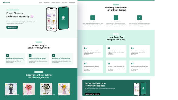
Welcome to another exciting build on my channel! 🌸 In this tutorial, I walk you through how I designed and developed Bloomify, a fully responsive flower delivery website using only HTML, CSS, and JavaScript — no frameworks, no libraries, just clean, foundational web development.
This blog post gives you an overview of what we created together in the video and why each part of the site was designed the way it was. If you’re learning front-end development or love making aesthetically pleasing websites, this is the perfect project for you.
🌼 The Concept: Fresh, Fast, Floral
Bloomify is a fictional flower delivery startup with a modern twist — AI recommendations, custom bouquets, and same-day delivery. My goal was to bring this vision to life with a website that looks polished, feels interactive, and runs smoothly across all devices.
💻 Technologies Used
-
HTML: I structured the site using semantic HTML5. Sections like
<header>,<section>, and<footer>help organize the content and improve SEO. -
CSS: Styling was done with pure CSS — I used Flexbox and media queries to ensure the site looks great on desktops and mobile phones. The color palette and typography give the site a fresh, eco-friendly feel.
-
JavaScript: I kept the interactivity lightweight. JavaScript handles the mobile menu toggle, scroll-based animations, and button interactions like app downloads.
🛠️ What We Built (Step-by-Step)
-
Hero Section: We started with a striking hero section featuring the Bloomify logo, a bold headline, and a call-to-action button. I used Flexbox to align text and images side by side and added a mockup phone image for visual appeal.
-
Why Bloomify?: This section highlights the brand’s core features. Each card was built using CSS and animated on scroll using JavaScript’s
IntersectionObserver. -
Customer Favourites: We showcased featured products using image cards. This was a great chance to work with CSS
gridand consistent spacing. -
How It Works: I created a simple three-step process layout that communicates value in seconds.
-
Download App: The final section includes real app store buttons and responsive layout to encourage action.
📱 Responsive from the Start
Mobile responsiveness was a priority. I introduced you to a mobile-first approach and created custom styles in queries.css to handle layout shifts, font sizes, and spacing on smaller screens.


